Brand Applications

The identity extended beyond the logo into a complete experience system:

Each touchpoint reinforced the same brand foundation while adapting to the needs of each audience.

Side-by-side landing pages: Owner version in dark mode with revenue-focused messaging, Traveler version in light mode with restorative, editorial imagery.
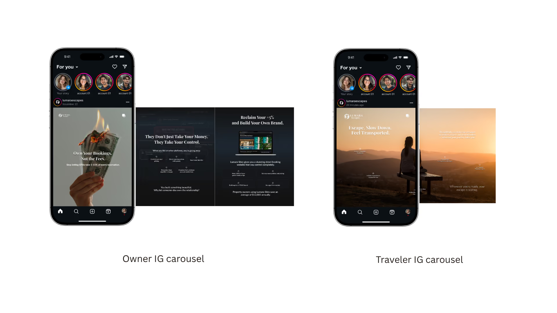
Side-by-side Instagram carousels: Owner version opens with a burning-cash visual on "Own Your Bookings, Not the Fees," Traveler version opens with a sunset hilltop scene on "Escape. Slow Down. Feel Transported."
Side-by-side newsletter emails: Owner version leads with device mockups and "Own Your Bookings. Not the Fees," Traveler version leads with a sunset photograph and "Escape. Slow Down. Feel Transported."
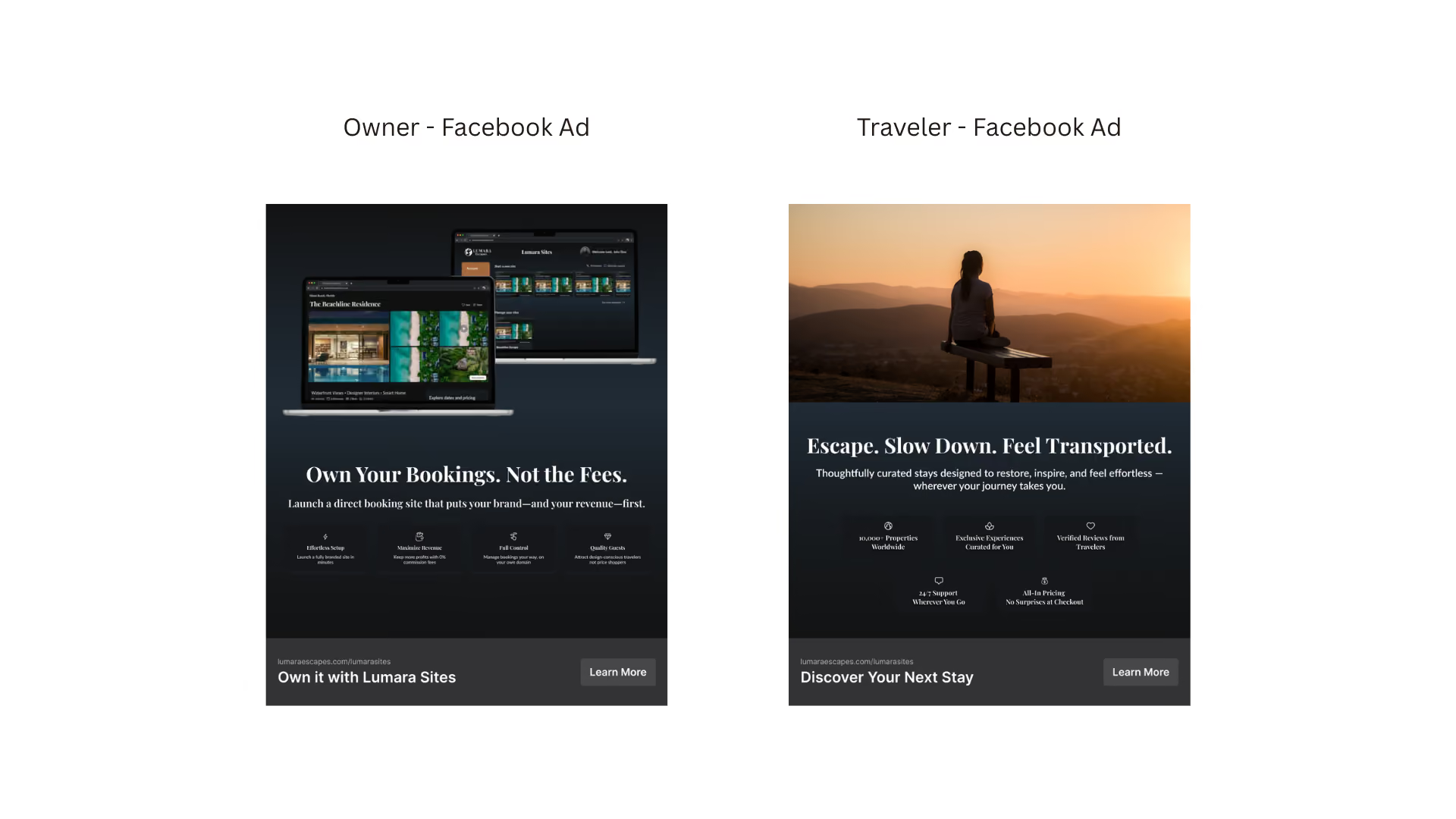
Side-by-side Facebook ads: Owner version shows device mockups with revenue-driven copy, Traveler version shows a sunset photograph with restorative, emotional copy.
No items found.
One identity, two audiences — website, social, email, and advertising consistently split between Owner (logical, dark, revenue-driven) and Traveler (emotional, light, restorative) across every touchpoint.