Final Identity System
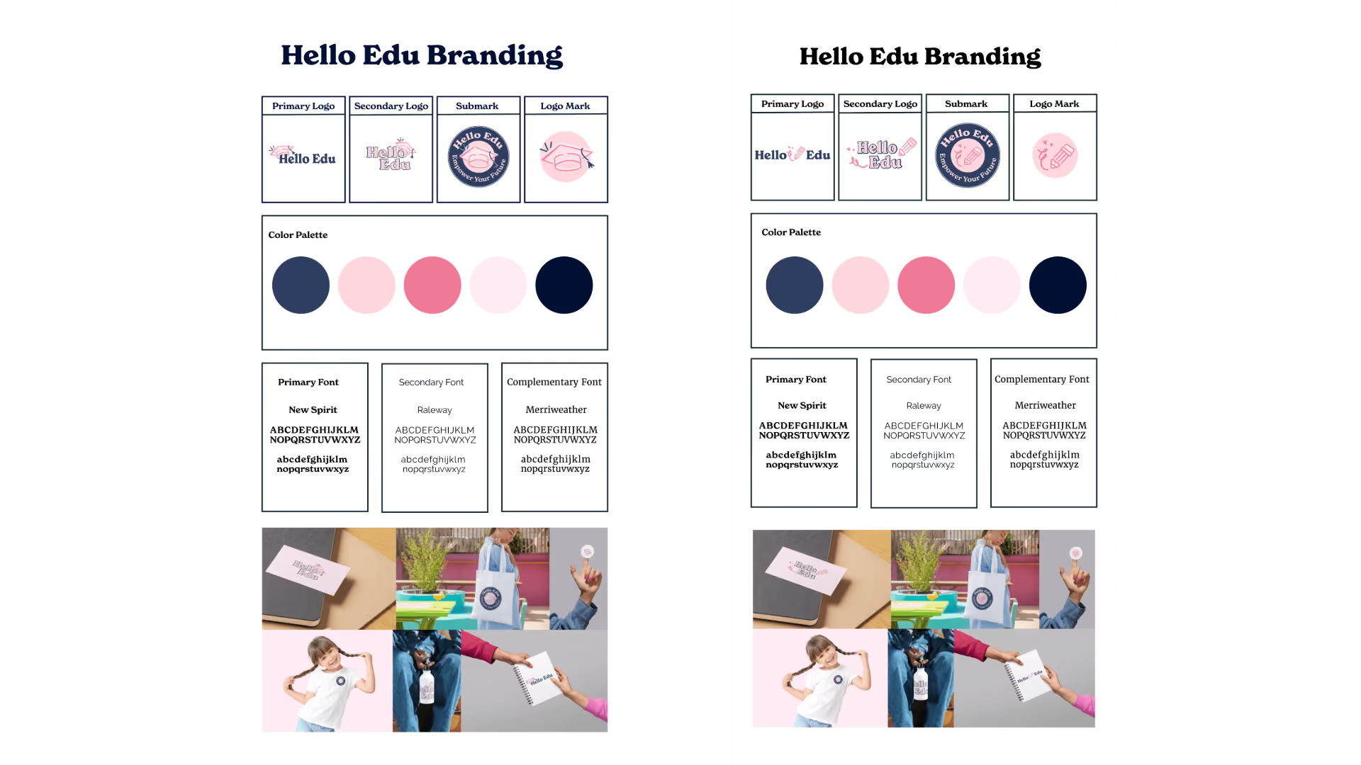
Both concepts were developed into complete brand systems, including a primary logo, secondary logo, circular submark, and standalone icon. This allowed the client to evaluate each direction not only as a mark, but as a flexible identity system.
The circular submark was intentionally designed to reference the emblem style often associated with colleges and established educational institutions, reinforcing credibility while creating a versatile asset for merchandise, social avatars, and print applications.
Ultimately, the Pencil concept was selected for its warmer, more personal expression of clients's mission. While the Graduation Cap direction leaned into traditional academic symbolism, the Pencil identity better reflected the client's focus on creativity, support, and individualized learning.
The selected direction evolved into a cohesive brand system designed for clarity, consistency, and long-term scalability. The existing navy and pink palette was refined to improve contrast, accessibility, and visual energy, with all color pairings validated against WCAG 2.1 AA standards.
Typography was built on three levels:
- New Spirit for expressive headlines and brand moments
- Raleway for navigation and interface elements
- Merriweather for body copy and supporting content
Together, these elements created a repeatable design system that could be confidently applied across web, marketing materials, social media, print collateral, and future offerings.