Mobile UX Design for an Experience Discovery App
Mobile-first product design system for discovering and booking authentic local food experiences. Completed as part of the Google UX Design Certificate, this project combines user research, information architecture, and interaction design to create a clear, intuitive discovery flow that improves usability and decision-making.
Project Snapshot
Solo Product & Brand Designer (UX Research, Brand Identity, UI Design)
12 Weeks
UX research, competitive analysis, brand & visual identity, component system, wireframes & prototyping, usability testing, mobile & desktop UI design
Figma, Zoom, Adobe Creative Suite
Key outcomes:
Travelers struggle to find authentic local food experiences and often settle on generic, tourist-focused options.
Key Pain Points:
X Difficulty distinguishing authentic experiences, causing uncertainty
X Language barriers create hesitation in booking
X Lack of verified reviews reduces trust and confidence
X Sacrificing quality for affordability
✔️ Reduce booking anxiety caused by authenticity and language concerns
✔️ Build trust through transparency, verified content, and direct host connection
✔️ Establish a custom, accessible visual identity distinct from generic UI patterns
✔️ Validate every major design decision through real usability testing
Research
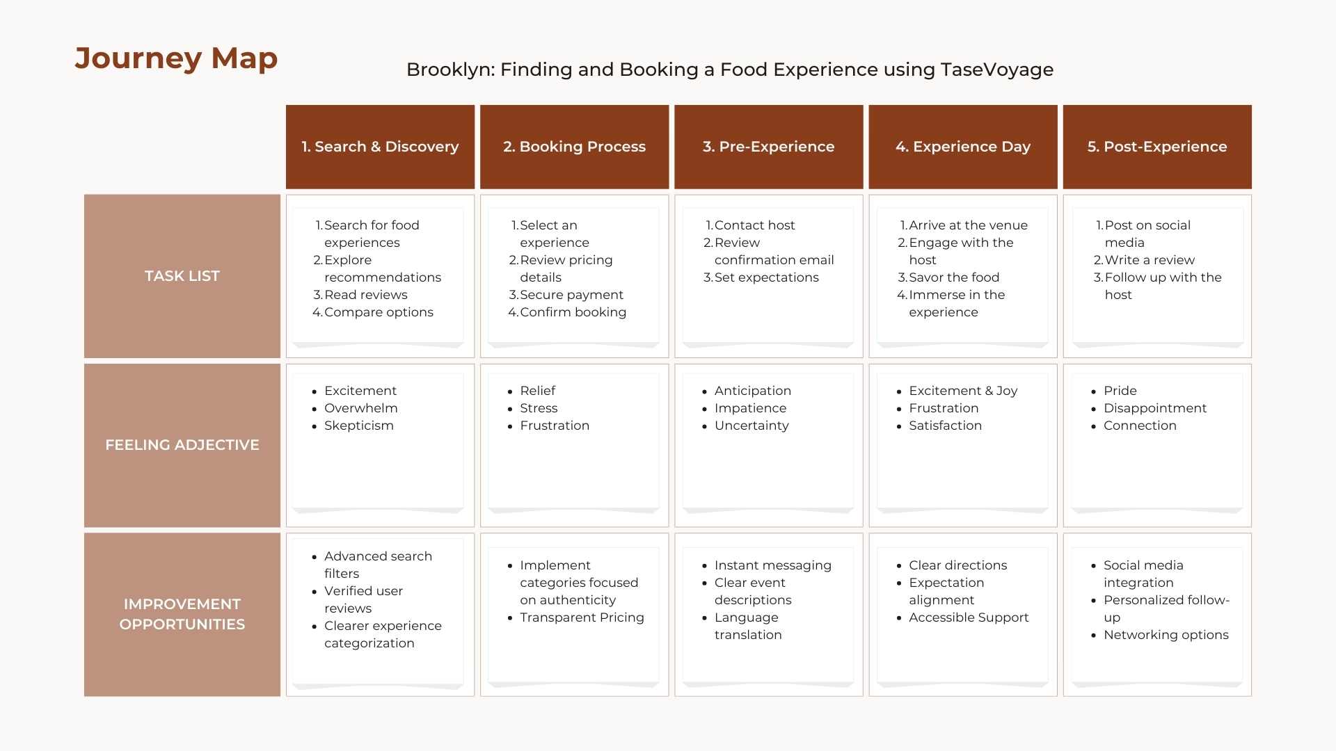
Before designing anything, I needed to understand what was getting in the way. A survey with 12 active travelers gave me data fast, and the answer pointed somewhere I didn't expect. It wasn't the price holding people back, it was anxiety over authenticity and language. Using that data alongside food tourism market research, I identified four primary personas: Bella (budget traveler), Brooklyn (immersive traveler), Ethan (family traveler), and Leo (luxury traveler). I then mapped Brooklyn's journey in depth as a representative deep-dive, since her culture-seeking, communication-sensitive profile surfaced the sharpest friction points across the four personas, identifying key pain points and improvement opportunities at every stage.
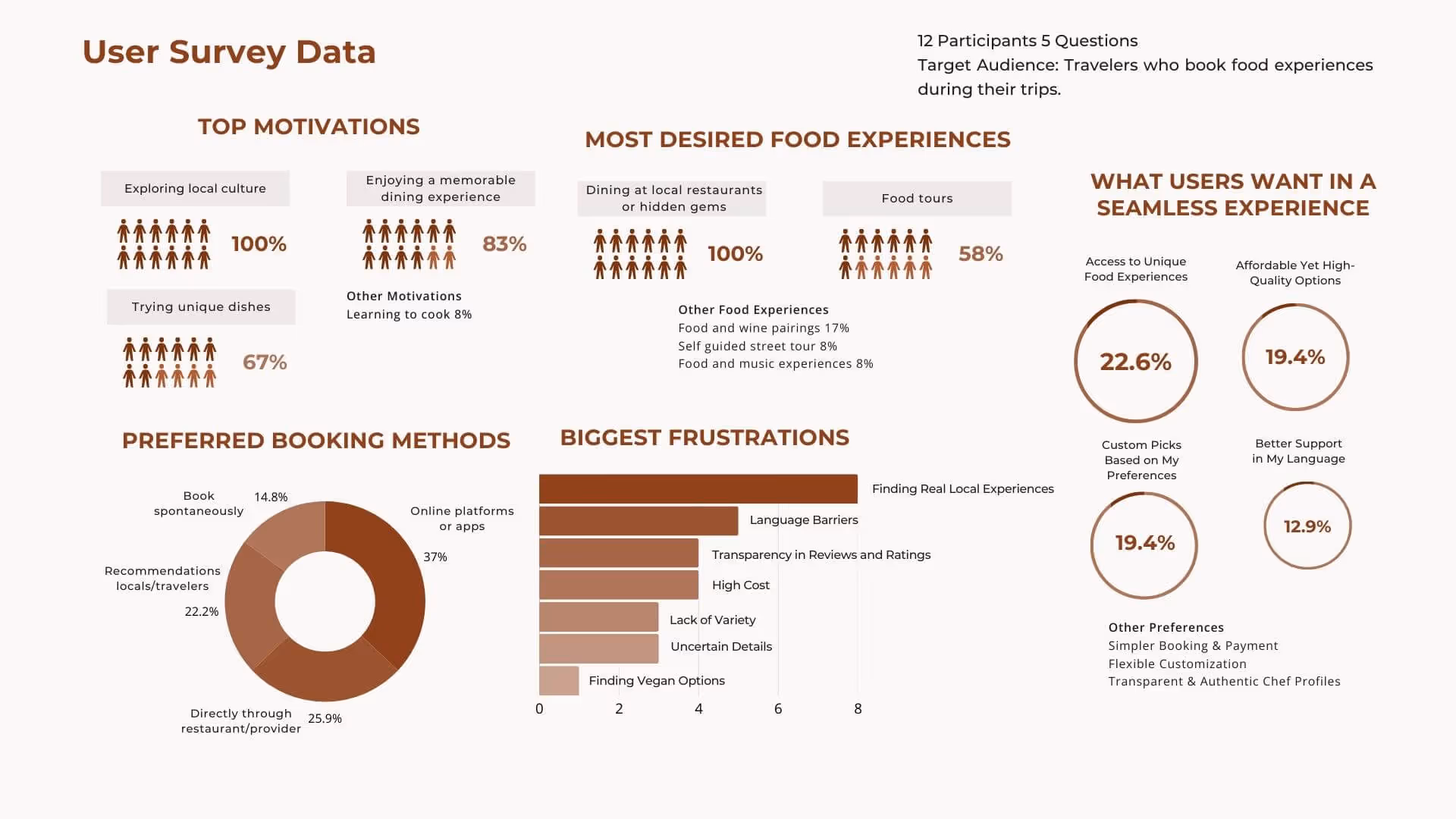
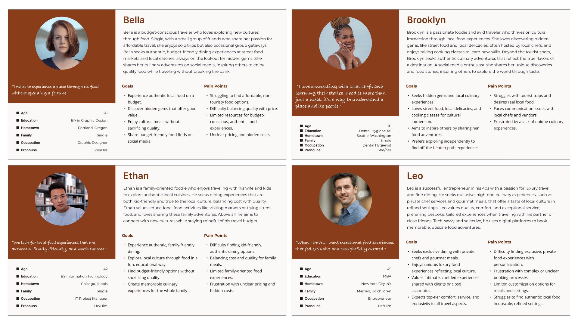

Survey data from 12 travelers, four traveler personas, and a detailed journey map for Brooklyn.
Competitor Analysis
I analyzed four competitors – Private Chef Services, Airbnb Experiences, Local Food Tours, and EatWith – to see where the market was missing the mark. After looking at both the functional and visual gaps, the opportunity for TasteVoyage became clear: to bridge the space between exclusive private services and raw, local authenticity. My goal was to combine that accessibility of a global platform with the intimacy of community-led dining, creating a ‘boutique’ experience for explorers who want genuine cultural immersion without the tourist clichés.
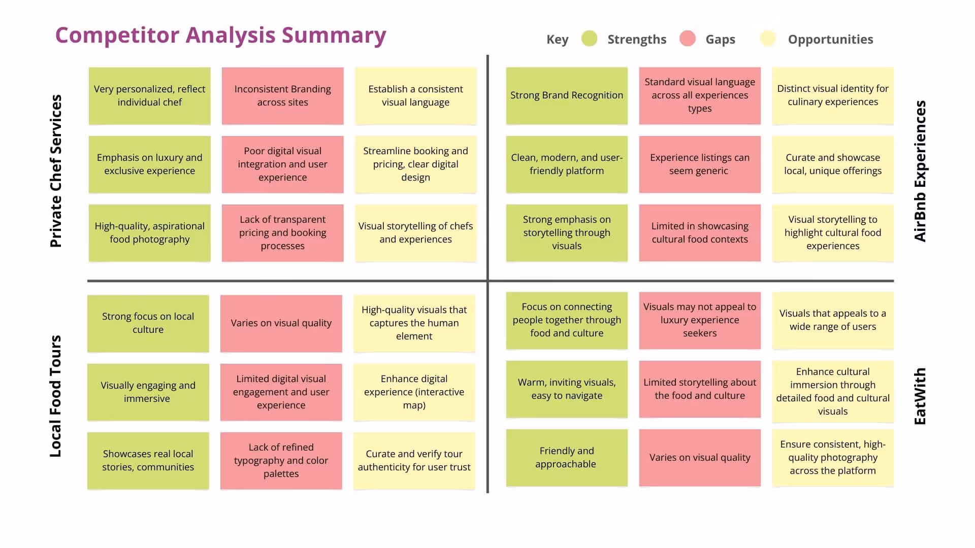
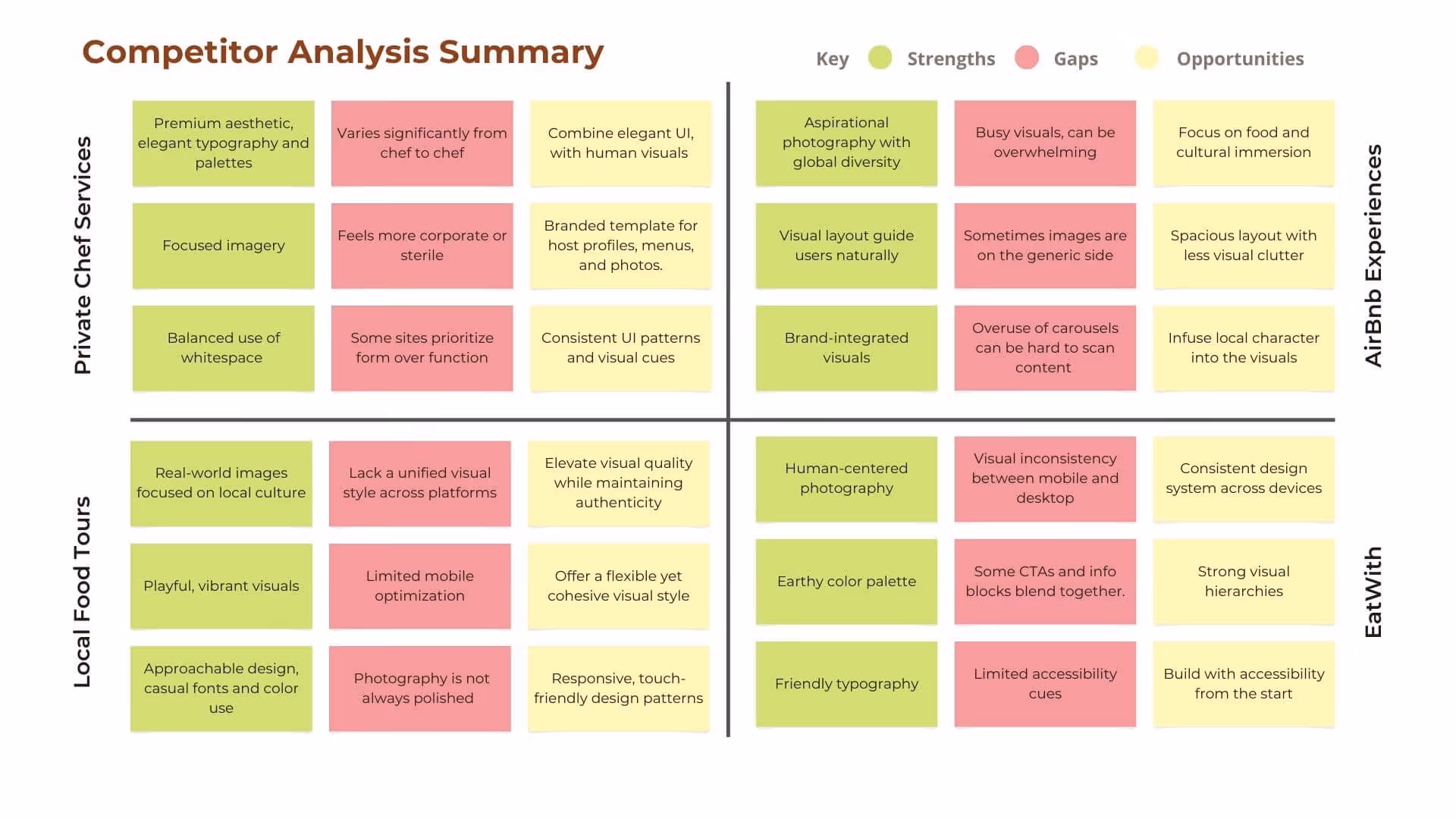
Functional and visual competitor analysis across four platforms, identifying gaps that informed TasteVoyage's positioning.
Brand Principles
Discovery revealed three core principles: curation over volume, transparency builds trust, and aspiration and accessibility. Before wireframing, I established the brand foundation to ensure every UX decision reinforced the brand promise.
Building a Warm, Accessible Visual System
I wanted the platform to feel like an extension of a dinner party, warm, inviting, and centered on people. Colors were pulled directly from photography of shared meals, and a quiet UI with generous white space ensures the app frames the community's content rather than competing with it. I moved away from generic icon libraries, redesigning each icon in Figma to match the brand's specific geometry and weight. All colors were tested to WCAG 2.1 standards, with a minimum 48x48px touch target size on mobile.
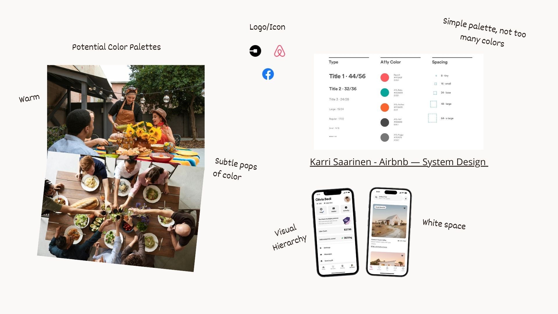
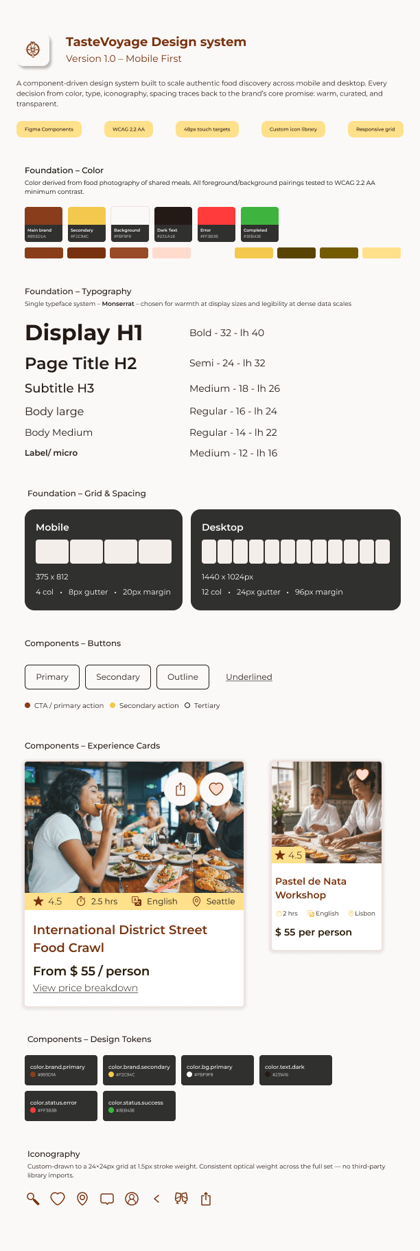
Moodboard establishing the visual direction, and final component library including color palette, typography, buttons, icons, and grid system.
Homepage Sketches
Following my research, I explored multiple homepage layout directions, sketching five variations to test different ways of introducing the search flow before committing to a single approach.
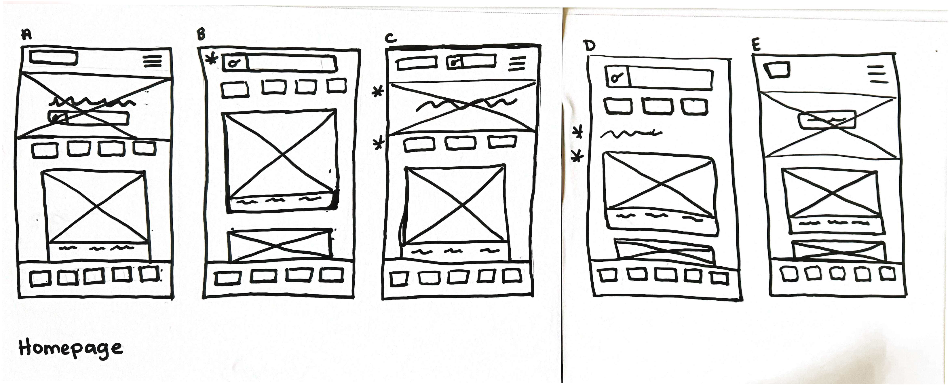
Early homepage sketches exploring layout and hierarchy before digital wireframing.
Round 1 Testing
From there, I developed low-fidelity digital wireframes in Figma, mapping the full end-to-end search and discovery journey, and prepared an interactive prototype for the first round of user testing.
Initially, the end-to-end journey overwhelmed participants, resulting in generic feedback. Drawing on my teaching background, I scaffolded the experience by narrowing the scope to the Search & Discovery phase, allowing for deeper, more actionable insights.
Round 1 Findings: The lack of upfront logistics caused excessive pogo-sticking and scrolling fatigue during the discovery process.
Caption: Lo-fi prototype used in Round 1 usability testing, mapping the full search and discovery flow across 5 screens.
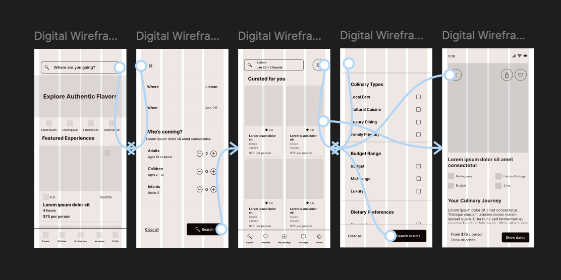
Lo-fi prototype used in Round 1 usability testing, mapping the full search and discovery flow across 5 screens.
Designing a Trust-First Discovery and Booking Flow
Round 2 Testing
Round 2 Findings: Task efficiency and booking confidence increased, confirming that addressing pogo-sticking and scrolling fatigue directly resolved the core friction points identified in Round 1.
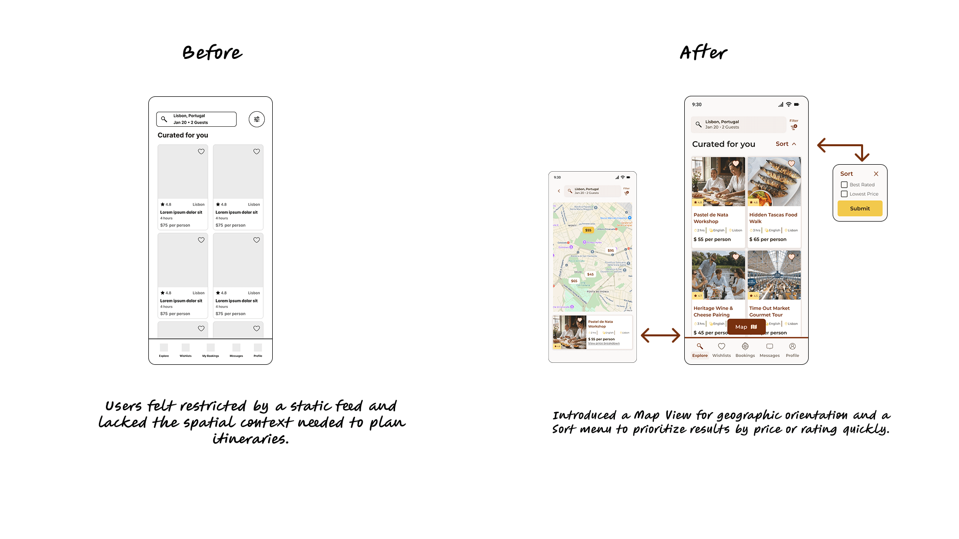
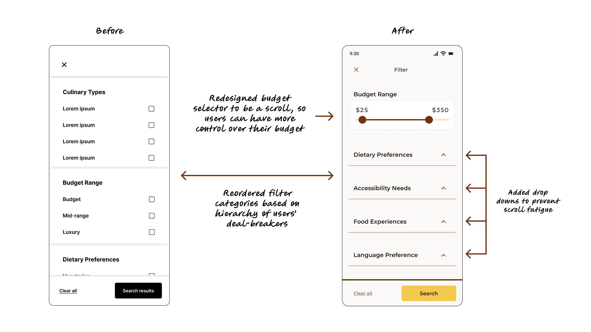
Before & after usability testing results showing the design changes, including the addition of a Map View and a redesigned filter interface.
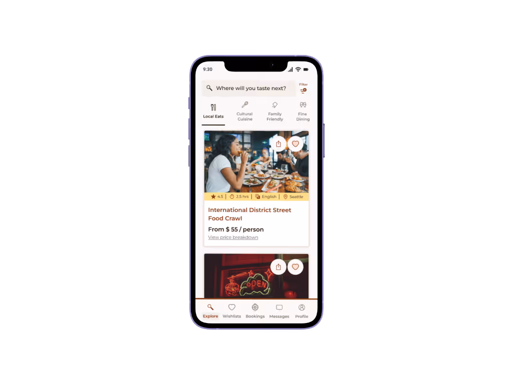
Discovery & Search
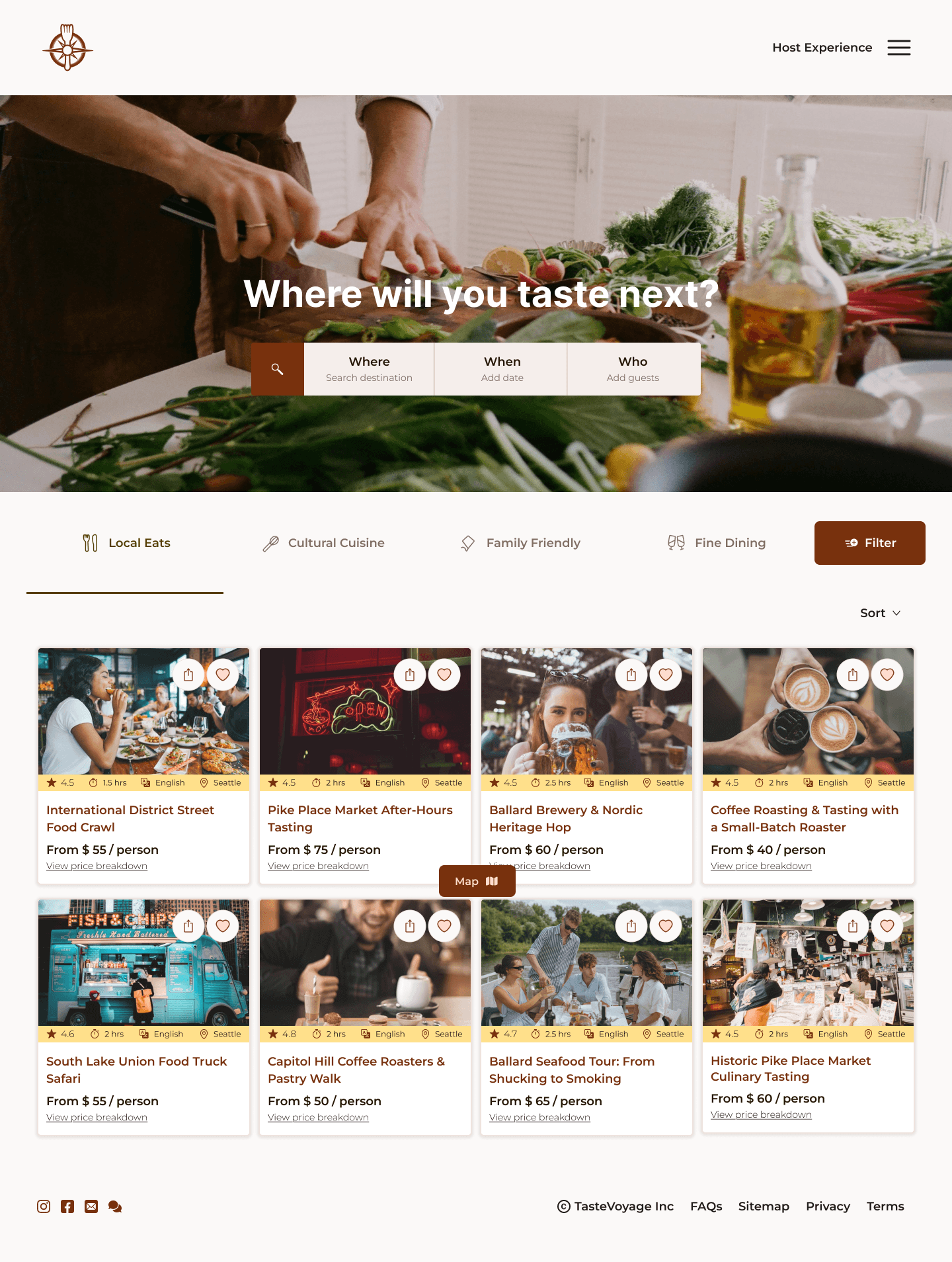
The Search and Discovery experience starts with a simple question: "Where will you taste next?" I wanted that first interaction to feel aspirational. To keep momentum, I broke the search flow into three quick, digestible steps (where, when, and who) so the user never hits a blank form. I was also very intentional with the language. Calling the discovery results "Curated for you" rather than "Search results" or nothing changes the entire vibe; it signals a thoughtful human element behind the suggestions. Finally, I addressed the scrolling fatigue and pogo-sticking issues for users identified in the usability testing.
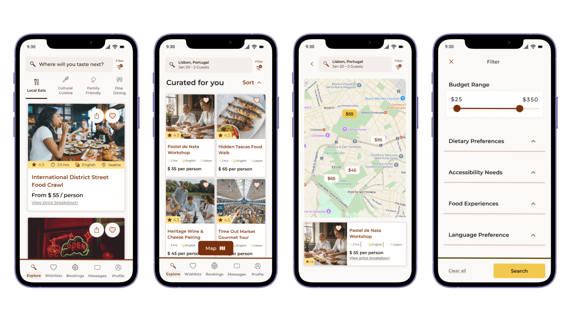
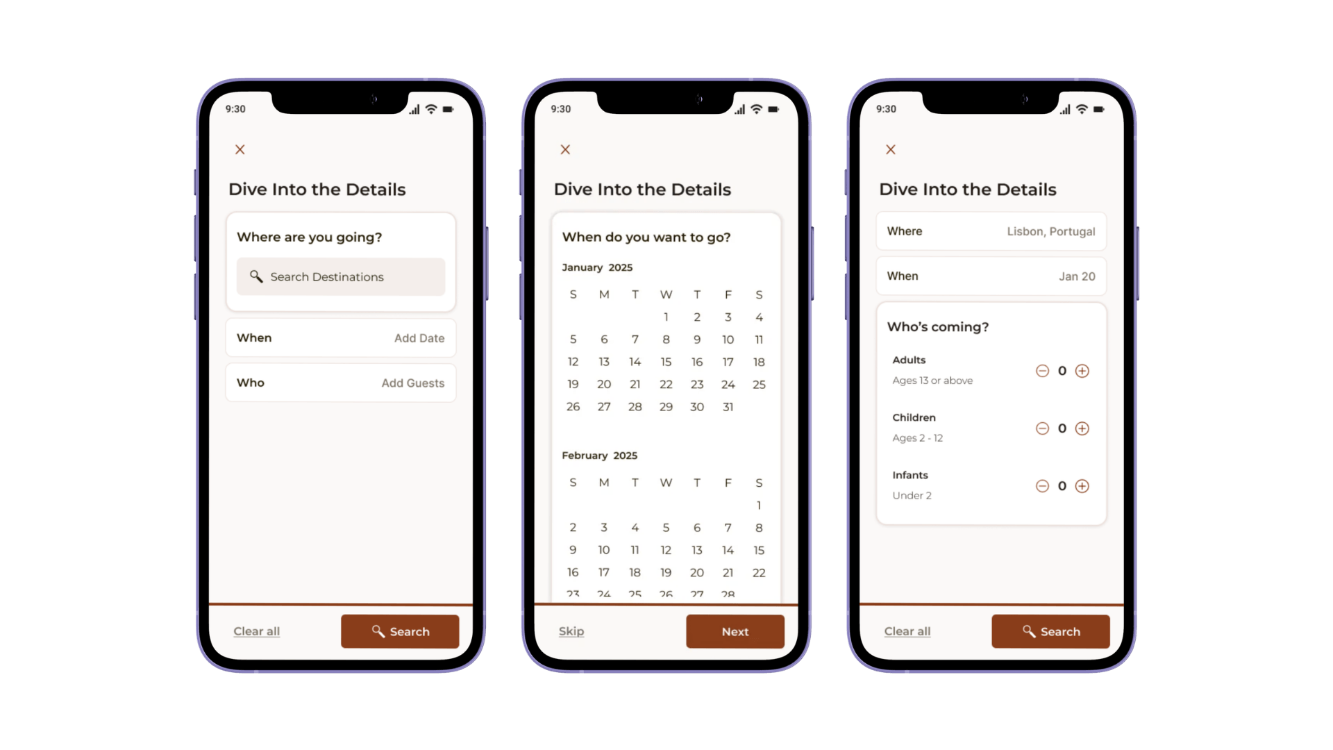
Discovery flow showing category filters, curated results, map view, and filter panel, alongside the three-step search flow (Where, When, Who) designed so users never encounter a blank form. The "Curated for you" language and Map View directly resolve the friction found in Round 1 testing.
Trust & Transparency
Research pointed to one recurring theme: travelers don't just want a great meal, they want the confidence to say "yes". The experience page layers more key logistics and a full price breakdown to remove friction before it arises. Verified badges, video host intros, direct messaging, and verified customer reviews transform a faceless booking into a connection with a real person. The goal is to turn a stranger into a trusted guide before the traveler has even committed.
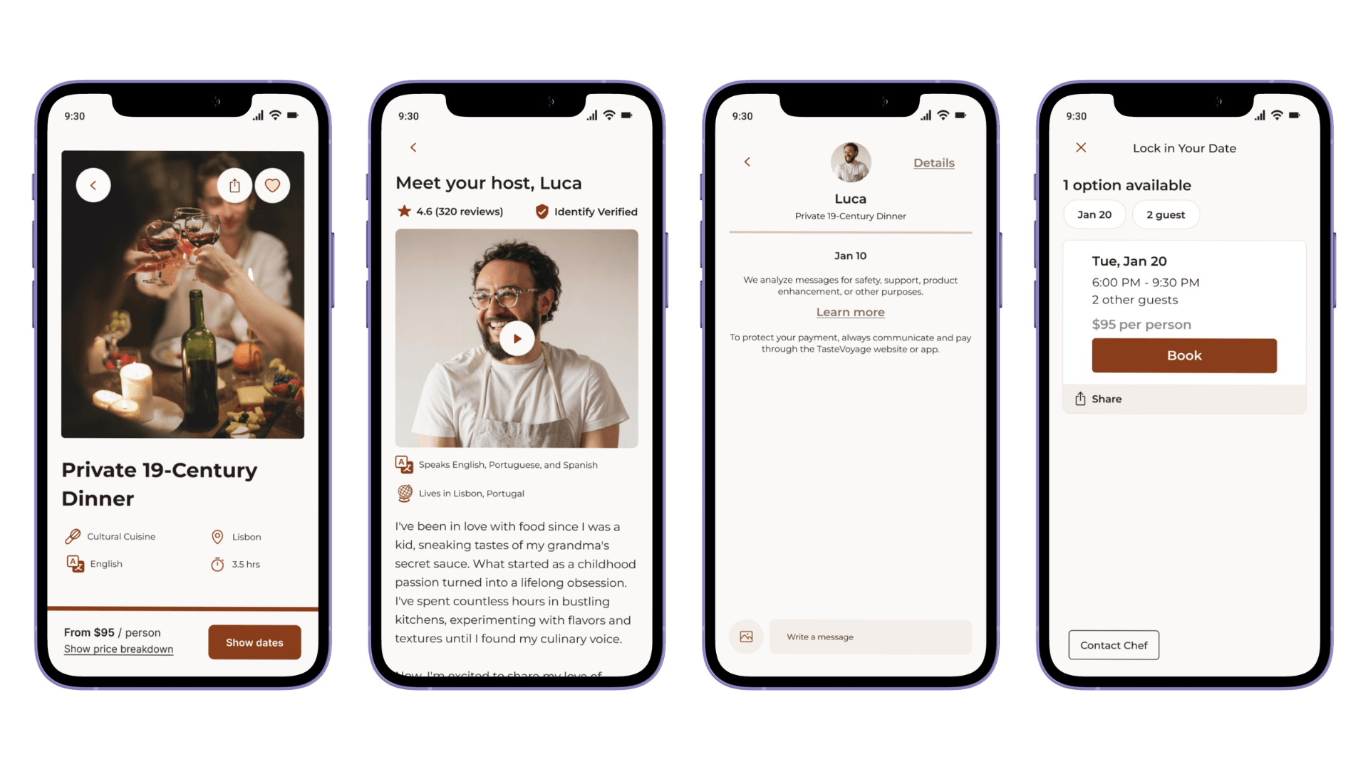
The experience page layering price breakdown, verified host badge, video intro, and direct messaging to build confidence before booking.
Frictionless Booking
Once at the point of highest intent, the booking flow gets out of the way. Availability surfaces at a glance, a full order summary appears before payment, and the confirmation is warm and immediate. The result is a streamlined two-minute journey that replaces uncertainty with clarity.
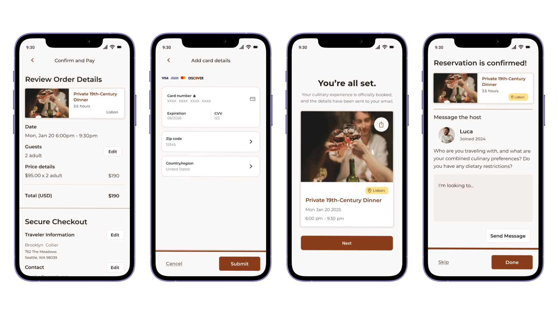
The four-step checkout flow — order review, payment, confirmation, and host message prompt — completing in a streamlined path from intent to confirmation.
Post-Booking Connection
The experience doesn't just stop at checkout; it actually begins there. Travelers are immediately connected to their host and prompted to share their preferences, so personalization starts before arrival. The booking hub keeps everything in one place, with host messages deliberately separated from general support so the personal connection never gets buried. This post-booking layer was the gap for other competitors, and the feature most likely to turn a one-time traveler into a returning user.

The booking hub separates host messages from general support, keeping the personal connection with the host visible after checkout.
Desktop Translation
While TasteVoyage was designed mobile-first, a significant portion of travel bookings happens on desktop. I explored how the experience would scale, using the expanded grid to surface more options at a glance, and bringing filter controls forward so desktop users can refine without extra navigation steps.
The mobile-first experience scaled to desktop, using the expanded grid to surface more results and bringing filters to the forefront for easier refinement.
A Validated, Trust-First Discovery Experience
TasteVoyage moved from a research question, what's stopping travelers from booking authentic experiences, to a tested, end-to-end product grounded in real user behavior rather than assumption.
The final experience included:
Research-Driven Positioning
Four personas, Bella, Brooklyn, Ethan, and Leo, and a five-stage journey map tracing one persona's full path from search anxiety to post-experience reflection, surfacing friction points that directly shaped the discovery, trust, and booking flows.
Custom Visual System
A warm, WCAG 2.1-tested component library with hand-redesigned iconography, built to feel like an extension of a shared meal

Validated Discovery Flow
Two rounds of usability testing directly resolved scrolling fatigue and pogo-sticking, replacing a static feed with map view, sort, and streamlined filtering
Trust-First Booking
Verified hosts, transparent pricing, and direct messaging turn a faceless booking into a connection with a real person before the traveler commits
Seamless Post-Booking Connection
Hosts and travelers connect immediately after checkout, closing a gap left open by competing platforms and turning one-time bookings into repeat relationships
One of my most significant takeaways from this project was the value of narrowing the scope to deepen the impact. Pulling from my teaching background, I recognized that introducing too many concepts overwhelms the user and produces shallow understanding. Narrowing the testing to the Search and Discovery phase produced clear, actionable feedback to improve the user journey significantly.
During this project, I also explored establishing a strong visual identity early on. This was inspired by my study of Andrew Couldwell's book "Laying the Foundations". I made the intentional decision to move away from the community icon libraries and redesigned each icon in Figma to be cohesive across the brand, so the UI felt custom and intentional.
Project Takeaways
UX Research
Conducted primary research with 12 travelers, developed four distinct personas, and mapped one persona's journey in depth to surface the sharpest friction points across the group.
Competitive Analysis
Evaluated four competitor platforms to identify a differentiated, boutique market position between exclusive private services and generic marketplaces.
Visual & Brand Identity
Built a custom, WCAG 2.1-tested component system and hand-redesigned iconography to reinforce a warm, community-centered brand feel.
Usability Testing
Ran two rounds of testing, first diagnosing scrolling fatigue and pogo-sticking, then validating that Map View and filter redesigns resolved the friction.
Trust & Post-Booking Design
Designed verified host profiles, transparent pricing, and a post-booking messaging hub that closes a connection gap left open by competing platforms.
Responsive Design
Extended the mobile-first system into a scalable desktop experience without adding navigation steps.
Let's discuss how we can scale your brand through design.