A brand system and website redesign that helps Hello Edu grow into a scalable educational platform, balancing playfulness with academic credibility to support Amanda's next phase of her business.
Solo Brand & UX/UI Designer)
6 Weeks
Figma, Figjam, Adobe Illustrator, Notion
The original Hello Edu branding leaned into the "playful education" aesthetic, utilizing whimsical fonts and a bright "girly" color palette. While this felt welcoming for early learners, the visual system had become fragmented over time. Inconsistent styling across the web and social media created a disjointed experience that didn't reflect the quality of the work.
More importantly, the brand was boxed in as a traditional tutoring agency. This limited positioning failed to showcase Amanda's evolving vision: moving beyond 1-on-1 tutoring to become a trusted authority for fellow educators and a go-to resource for homeschool parents.
Primary Goal: Fuel Amanda's business growth by transitioning the brand from a "boutique service" to a "professional practice," all while keeping her approachable personal touch at the center.
Design Objectives:
Before designing, I focused on three key questions:
1. What's not working with the current brand and website?
2. What does Amanda want Hello Edu to become in the near future?
3. How will we measure success?
The first question I aimed to answer was, 'What's not working with the current brand and website?' I then examined Hello Edu:

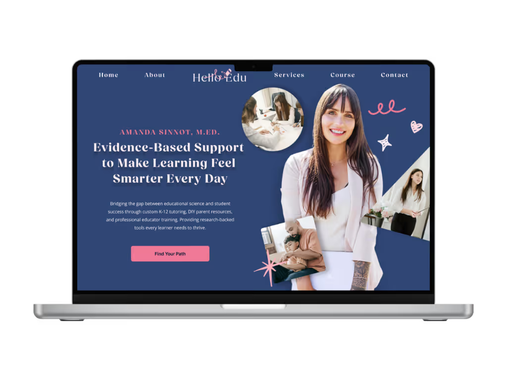
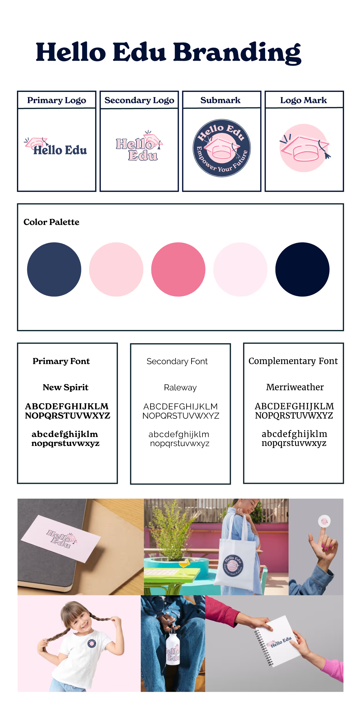
A snapshot of Hello Edu's current brand
My Findings
Hello Edu branding was clearly learning into the playful education vibe, however I noticed it had some inconsistencies through out the branding system and didn't currently reflect where Amanda wanted to take the brand. The redesign would focus on creating a consistent, professional, but approachable identity.
Through our discussions, we clarified Amanda's goal for Hello Edu:
Expanded Offerings
Key Insight
Amanda shared a site she admired for inspiration. While the audience was different, she liked how clearly the services were presented and how confidently the owner was positioned as a thought leader.
By reviewing the inspiration site, I identified design patterns that project authority and clarity:
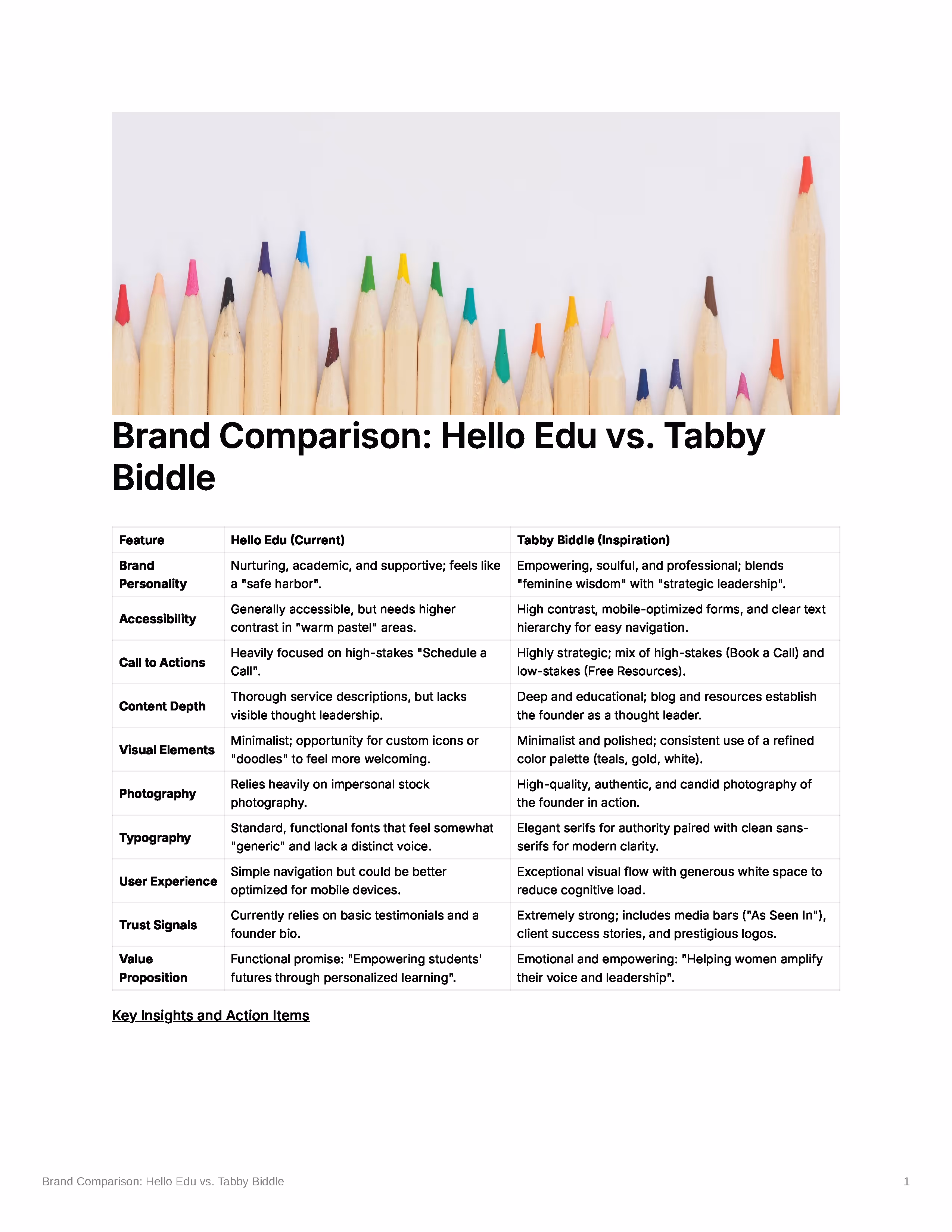
Comparing Hello Edu with the inspiration site revealed where Hello Edu was falling short in authority signals, content depth, and overall polish,
Based on discovery findings, I created a strategic framework that explored how Hello Edu could scale while staying approachable. This framework guided the redesign of the brand, content, and website to:
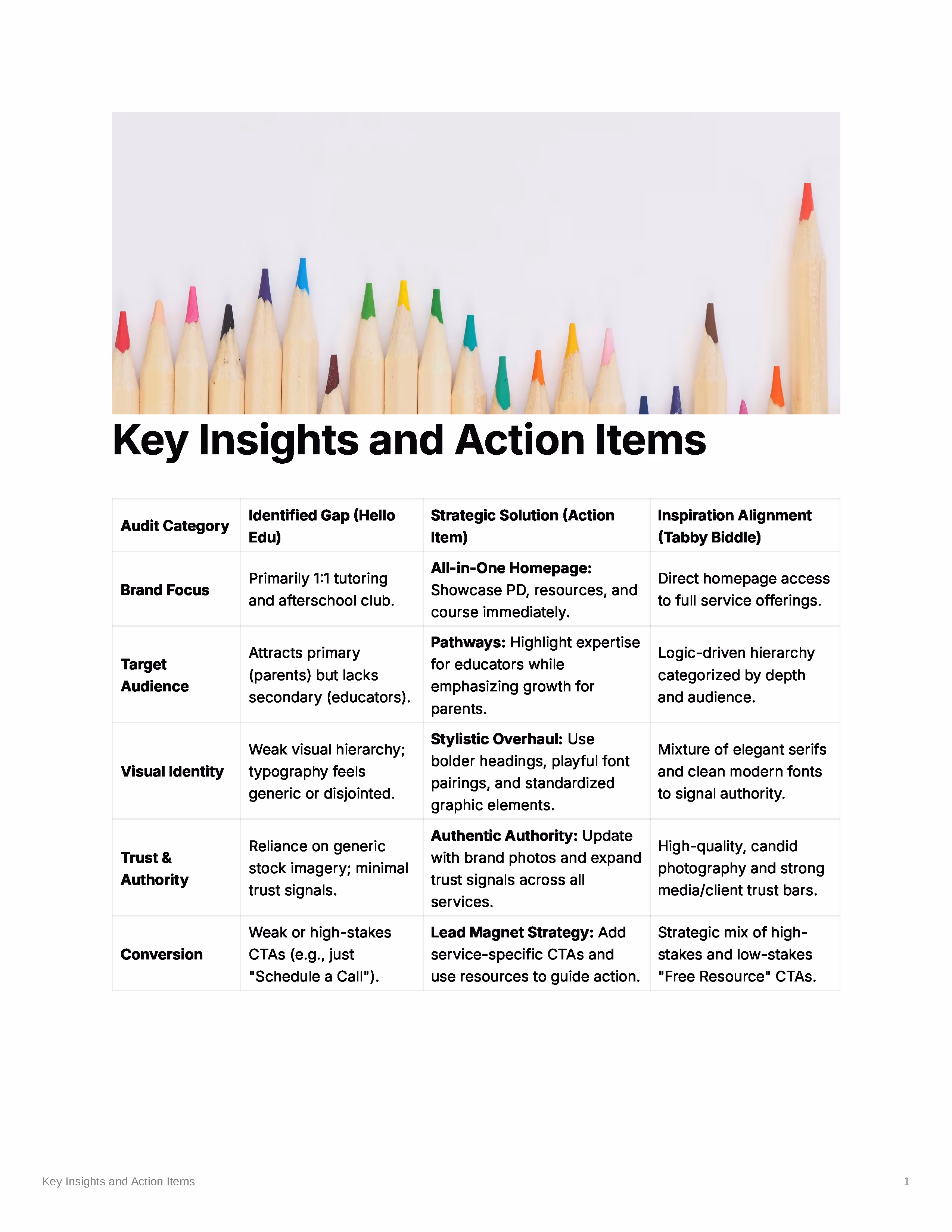
A table showing Hello Edu's gaps, proposed solutions, and alignment with the inspiration site Tabby Biddle across five categories: Brand Focus, Target Audience, Visual Identity, Trust and Authority, and Conversion.
Two sitemap options were explored to test how the 90-Day Parent Course could be featured:
Sitemap A
Course housed within the Services dropdown to keep the navigation clean.
Sitemap B
Course added to top-level navigation, giving it equal importance alongside other services.
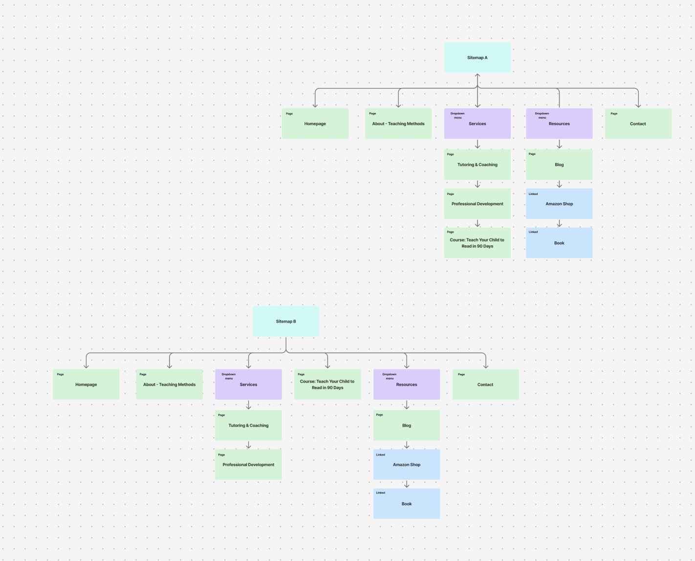
Sitemap A hides the 90-Day course under Services, while Sitemap B gives it top level placement for visibility and easy access.
Decision
My initial recommendation was Option A to keep the navigation clean and support user flow, with key resources like the course, book, and Amazon shop highlighted on the homepage. After completing the discovery phase, it became clear that Option B better supported Amanda's goals by elevating the course to the same level of importance as her services.
Logo Exploration
Using insights from Amanda's logo questionnaire and brand preferences, I explored icon-based concepts that could work across multiple touchpoints:
Hand-drawn logo exploration featuring education symbols like graduation caps, books, and pencils, plus playful double 'e'. Concepts balanced familiarity with distinction while considering versatility across applications.
Strongest Concepts
After initial exploration, two directions stood out as the strongest concepts:
A pink graduation cap with a navy tassel forming playful swoosh, emphasizing achievement and movement in education
A stylized pencil with heart accents conveying a nurturing, creative approach to education
Complete Brand System
I developed each concept into a full brand system with multiple variations that allows flexibility for the brand across digital, print, and merchandise without losing recognition.
Complete brand system featuring the graduation cap concept with navy and pink palette, three-font hierarchy, and real-world application mockups.
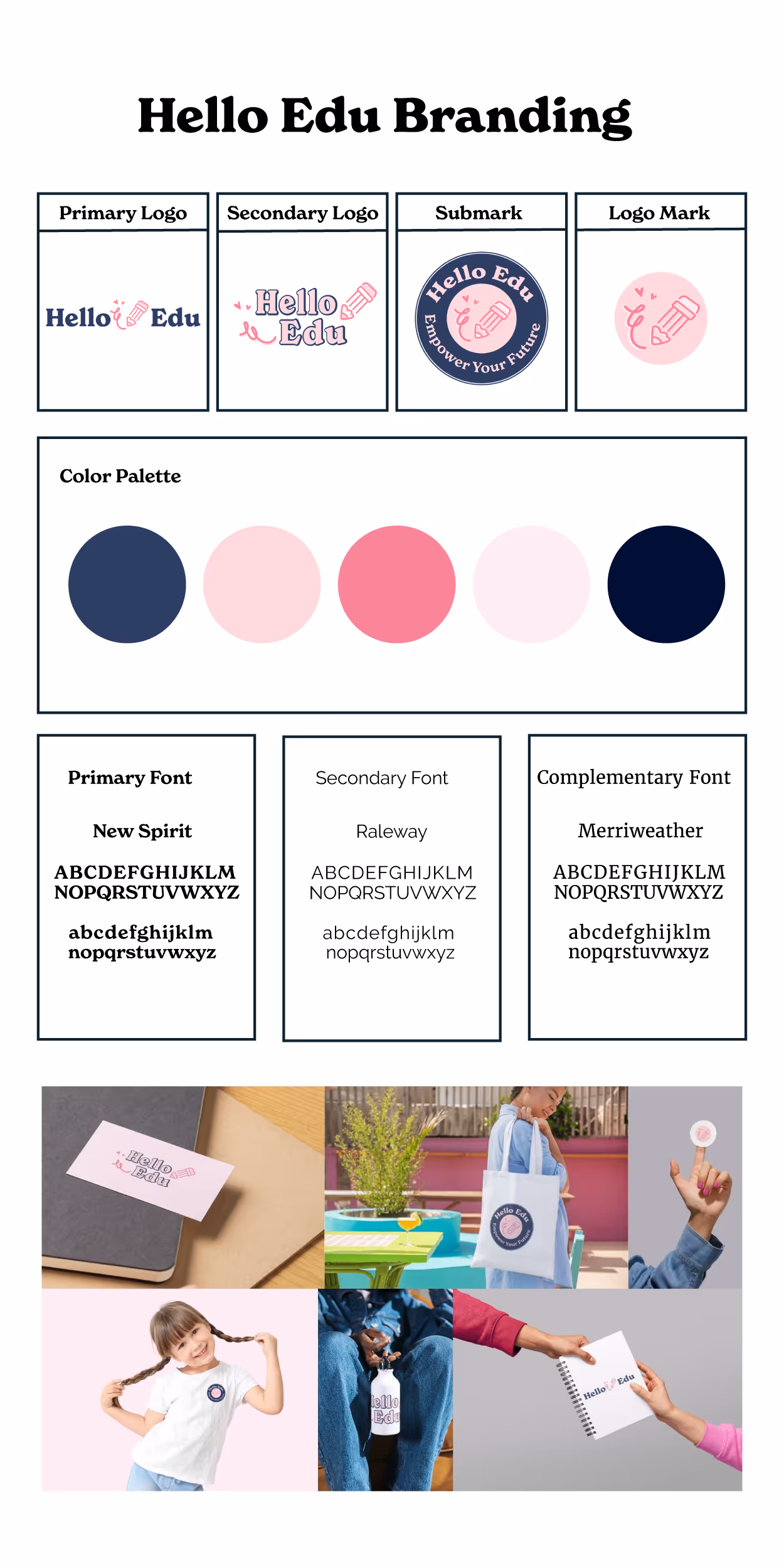
Alternative brand system using the pencil and heart motif, maintaining the same color palette and typography for brand consistency while offering a more playful aesthetic.
Color Palette Refinement
Amanda wanted to keep her existing navy and pink color palette
Typography System
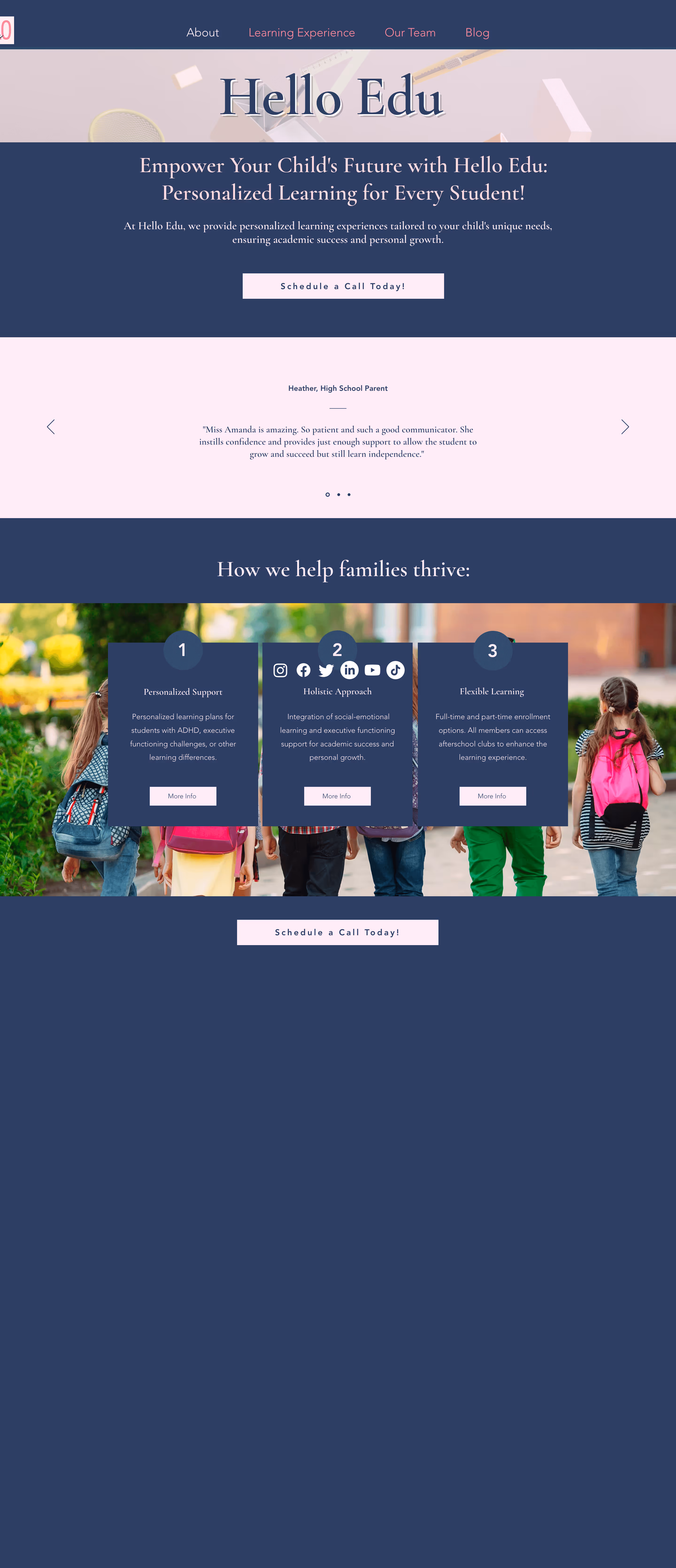
During this stage, the wireframes focused on layout and structure, showing how each page would flow before adding fonts, imagery, and other visual elements. An interactive Figma prototype allowed Amanda to explore the site and experience the navigation and user flow first hand.
Strategic Homepage
All-in-one showcase of Amanda's offerings, directly addressing the gaps identified during the audit.
Side by side comparison of Amanda old home page site and wireframe of new homepage
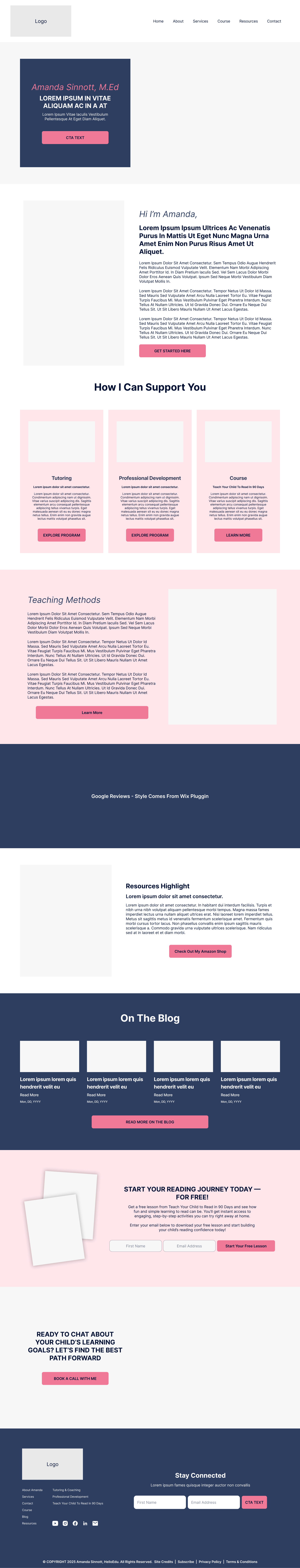
Complete Site Wireframes
The site was designed to feel like a natural extension of Amanda's teaching, organized, supportive, and easy to navigate.
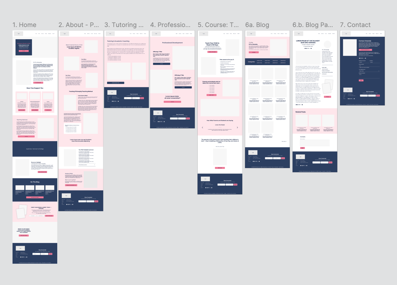
Showcases the full 7 page system designed to support Hello Edu's growth, with dedicated paths for tutoring, course, and professional development.
Project Pivot
After six weeks, Amanda decided to pursue a different direction for the final design execution. While the Amanda chose a different visual approach, this project established the strategic foundation and information architecture that informed her next steps, including the sitemap structure, content strategy, and audience segments that would guide Hello Edu's growth. This pivot became an important learning moment for me as designer.
Amanda was expecting something more polished and fully branded at the wireframe stage, while my approach focused on validating structure and user flow before layering in visual personality.
The redesign aimed to transform Hello Edu from a local tutoring service into a trusted education resource hub, clearly showcasing Amanda's expertise and offerings for her audiences.
Revisiting the project later, I realized Amanda was expecting something more polished and fully aligned with her brand, while my focus had been on information architecture and user flow. I had planned to layer in her full personality and brand style after the "bones" of the site were approved, but I could have done more to incorporate that throughout the wireframes from the start.
Logo & Typography Refinement
Amanda's feedback focused on refining the logo and typography: she wanted a sleeker, more modern serif font, and updated tagline ("Smarter Every Day"), and a more cohesive, unified logo.
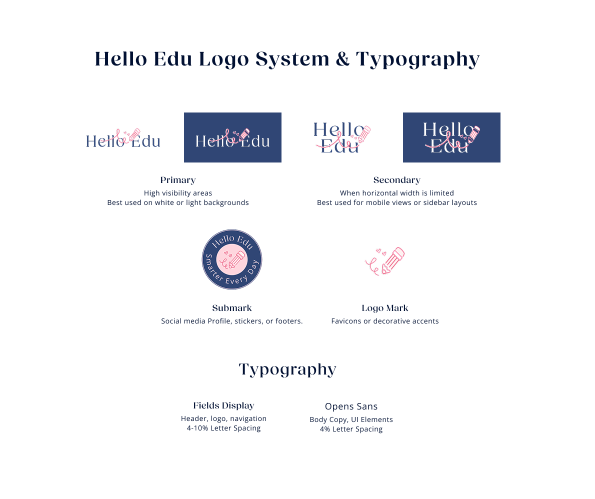
Showcasing the refined logo system that still feels fun and approachable but is more timeless and better suited for her long term goals
Color Palette
I brightened the navy and the light pink accents to bring more energy to the brand while staying true to Amanda's original palette. The updated colors were tested for accessibility, ensuring strong contrast across all applications. The refinements gave the site a lighter, more vibrant feel without losing familiarity.
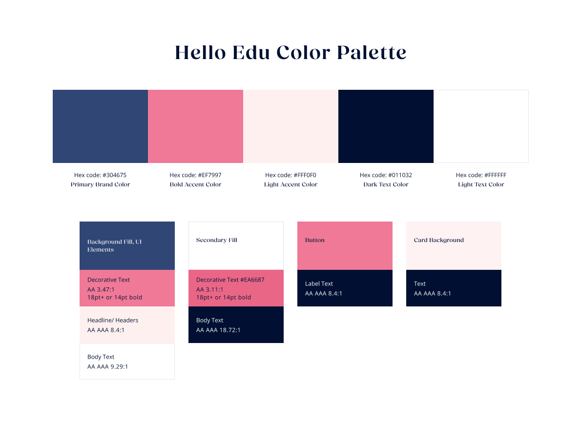
The refined palette was tested against WCAG 2.1 accessibility standards. The bottoms section documents the specific application, with contrast ratio verified for each combination.
Competitor Analysis
Studying competitors revealed how top education brands strike the balance between fun and credibility. These insights helped me refine the home page, incorporating playful elements without compromising trust or professionalism.
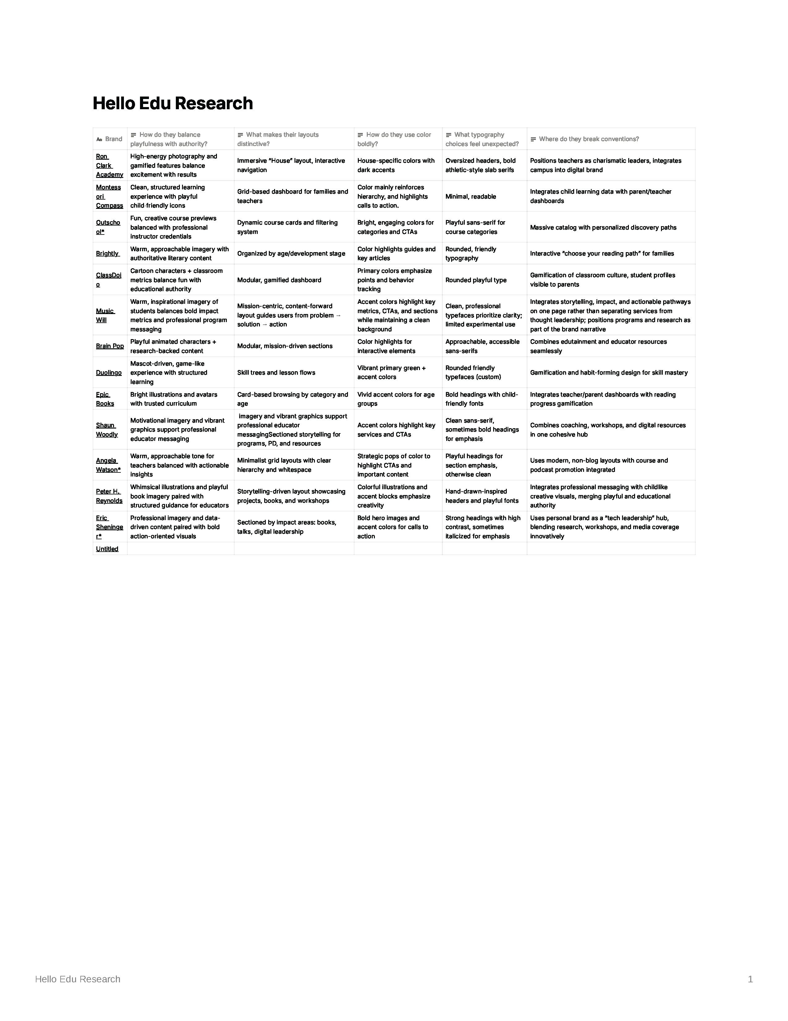
Competitive research across 13 brands in the educator space examining how each balanced playfulness with authority, and how they break from the norms.
Revisited Homepage Design
Using insights from the competitor analysis and the refined brand system, I enhanced the homepage to better showcase Hello Edu's personality through playful elements, and curated brand images. I also restructured the homepage to improve user flow and highlight key offerings more clearly.
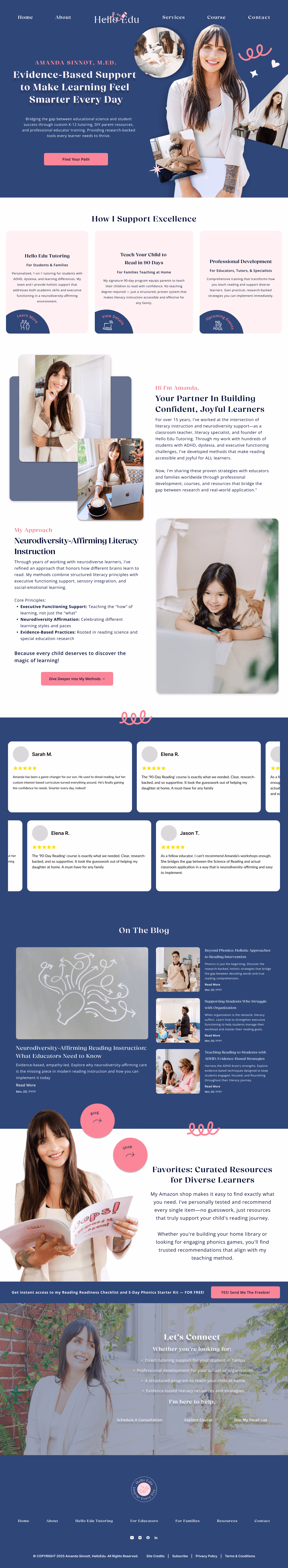
The homepage design incorporates Hello Edu's brand personality more clearly.
Additional Opportunities
If I had more time to further refine the homepage, I would explore adding playful interactive features, such as arrows that expand on hover or subtle graphics that animate as the user scrolls. These interactions could bring more of Hello Edu's personality to life while keeping the experience engaging and approachable.
While this project didn't reach the final design stage with Amanda, it became one of the most valuable learning experiences in my design career, not because of what I delivered, but because of what I discovered about myself afterward. It was a real client project that helped me understand the nuances of how the design process works in the real world. Strategy and structure are important, but presenting solutions also needs to be rooted in the client's vision. There was a disconnect when Amanda felt I didn't fully understand her brand, even though my research and designs reflected it.
Revisiting the project later, I realized Amanda was expecting something more polished and aligned with her brand. I could see that I had played it safe, not just with the wireframes, but with the creative choices throughout. The competitive research and post-project revision pushed me to take risks I should have taken from the start. It taught me that advocating for bolder design choices doesn't mean I'm disregarding the client. It's about trusting the research and letting the brand's personality lead.
Connect with Me

