Lumara Escapes is a fictional boutique travel booking platform connecting travelers with intimate, restorative, design-led properties worldwide.

Solo Brand, UX/UI,
Marketing Designer
10 Day Sprint
Figma, Figjam, Canva
Design a comprehensive marketing campaign for Lumara Escapes' dual audiences:
For Travelers: driving property bookings
For Property Owners: promoting Lumara Sites adoption
Each audience required tailored messaging and a distinct customer journey while maintaining overall brand consistency.
Deliver two complete marketing ecosystems, fully optimized for light and dark modes, across web, email, and social channels.
Before starting the design process, I wanted to dive into understanding the two distinct audiences that would interact with the platform and research the current market.
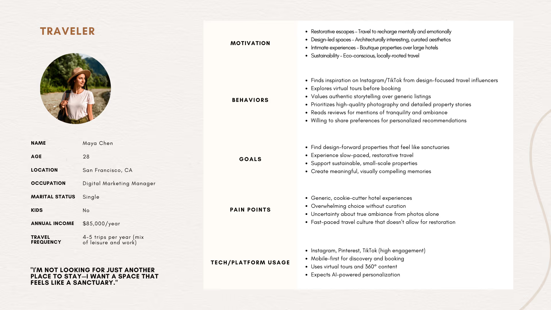
Travelers are led by emotion and sensory experience
"Make me feel something"
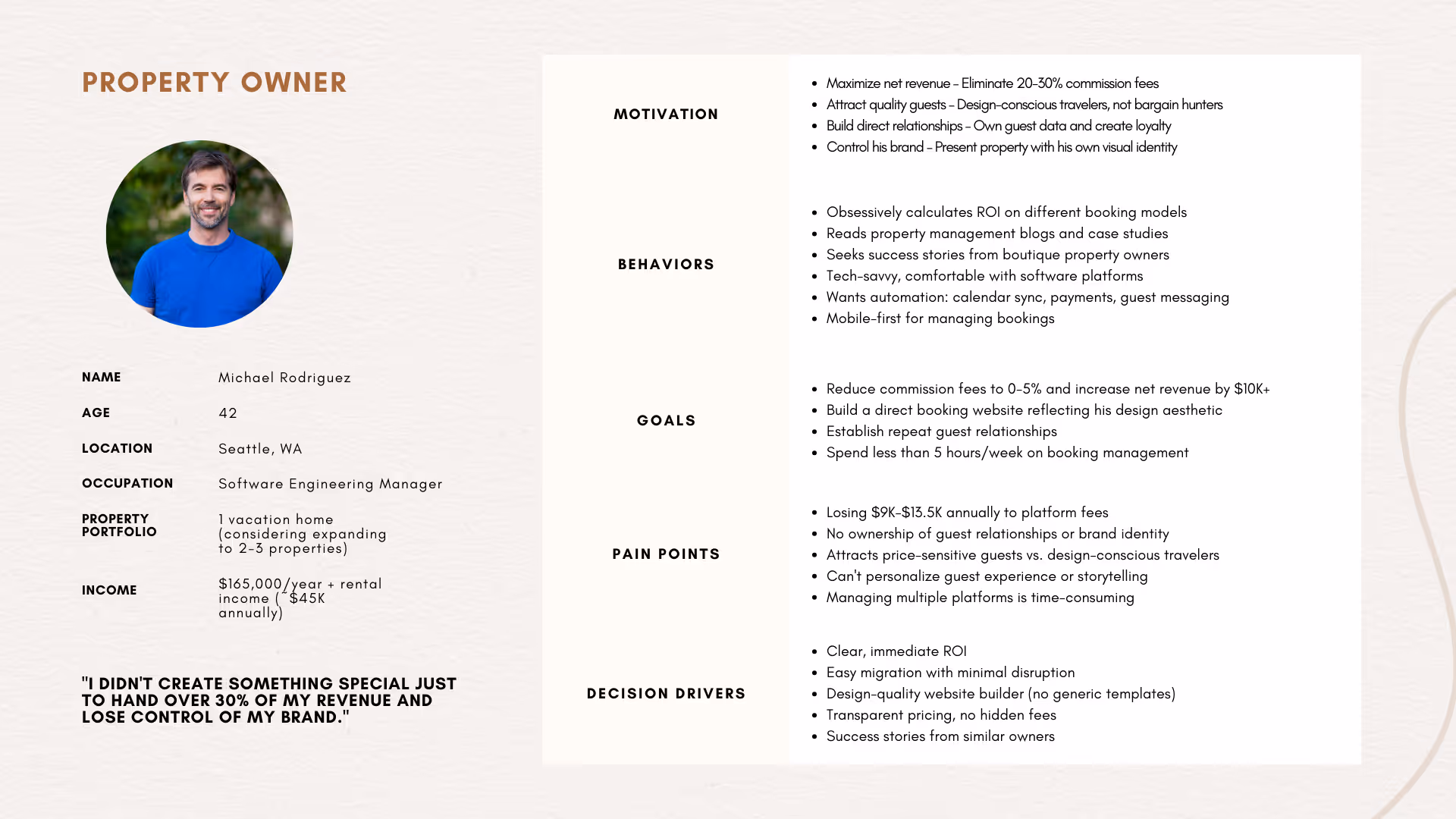
Property Owners are led by logic and financial proof
"Show me the numbers"
To understand Lumara Escapes' competitive positioning and validate the market opportunity, I conducted a SWOT analysis examining strengths, weaknesses, opportunities, and threats relative to major players in the travel booking space.
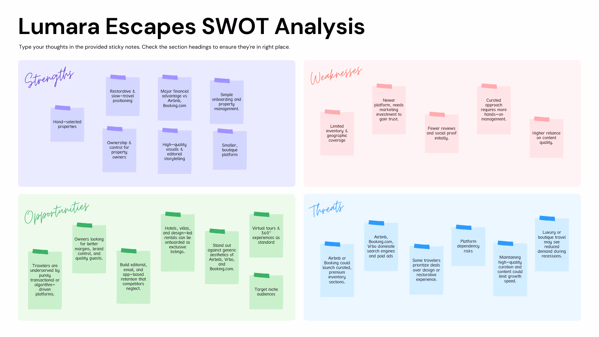
SWOT analysis mapping Lumara's strengths against competitor weaknesses and market opportunities.
Findings: The analysis confirmed that the best competitive advantage lies in being intentionally smaller and more curated, positioning boutique scale as a feature, not a limitation. This informed every design decision across both marketing funnels.
Before defining features or interface layouts, I established a Visual Brand Board defining:
This ensured consistent brand expression across travelers' and owners' journeys while guiding messaging, layout, and strategy.
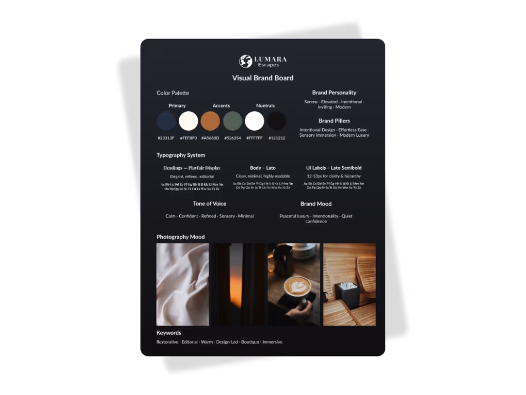
Brand Board driving trust, serenity, and consistency across traveler and property owner journeys.
The brand needed to appeal to two very different mindsets within the same visual identity.
Traveler Funnel
Goal: Turn travelers into return guests and brand advocates.
Flow: Inspiration → Curation → Transparent Booking → Loyalty
Owner Funnel
Goal: Convince property owners that the platform is more profitable than relying on major booking platforms.
Flow: Simple Onboarding → Quality Guests → Control → Earn More
I approached landing pages and supporting assets as a single, cohesive conversation, reflecting the "split personality" across every touchpoint.
Hero section exploration for traveler landing page testing four layout approaches
V1: Left-aligned text & search, right-aligned imagery, natural reading flow
V2: Horizontal auto-scroll, immediately showcases a variety of properties
V3: Scattered imagery, encourages exploration over immediate conversion
V4: Staggered magazine-style layout, slow eye movement premium curation
For this brand, speed wasn't the goal connection was. V4 fosters discovery, builds trust, and communicates quality through intentional white space and layered imagery.
Early sketches demonstrated the platform’s split personality: logic-driven proof points for owners on the left, and emotion-led storytelling for travelers on the right.


Digital wireframes allowed for introduction of real copy, this helped reveal where the story felt strong, where it needed clarity, and how the layout supported emotion for travelers and logic for property owners(pictured above).
A two-part email flow
Each asset was designed to stand out in crowded feeds while maintaining the boutique, high-end feel of the Lumara brand.


Owner Landing Page(dark): Focuses on commission savings and control to address core owner pain points while introducing Lumara Sites as a direct-booking alternative.
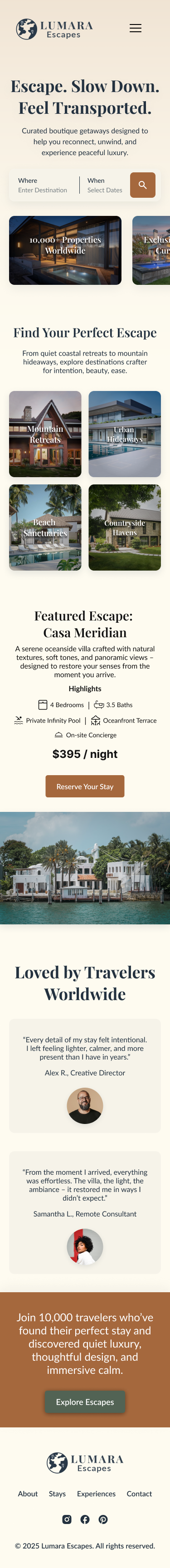
Traveler Landing Page(light): Designed to slow the user’s eye and create a sense of discovery, reinforcing trust and curation before prompting search or booking.
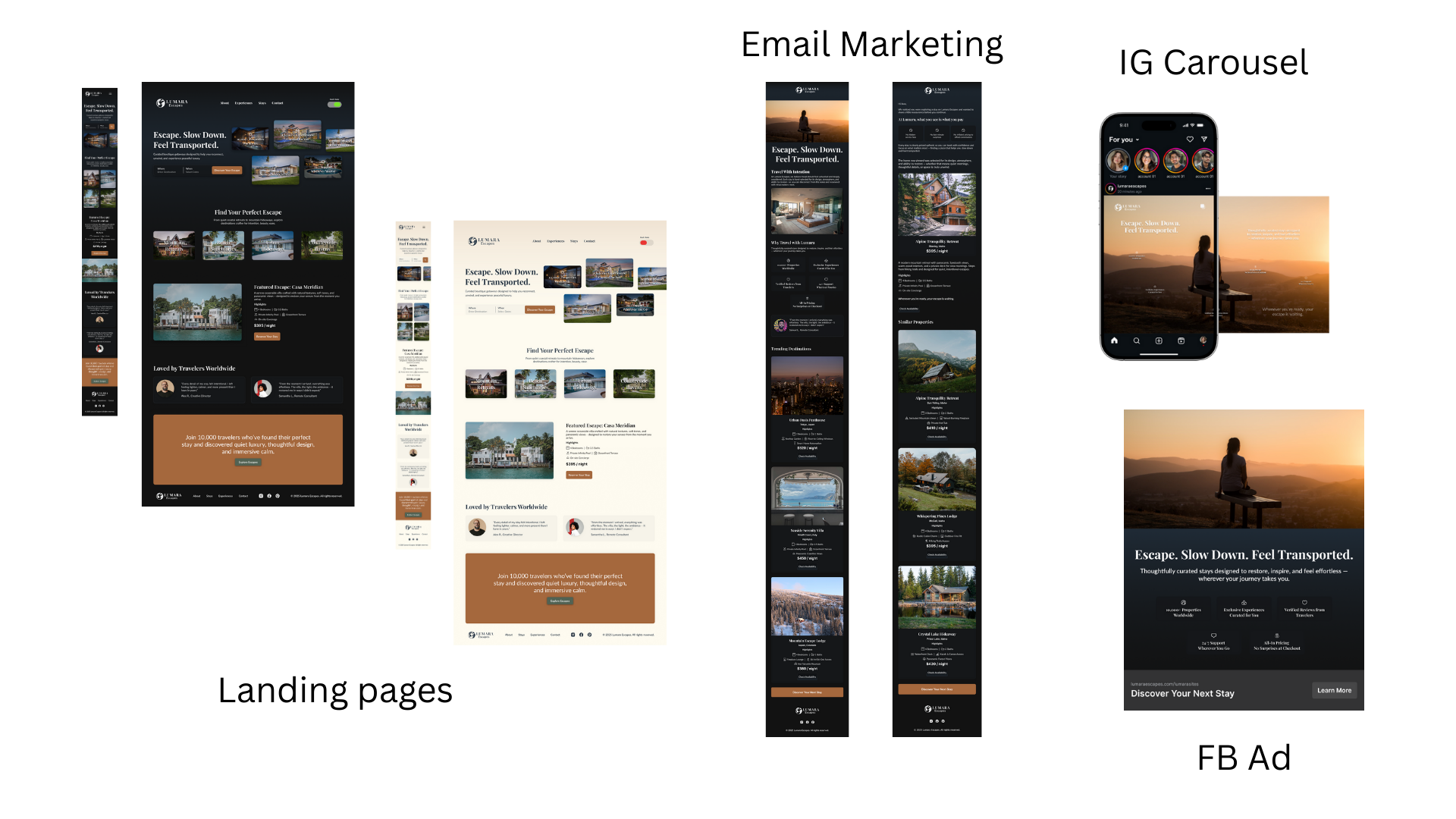
A cohesive system of landing pages, emails, and social assets built to reinforce Lumara Escapes’ emotional storytelling while maintaining visual consistency across channels.


Uses aspirational imagery and concise copy to capture attention in-feed while maintaining a boutique, editorial tone.
View the high-fidelity Figma prototype: Check it out here
Includes travelers owner landing pages, email flows, and social assets.
While Lumara Escapes is a fictional brand, the following outcomes are projected using industry-standard benchmarks from travel marketplaces, DTC booking platforms, and email performance averages.
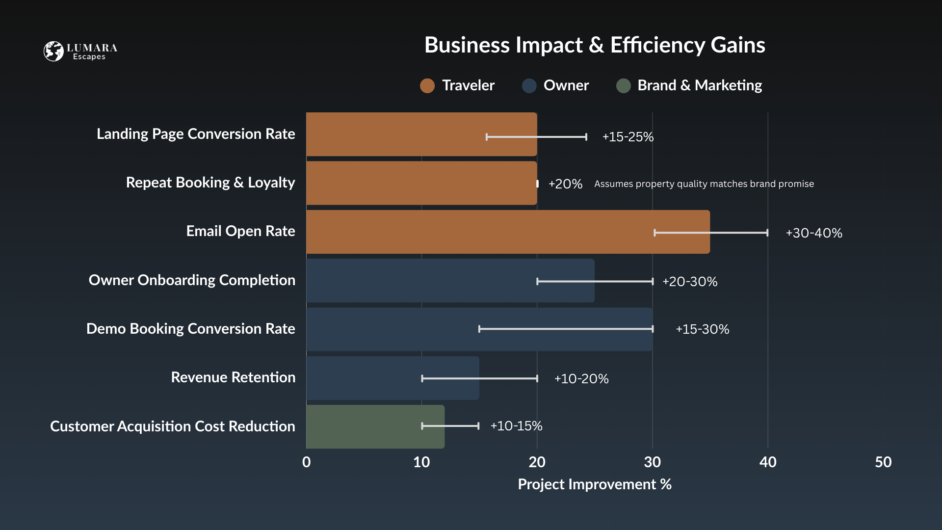
This chart illustrates how Lumara Escapes’ dual-funnel strategy could drive measurable growth and efficiency gains across key marketing KPIs.
This project reinforced the importance of audience-driven design. By recognizing that travelers and property owners interact with the brand differently, I was able to design parallel journey that feel cohesive yet speak directly to each audience's motivations.
In a real-world project environment, I would:

