TasteVoyage is a mobile platform designed to help travelers quickly find and book authentic local food experiences. I led research, strategy, and design to create a curated, intuitive discovery and booking experience that balances aspiration with accessibility.
Solo Product & Brand Designer
(UX Research, Brand Identity, UI Design)
12 Weeks
Figma, Zoom, Adobe Creative Suite
Travelers struggle to find authentic local food experiences and often settle on generic, tourist-focused options.
Key Pain Points:
• Difficulty distinguishing authentic experiences, causing uncertainty
• Language barriers create hesitation in booking
• Lack of verified reviews reduces trust and confidence
• Sacrificing quality for affordability
How might I create a platform that feels authentic, curated, and transparent without making users feel excluded or overwhelmed?
Design a mobile-first food experience discovery platform that delivers personalized, transparent, and inclusive recommendations for users looking for authentic local experiences.
Success Metric:
Increase booking confidence from 5/10 to 8/10 (measured by moderated usability studies and unmoderated system usability scale (SUS) assessments.
Before designing anything, I needed to understand what was getting in the way.
A survey with 12 active travelers gave me data fast, and the answer pointed somewhere I didn't expect: it wasn't the price holding people back, it was anxiety.
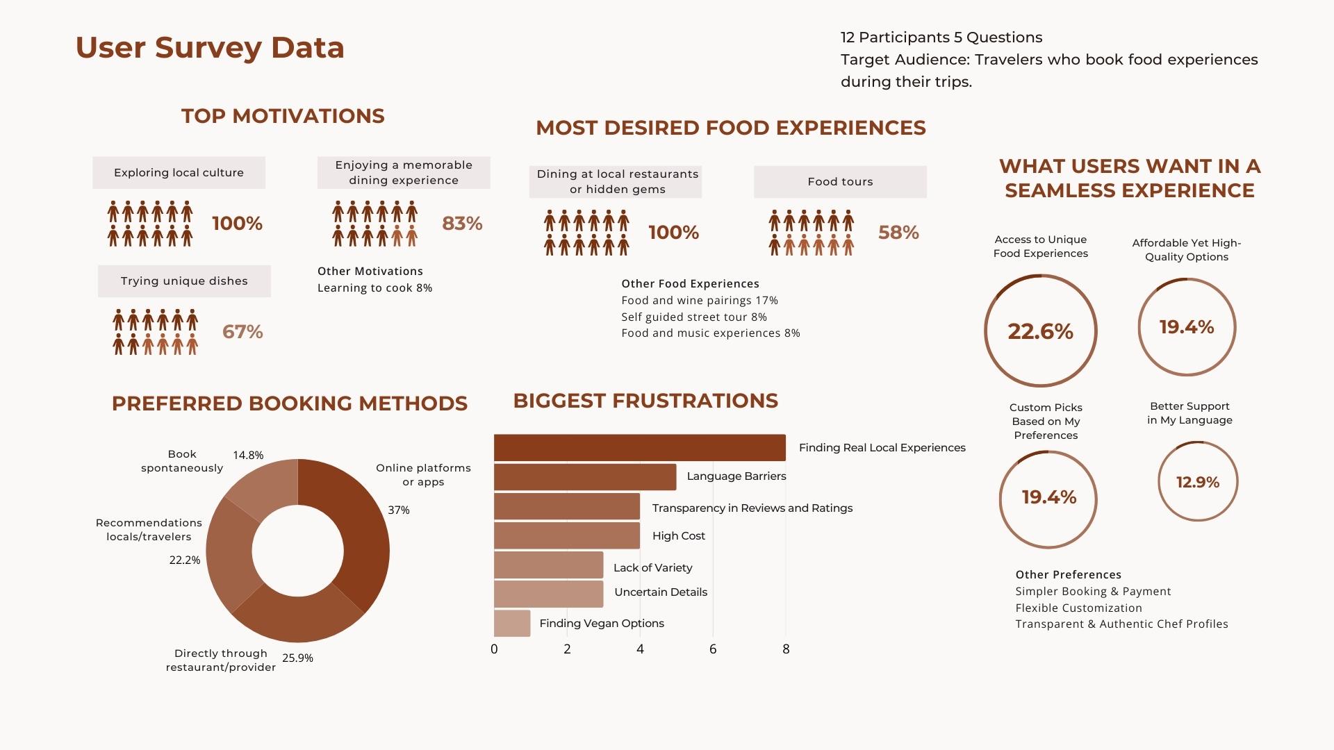
12-participant survey data on food experience discovery during travel.
After conducting the survey, I found it interesting that the data showed that travelers are willing to pay for quality local food experiences, but hesitate over whether the experience is authentic, lack of transparency, and significant anxiety over language barriers.
Using insights from the user survey and food tourism market research, I identified four primary personas, each representing a specific set of needs and pain points. This allowed me to picture my users as real people who would be interacting with the platform.
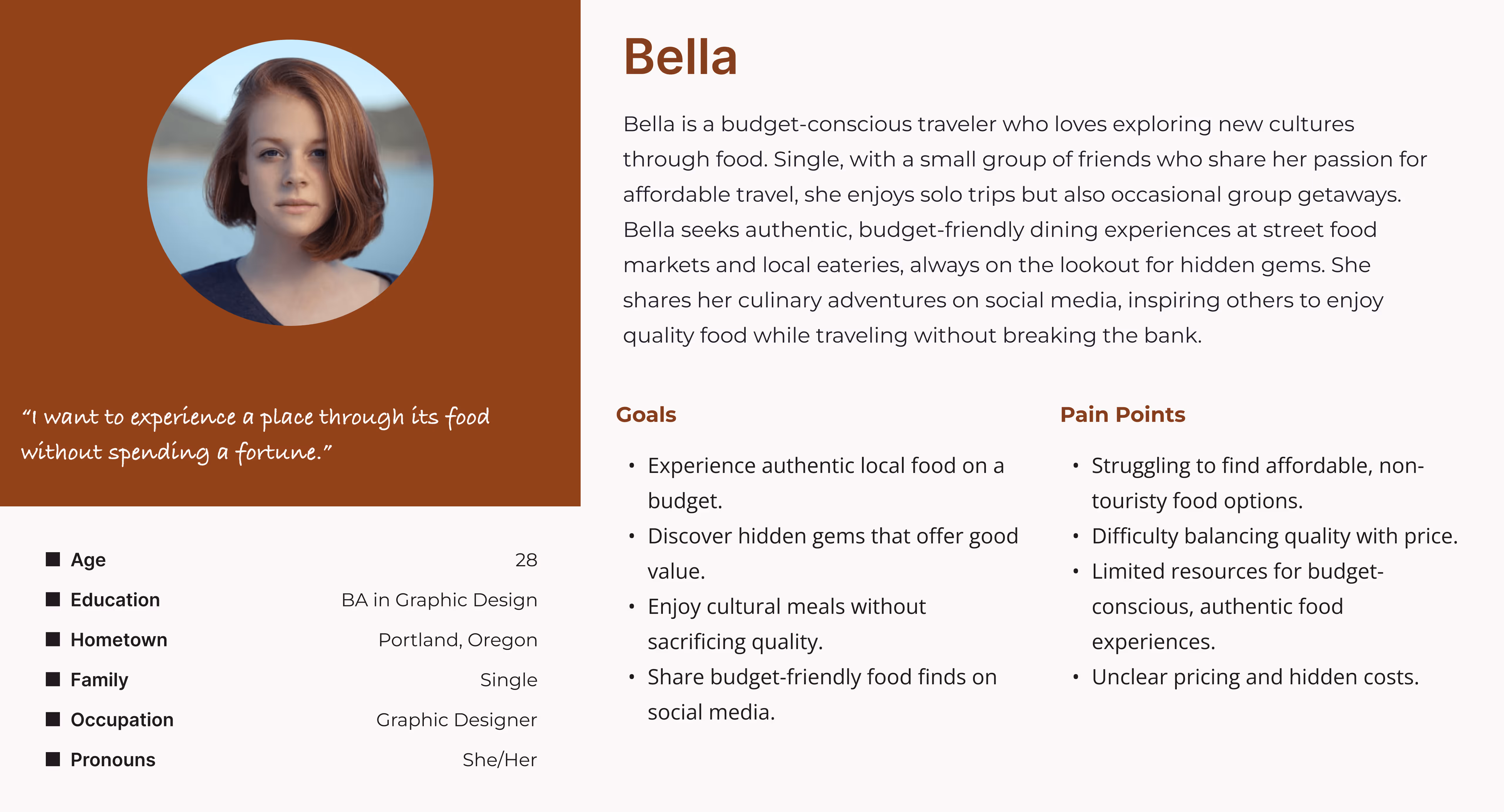
Bella - Budget Traveler
Find hidden gems without breaking the bank.
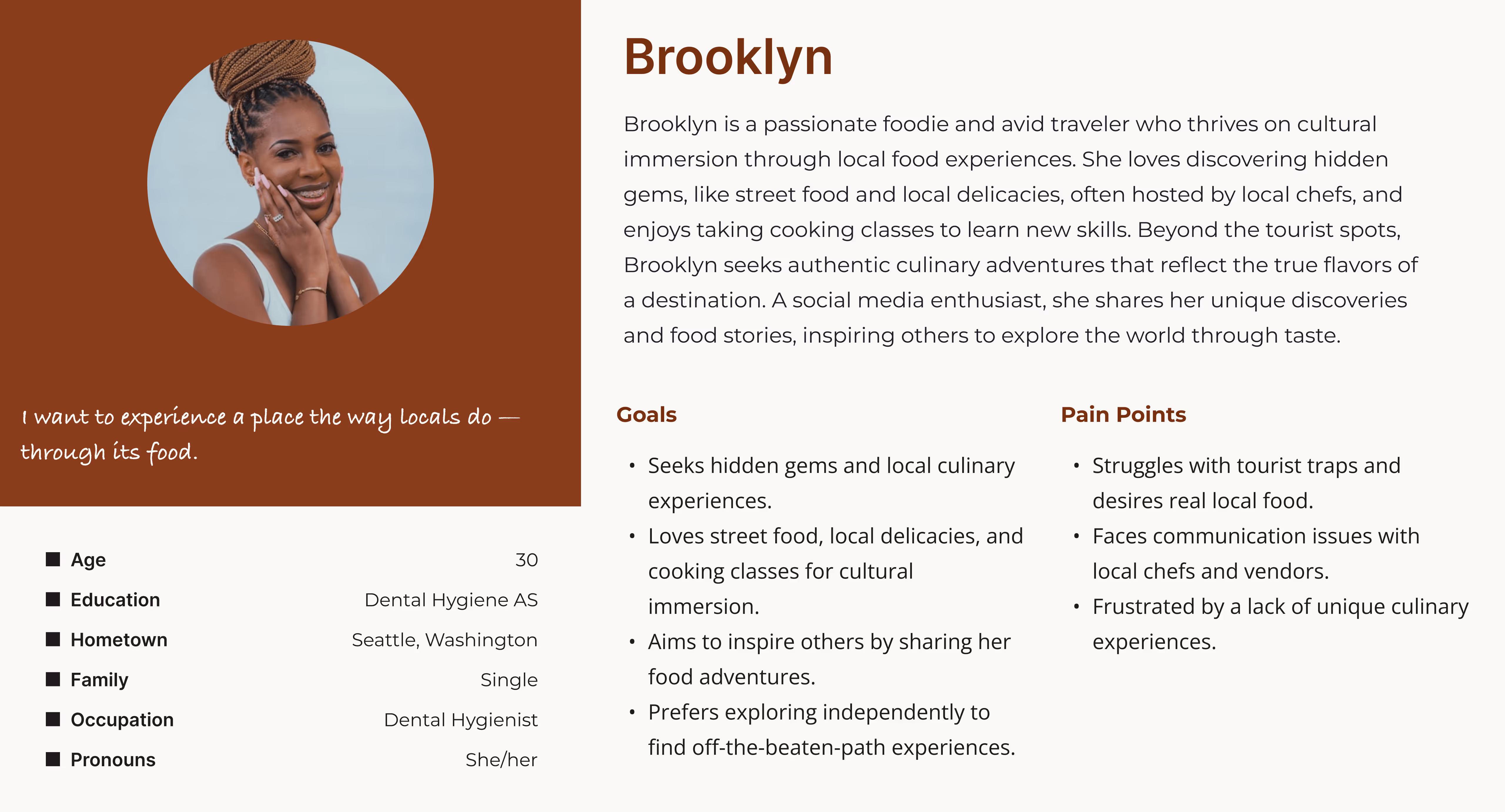
Brooklyn - Immersive Traveler
Deep immersion through local delicacies.
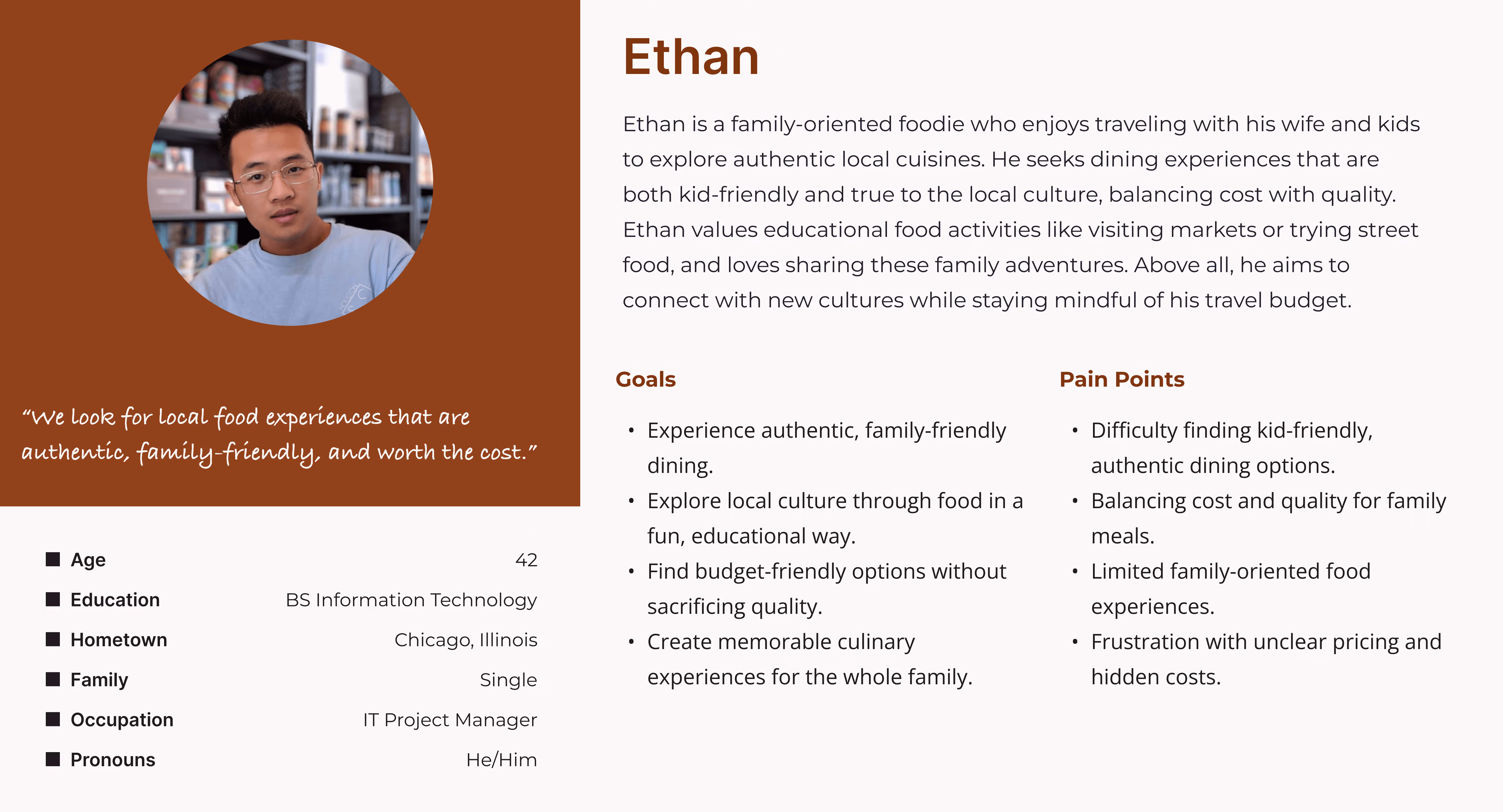
Ethan - Family Traveler
Kid-friendly, authentic cultural dining.
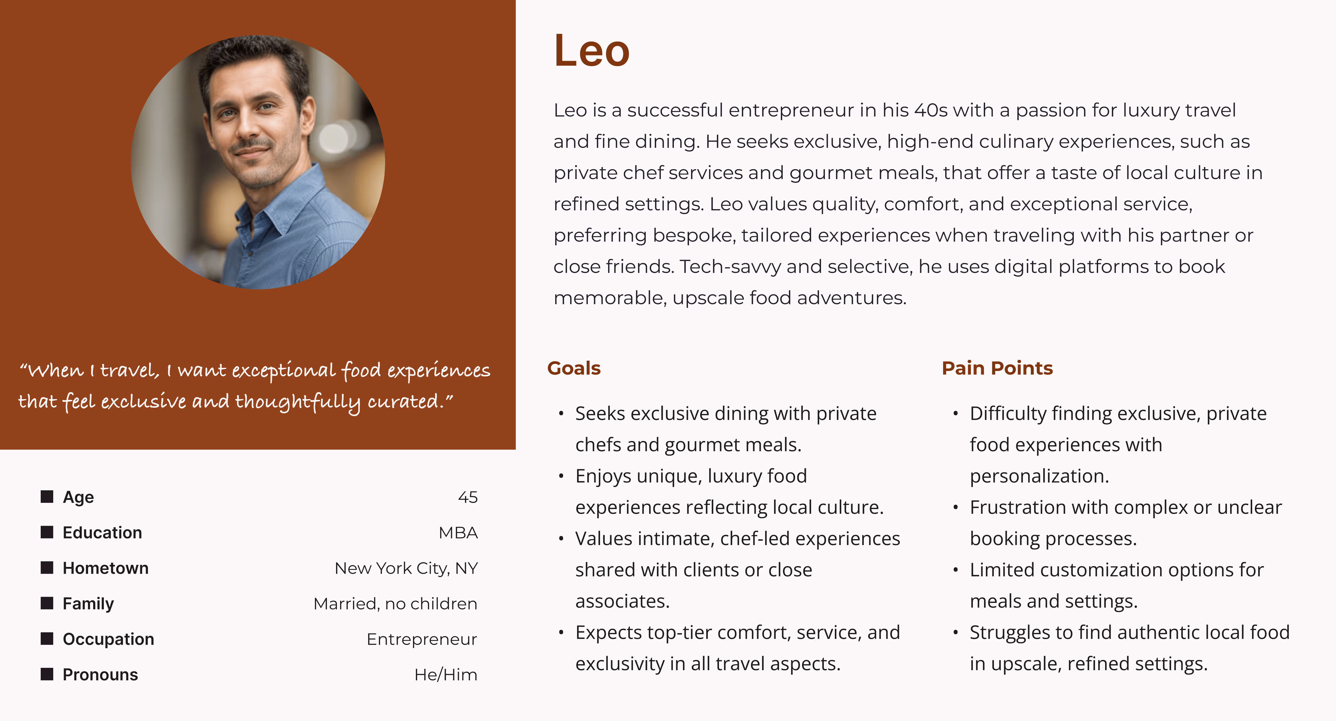
Leo - Luxury Traveler
Exclusive, chef-led gourmet experiences.
After defining four primary personas, I mapped the journey for each user, highlighting tasks they may complete, how they might feel through each stage of the process, and potential solutions for pain points identified through the journey. This allowed me to visualize how each persona would interact based on their unique goals and interests.
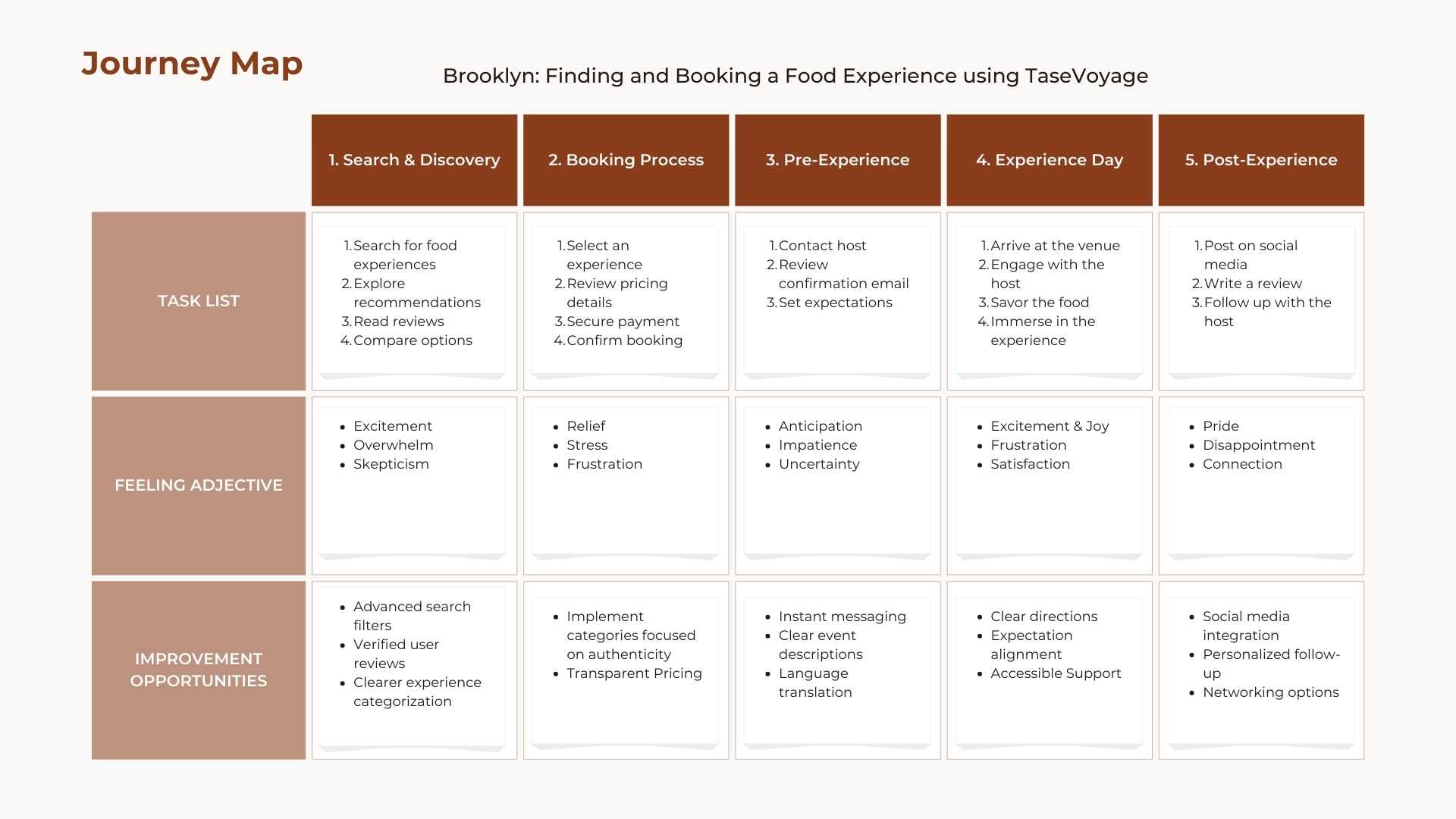
User journey map for Brooklyn, the map highlights task lists for Brooklyn, how she might feel throughout each tasks, and ideas for improvement
I analyzed four competitors that are currently in the market for food-based experiences: Private Chef Services, Airbnb Experiences, Local Food Tours, and EatWith. Analyzing these competitors allowed me to identify current market trends and successes, as well as existing gaps, which I used to brainstorm improvement opportunities for TasteVoyage.
I approached my competitor analysis with a function-first mindset. While I wanted the app to be visually compelling, it needed to function well for users. By analyzing both the functional and visual strategies of the market, I ensured TasteVoyage would be aligned with current standards while still standing out.
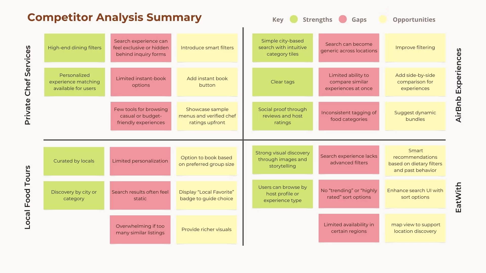
Competitor Analysis focusing on function: Analyzing competitors for key strengths, gaps, and opportunities. These insights would help guide the design solution for travelers.
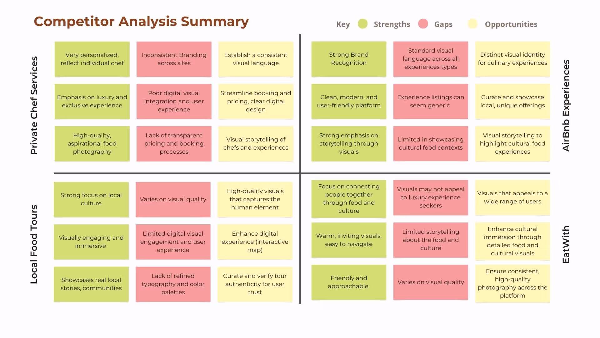
Competitor Analysis focusing on Brand/Visual: Analyzing competitors for key strengths, gaps, and opportunities. These insights would help ensure TasteVoyage can stand out from its competitors, while still feeling intuitively familiar.
Create a curated, authentic platform with consistent brand identity, transparent pricing, and visual storytelling that showcases local culture without feeling exclusive or touristy.
Positioning Statement: Authenticity of local tours + curation of private services + accessibility of Airbnb + Community of EatWith = Boutique platform for cultural food explorers.
The discovery phase revealed three core design principles:
1. Curation Over Volume
Users feel overwhelmed by options and can't distinguish authentic experiences from tourist traps.
Design Response:
Curated selections featuring verification badges, local favorites, and cultural context.
2. Transparency Builds Trust
Hidden costs, language barriers, and unclear expectations create anxiety.
Design Response:
Upfront pricing, instant messaging with hosts, language support, and detailed experience descriptions.
3. Aspiration & Accessibility
Users seek unique experiences but are budget-conscious or value-driven, not only luxury focused.
Design Response:
Offer a range of price points, clear categorization, and visual storytelling that feels premium yet approachable.
These principles directly informed both the brand strategy and product design decisions in subsequent phases.
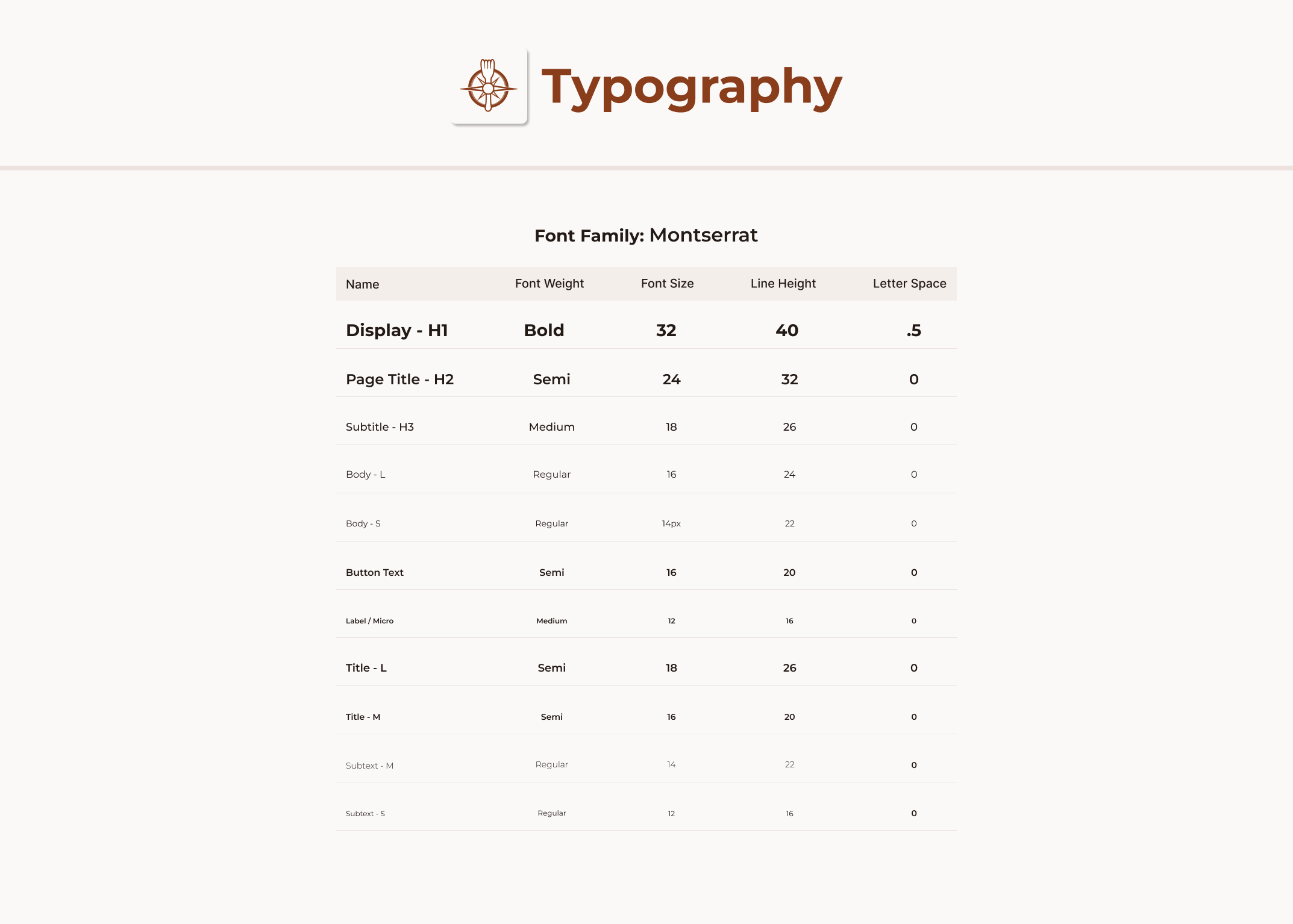
Before diving into wireframes, I established the brand foundation that would guide all visual design decisions.
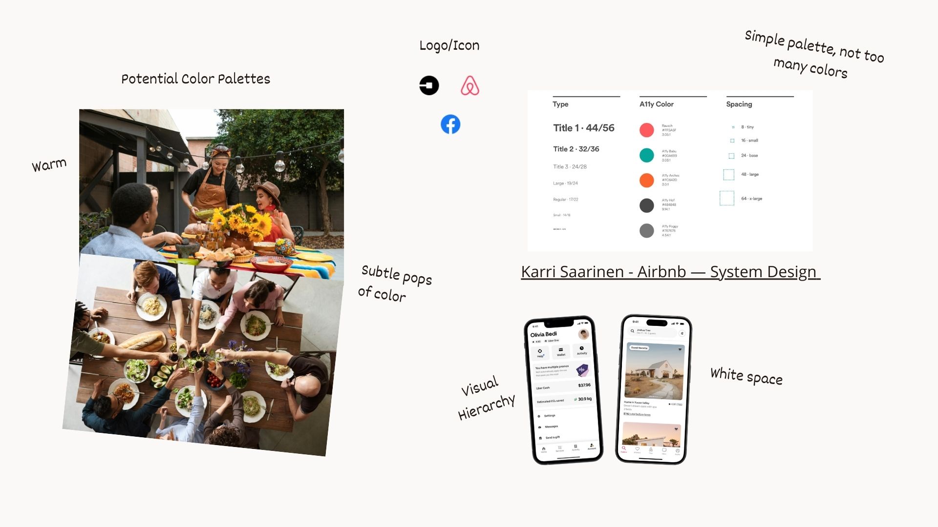
Mood Board: I wanted the platform to feel like an extension of a dinner party; warm, inviting, and centered on people. By pulling colors directly from photography of shared meals, the interface feels naturally connected the the real world experience. I opted for a quiet UI with generous white space to ensure the app never competes with the community's content, but rather frames it.
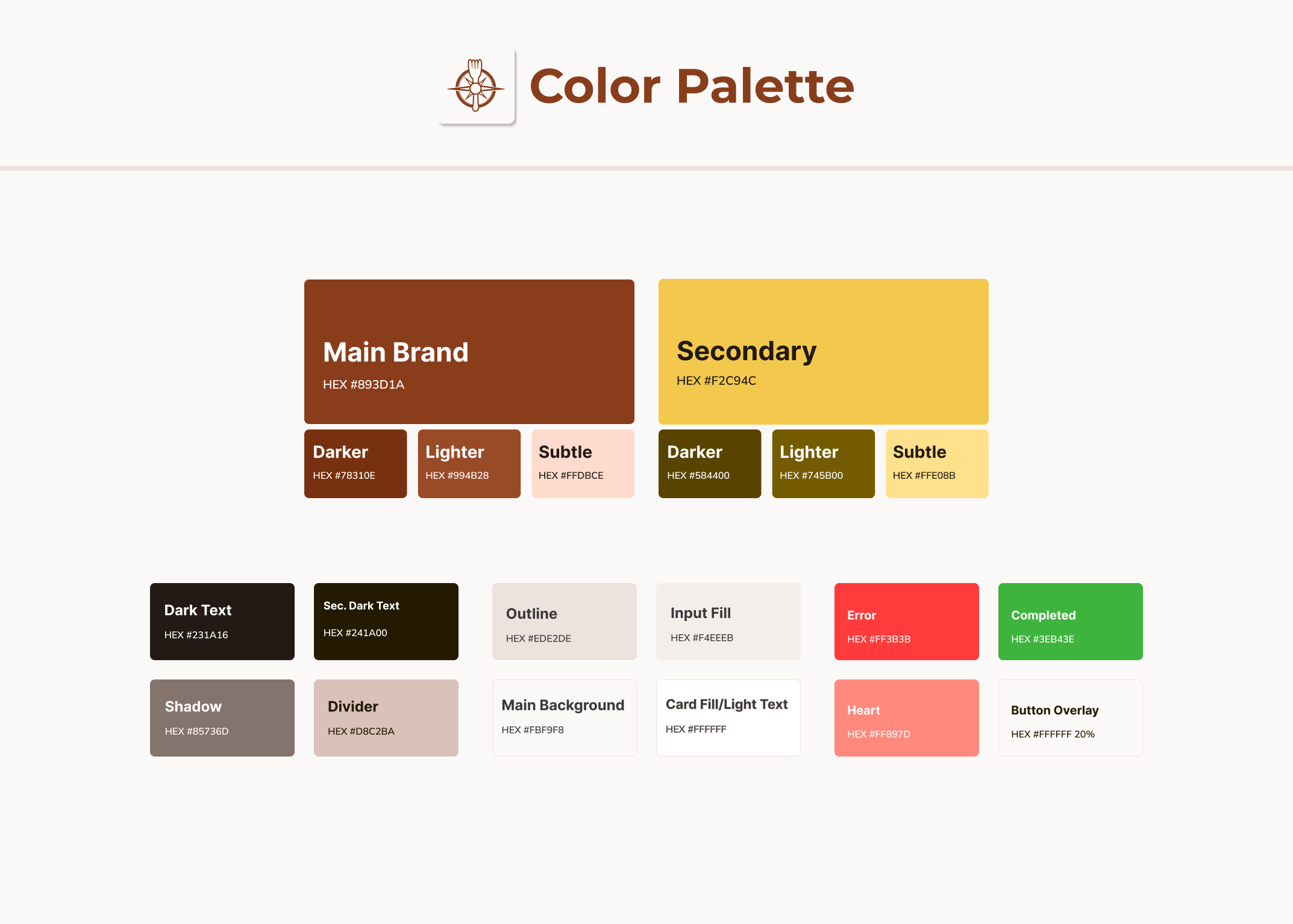
Color Palette
Typography
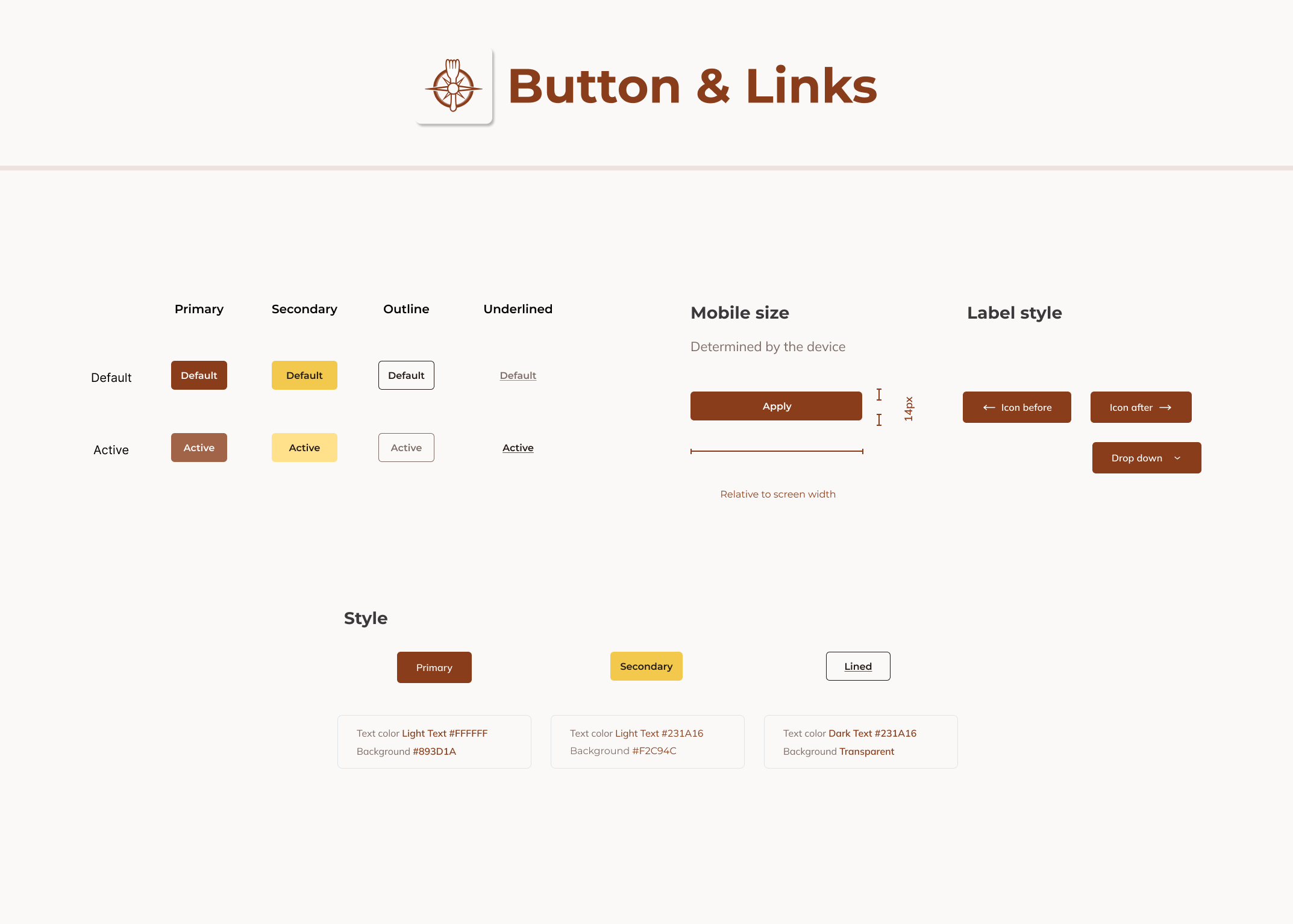
Button & Links
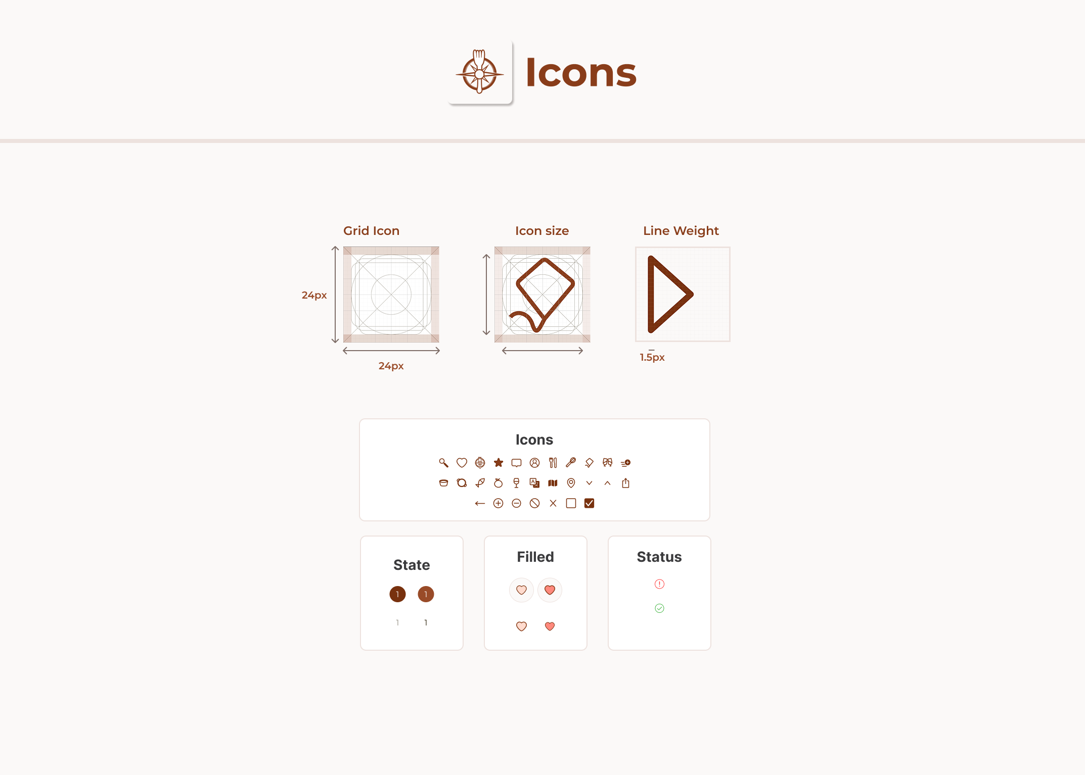
Icons
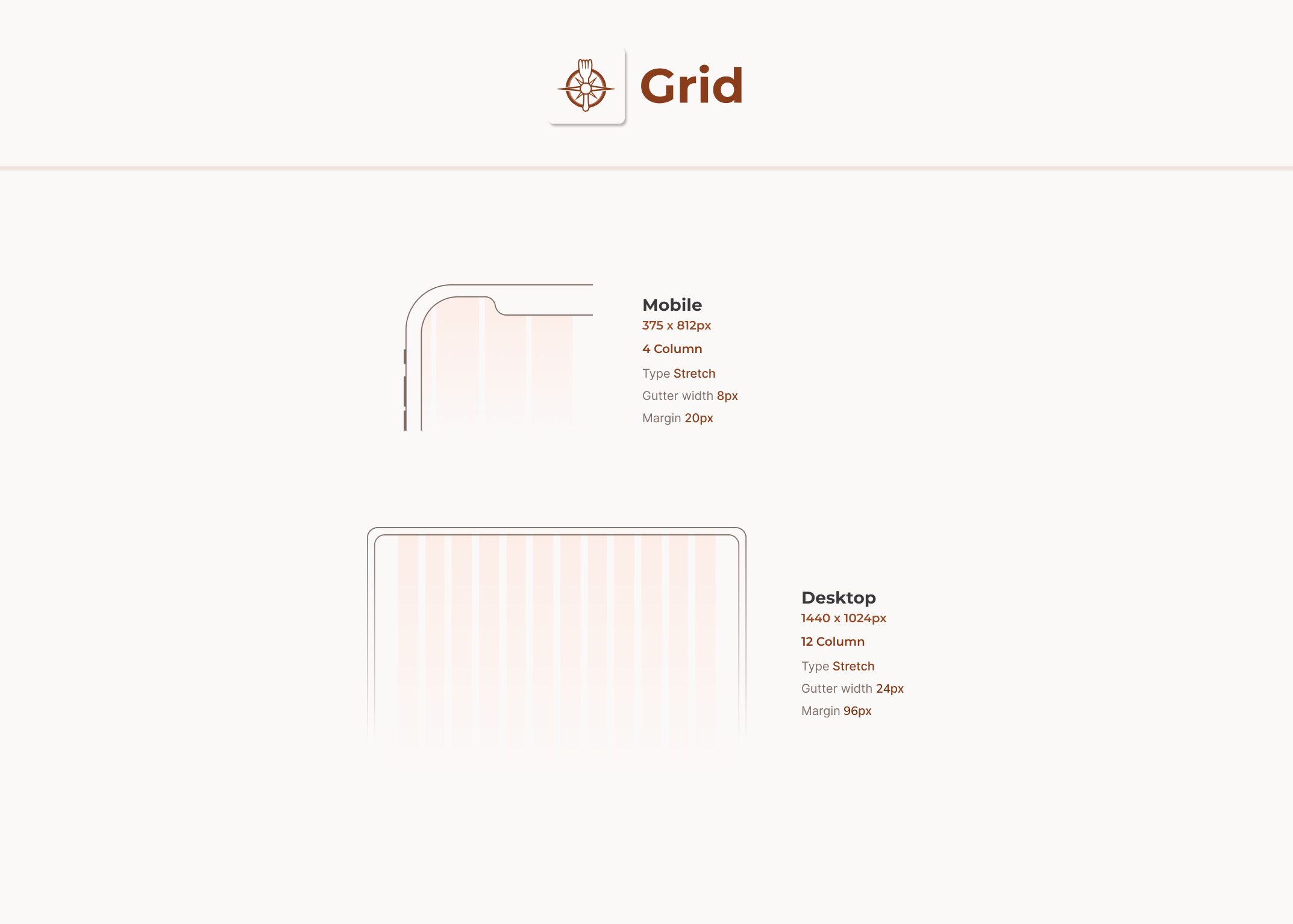
Grid
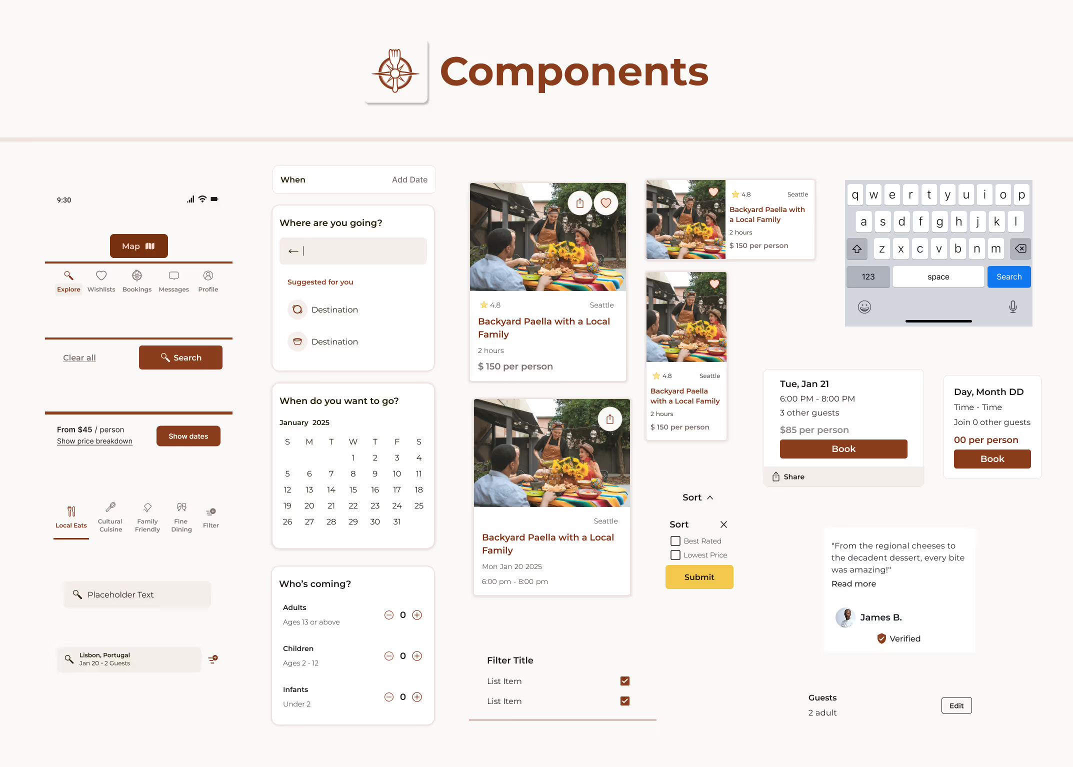
Components
Establishing the brand identity first ensured that every UX decision reinforced the brand promise. The visual language became an integral part of the strategy, guiding layouts, interactions, and storytelling across the platform.
Having designed learning materials for students with diverse needs, I know that an experience that works for everyone is a better experience for everyone.
Focusing on the core features identified during user research, I sketched the first wireframes.
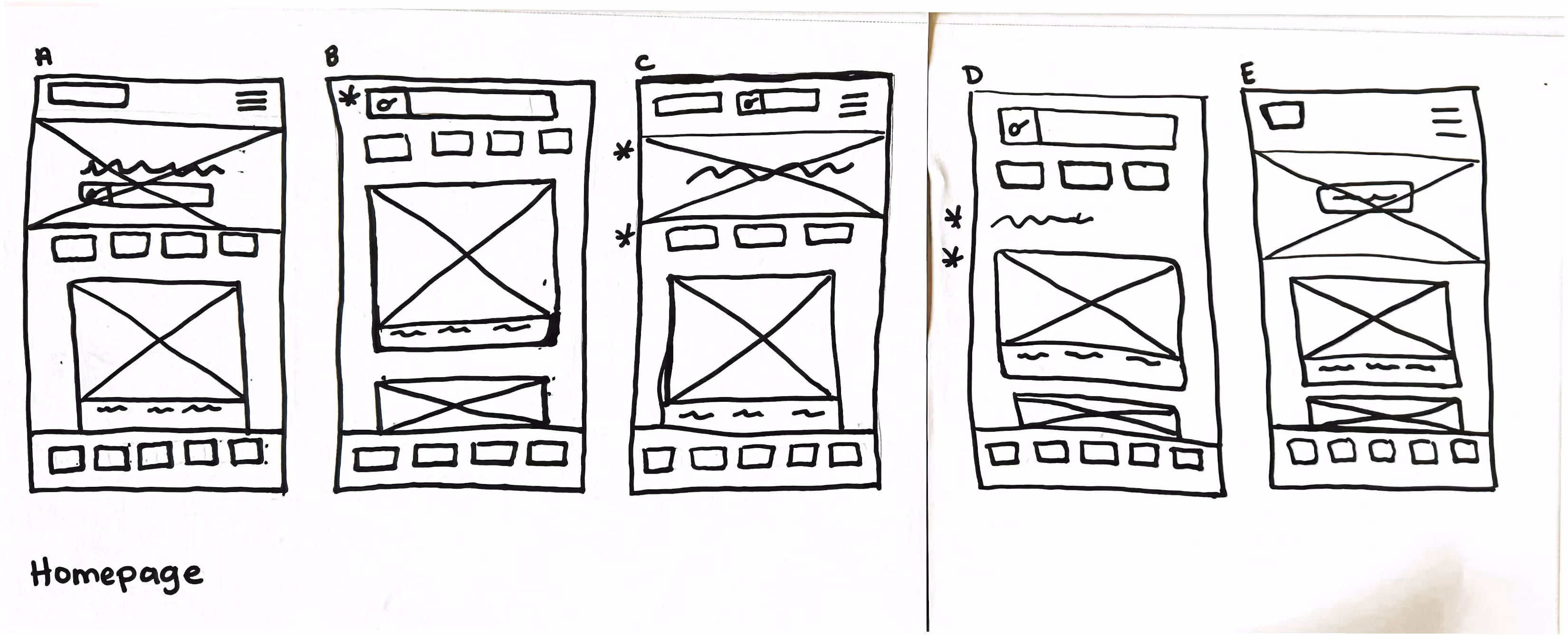
Homepage sketches exploring entry points into the search experience, with star markers highlighting user-centered design decisions.
Developed low-fidelity digital wireframes in Figma to visualize key features, then prepared an interactive prototype for the first round of user feedback.
I conducted a moderated usability study with 6 individuals to assess the search and discovery journey, identifying pain points and areas for improvement.
During my first usability test, I evaluated the full user journey. However, I quickly noticed I was trying to capture too much at once, both for myself and the participant. This led to more generalized feedback and moments where the user felt slightly overwhelmed. Drawing from my background in teaching, I recognized a familiar pattern: when too many concepts are introduced at once, depth of understanding suffers. Applying that same principle, I made a deliberate decision to narrow the scope and focus on the Search and Discovery phase. This shift allowed me to facilitate a more focused session, which uncovered more specific insights and led to clearer, more confident design decisions.

User testing evaluated the search and discovery flow, focusing on the path from intent to selection.
1. Users found sorting by price or rating too slow because these options were buried deep within the filter menu.
2. The lack of a quick "Sort" button increased cognitive load.
3. Text-based locations lacked context leading users to request a map view to better understanding proximity and travel time.
1. Users quickly surfaced the best options using one-tap sorting for price and ratings.
2. Automatic sorting reduced manual comparison and decision fatigue.
3. The map view made it easy to understand where experiences were located, increasing book confidence.
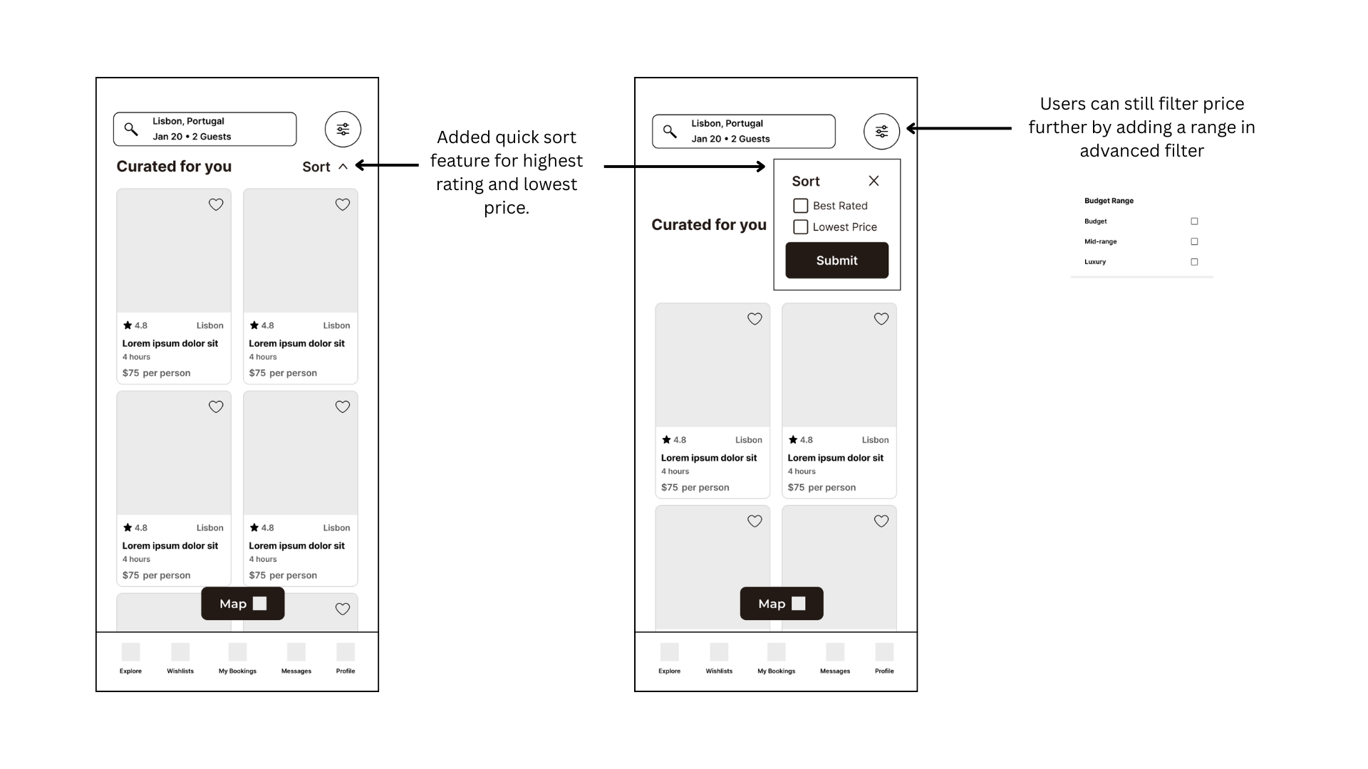
Quick sort feature, allows user to instantly view experiences by best rating or lowest price, while advanced filters remain available for deeper refinement.
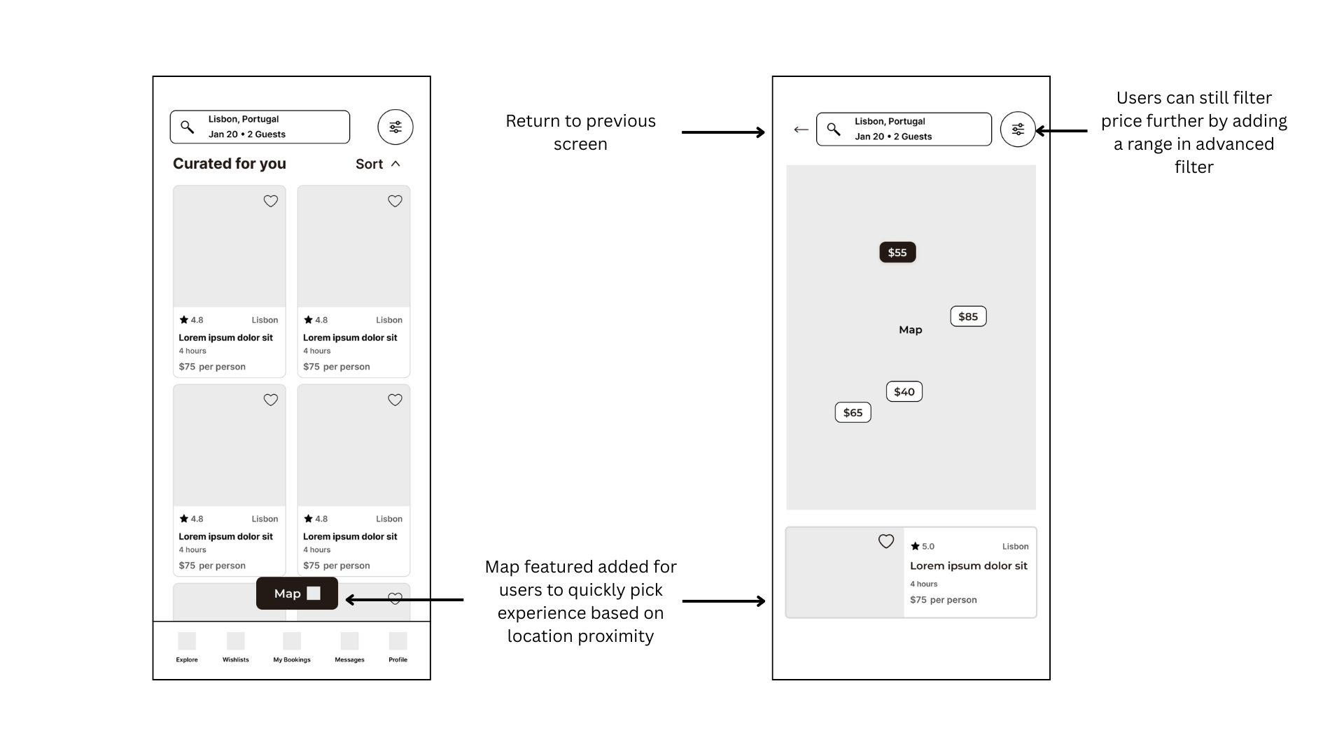
Map view displays experiences by location with pinned pricing, allowing users to explore spatially while previewing key details without leaving the map.
TasteVoyage is a streamlined, mobile-first interface designed to bridge the gap between "interest" and "action." By focusing on full transparency and human connection, the platform optimizes the entire path from discovery to the final bite.
Explore TasteVoyage
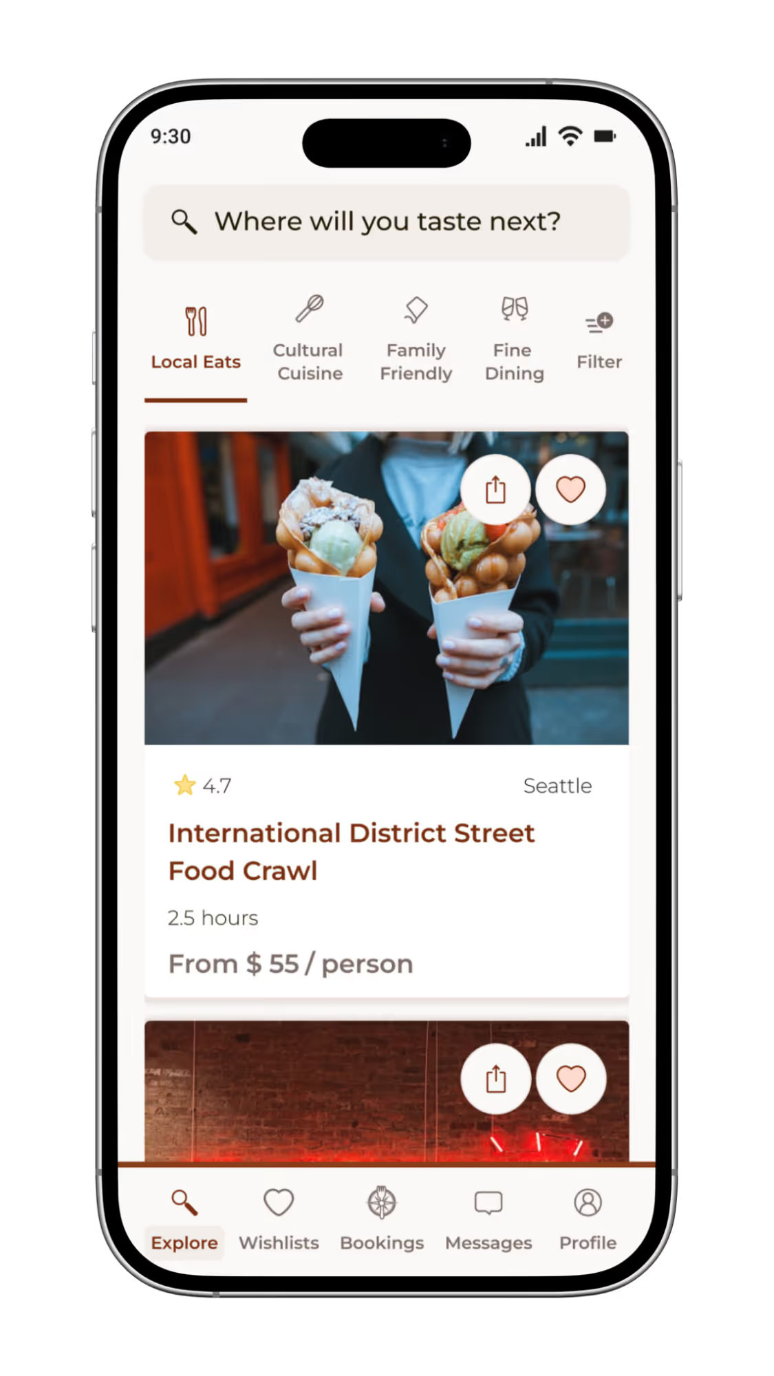
High-fidelity design and interactive flow of the TasteVoyage mobile application, a platform dedicated to discovering authentic local food experiences.
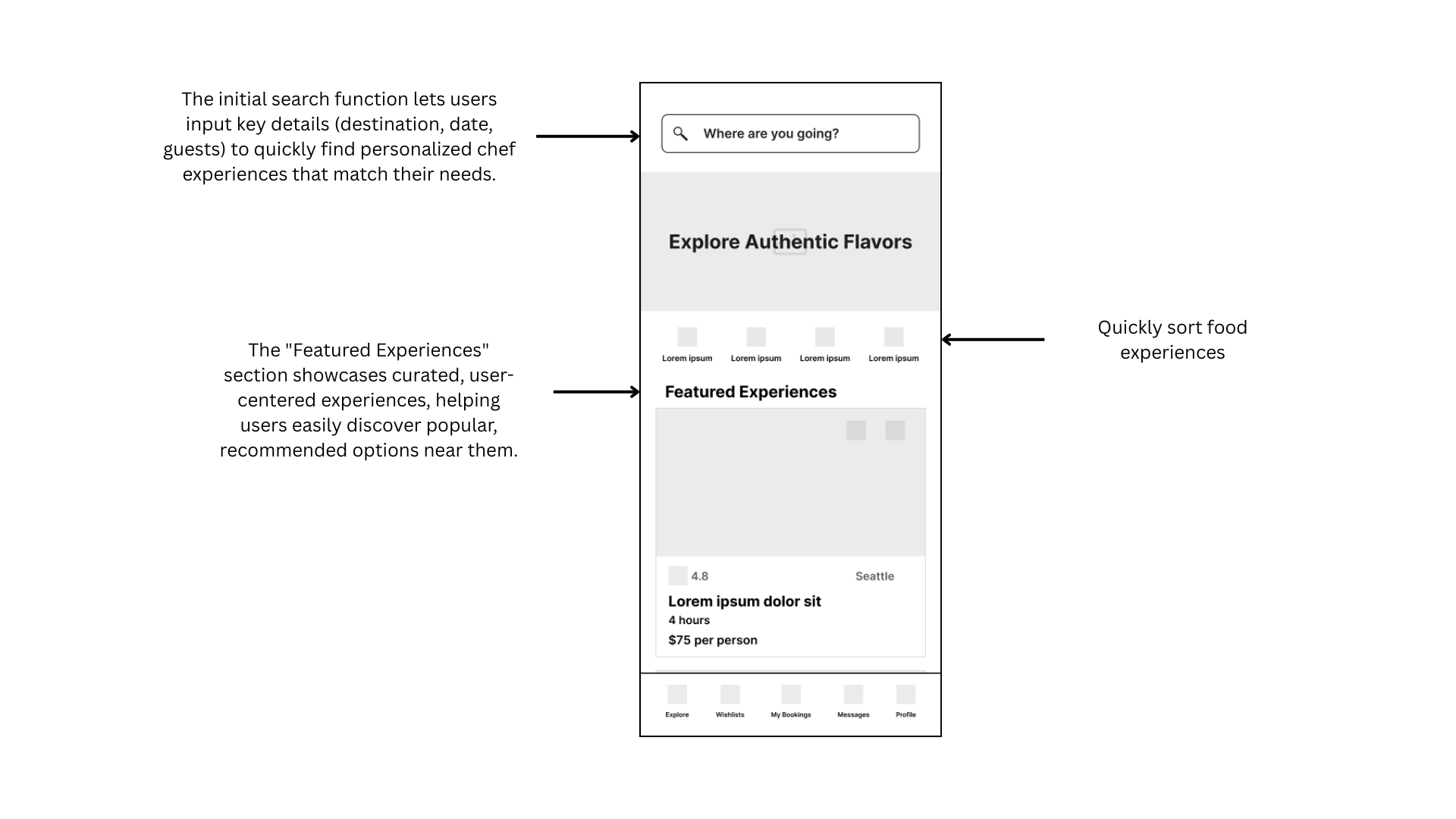
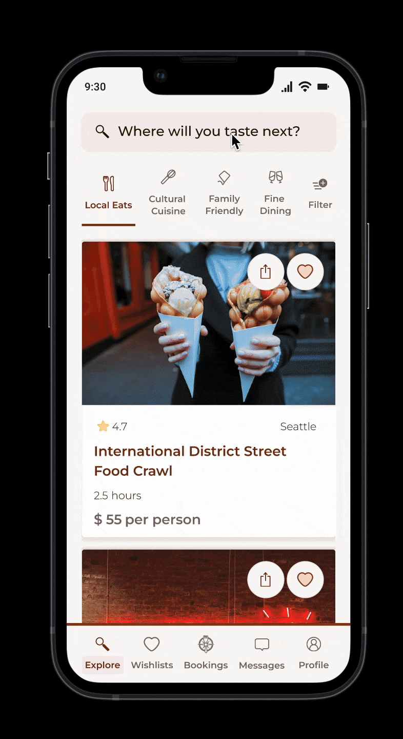
Discovery & Smart Search
The Search and Discovery experience starts with a simple question: "Where will you taste next?"
I wanted that first interaction to feel aspirational. To keep that momentum going, I broke the search flow into three quick, digestible steps, where, when, and who, so the user never hits that "blank form" fatigue. I was also very intentional with the language. Calling the results "Curated for you" rather than "Search results" changes the entire vibe; it signals that there's a thoughtful human element behind the suggestions. Finally, I brought in the map toggle as a direct response to what I saw in usability testing. Some people just need to see the world spatially to make sense of it, and this lets them orient themselves without ever breaking their flow.
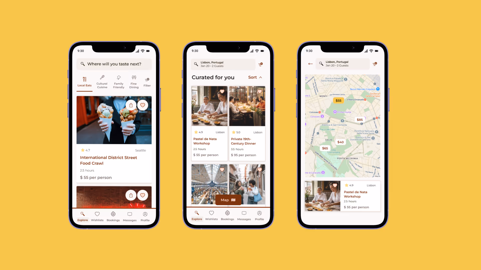
High-fidelity showcase of the discovery and exploration phase of the TasteVoyage app, focusing on how users find their next culinary adventure.
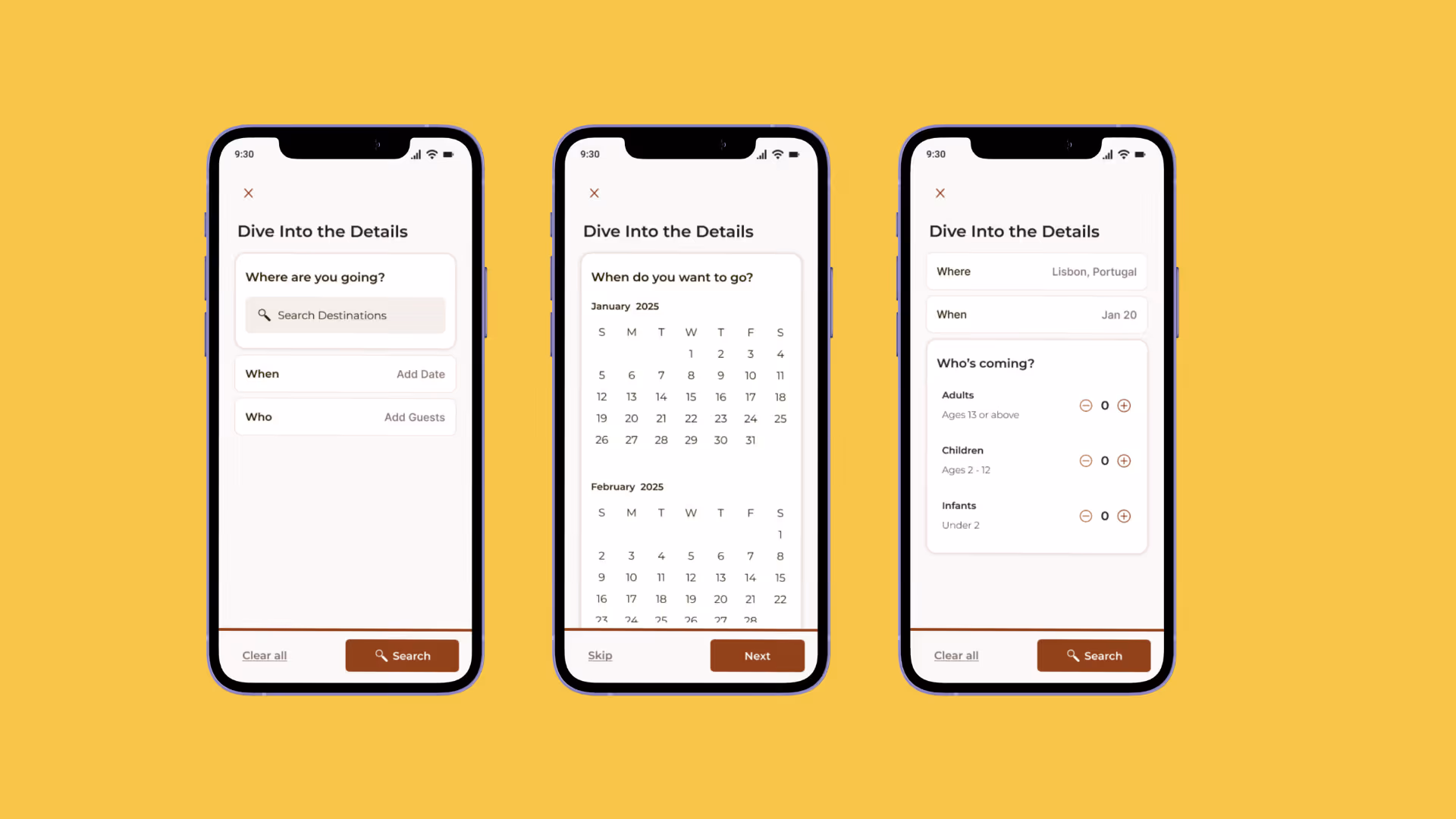
High-fidelity breakdown of the conversational search flow, designed to simplify complex travel planning into a seamless, step-by-step discovery experience.
Trust & Transparency
The research pointed toward a single recurring theme: travelers don't just want a great meal; they want the confidence to say "yes" without second-guessing.
I designed the experience page to prioritize that peace of mind. It starts with photography to pull them in, but the real work happens in the details. Adding language tags, precise locations, and a clear price breakdown, it removes the friction of hidden costs and communication barriers before they even arise. I also wanted to humanize the process. Instead of booking a faceless service, travelers connect with a real person. Between verified badges, video intros, and the ability to message a host directly, the design transforms a stranger into a trusted guide. It's about removing that final bit of hesitation so the traveler can focus on the experience itself.
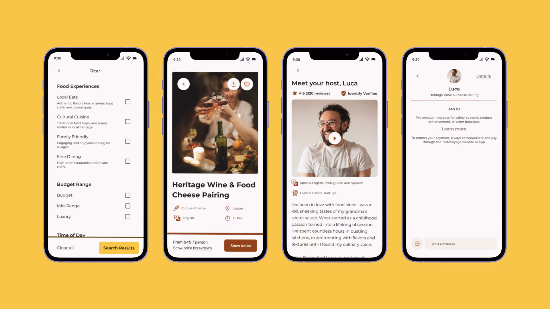
High-fidelity mockup showcase of the refined filtering and host transparency features, highlighting the users' preferences and personal stories to foster human connection.
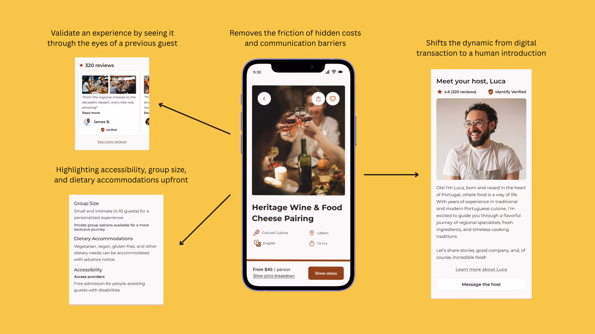
A deep dive into the "human-centered" UI, elevating verified host profiles, accessibility, details, and social proof to build traveler trust.
Frictionless Booking
Once a traveler is ready to commit, the booking flow gets out of their way.
I designed the booking flow to eliminate hesitation at the point of highest intent by prioritizing transparency and speed. By surfacing availability at a glance and presenting a full order summary before payment, I removed the friction of hidden costs and decision fatigue. The result is a streamlined, two-minute journey that replaces uncertainty with a warm, clear confirmation.
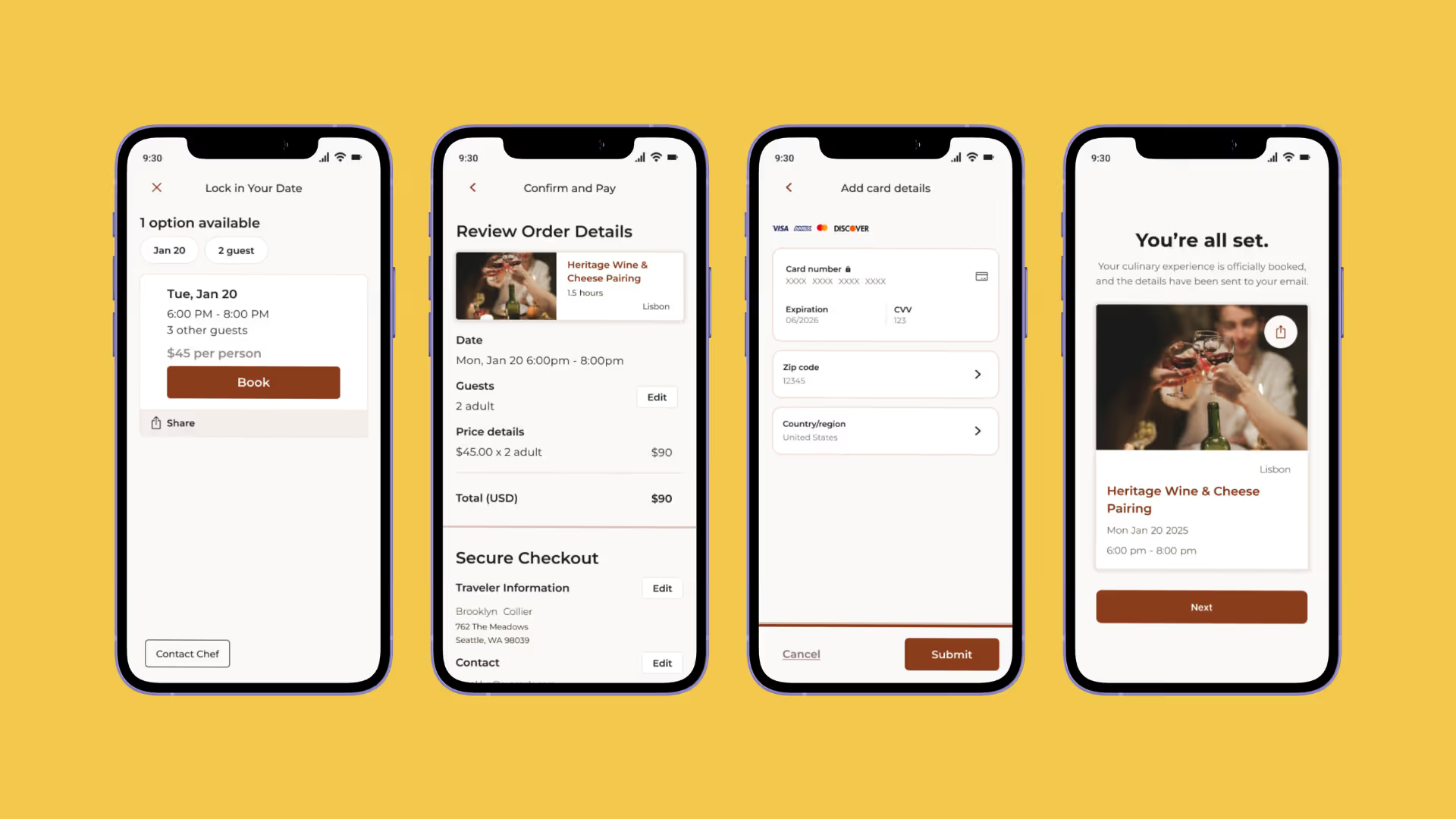
A transparent checkout experience that prioritizes user confidence through clear pricing, secure payment states, and immediate confirmation.
Post-booking Connection
The experience doesn't just stop at checkout; it actually begins once users hit "book".
Once a booking is confirmed, travelers are immediately connected to their host. By prompting them to share dietary restrictions and preferences right away, the host can start personalizing the experience before the traveler even arrives. I also wanted the app to feel organized and reliable for the long haul. The booking hub keeps everything in one place, and I intentionally separated host messages from general support so the personal connection never gets buried under logistics. This post-booking later was the missing piece in almost every competitor I analyzed, and I believe it's exactly where we turn a one-time traveler into a loyal user.
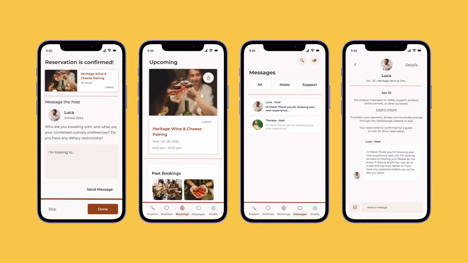
A dedicated transition from transaction to hospitality, facilitating direct host communication and preference sharing to personalize the upcoming event.
After establishing the mobile-first experience, I explored how TasteVoyage would scale for the 40% of desktop users who book food experiences via desktop.
The desktop homepage uses the extra space for better visual storytelling while keeping the familiar mobile navigation. By expanding the grid to show 4 experiences per row, users can browse much faster than on the mobile layout. Additionally, prominent filter and category controls make it easier for power users to refine their search without extra navigation steps.
A high-fidelity showcase of the responsive desktop homepage and discovery features, highlighting the users' preferences and personal stories to foster human connection.
While TasteVoyage is a conceptual project, the design was validated through usability testing and benchmarked against industry standards.
Usability Testing Results
User Confidence in Selection
Before: 5.2/10
After: 8.1/10
+56% confidence increase
This increase was primarily driven by clearer filtering, improved visual hierarchy, and the introduction of map-based context that helped users make faster, more confident decisions. As one user noted, "I'd definitely user this on vacation."
One of my most significant takeaways from this project was the value of narrowing the scope to deepen the impact. While I initially mapped and wireframed the entire user journey from discovery to booking, that first usability test with my participant made me pivot and focus my usability study specifically on the Search and Discovery phase. This pivot allowed me to gather targeted, high-fidelity feedback that led to clearer design decisions. By refining this critical entry point first, I was able to build a more intuitive foundation for the subsequent stages of the project with greater confidence.
This project reinforced the importance of establishing a strong visual "source of truth" early on. Drawing inspiration from Andrew Couldwell's Laying the Foundations, I approached the design system as a balance of rigid structure and creative expression.
I made the intentional decision to move away from generic community icon libraries. By redesigning each icon in Figma to be cohesive with the brand's specific geometry and weight, I ensured the UI felt custom and intentional.
If continuing this project, I would:

