End-to-end brand and UX redesign focused on improving clarity, accessibility, and trust across digital touchpoints. The project restructures visual identity, information architecture, and web experience into a cohesive system for communicating educational offerings more clearly and consistently.
Solo Brand & UX/UI Designer
6 Weeks
Figma, Figjam, Adobe Illustrator, Notion
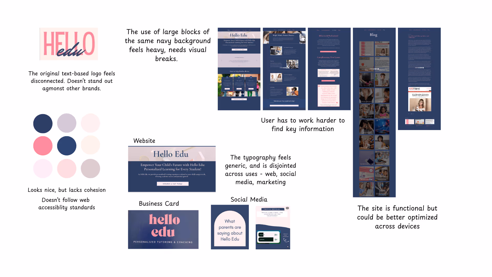
Hello Edu's original branding leaned into a playful, expressive aesthetic. While this felt welcoming for early learners, the visual system had become fragmented over time. Inconsistent styling across the web and social media created a disjointed experience that didn't reflect the quality of the work. More critically, the brand was boxed in as a traditional tutoring agency, limiting Amanda's ability to position herself as a trusted authority for educators and a go to resource for homeschool parents.
Pain Points
How might I evolve Hello Edu's brand from a boutique service to a professional practice while keeping Amanda's approachable, personal touch at the center?
Brand Audit & Discovery
Before designing anything, I focused on three questions: What isn't working with the current brand, where does Amanda want Hello Edu to go, and how will we measure success. I audited the full brand ecosystem, including the website, navigation, social media, marketing materials, and client communications, using an accessibility checker for WCAG 2.2 compliance and AI tools to analyze brand voice consistency. The findings were clear: Hello Edu's visual identity was fragmented and no longer reflected the quality or scope of Amanda's work.
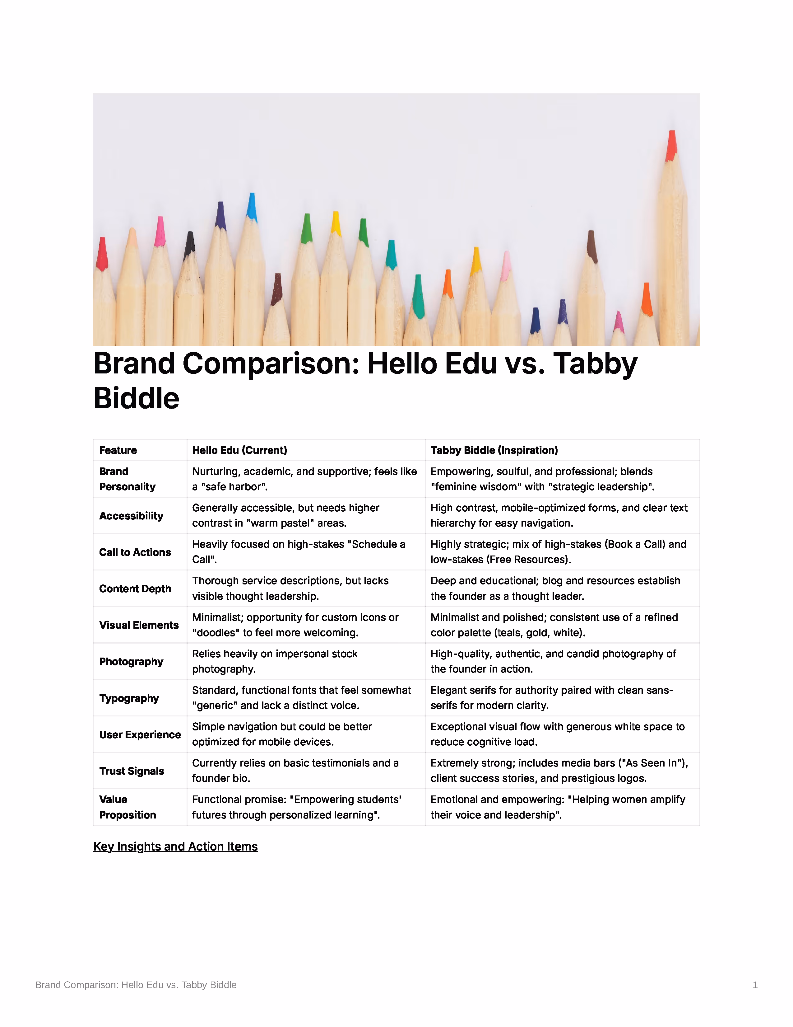
Client Vision & Competitor Analysis
Through discovery conversations, Amanda clarified her expanded vision: Hello Edu Tutoring, a new 90-Day Reading Course, Professional Development Workshops, Educational Resources, and Thought Leadership Content. She shared an inspirational site she admired for its clarity and authority. Comparing Hello Edu revealed exactly where the brand was falling short in authority signals, content depth, and overall polish. The comparison became the strategic foundation for every design decision that followed.
Strategy & Information Architecture
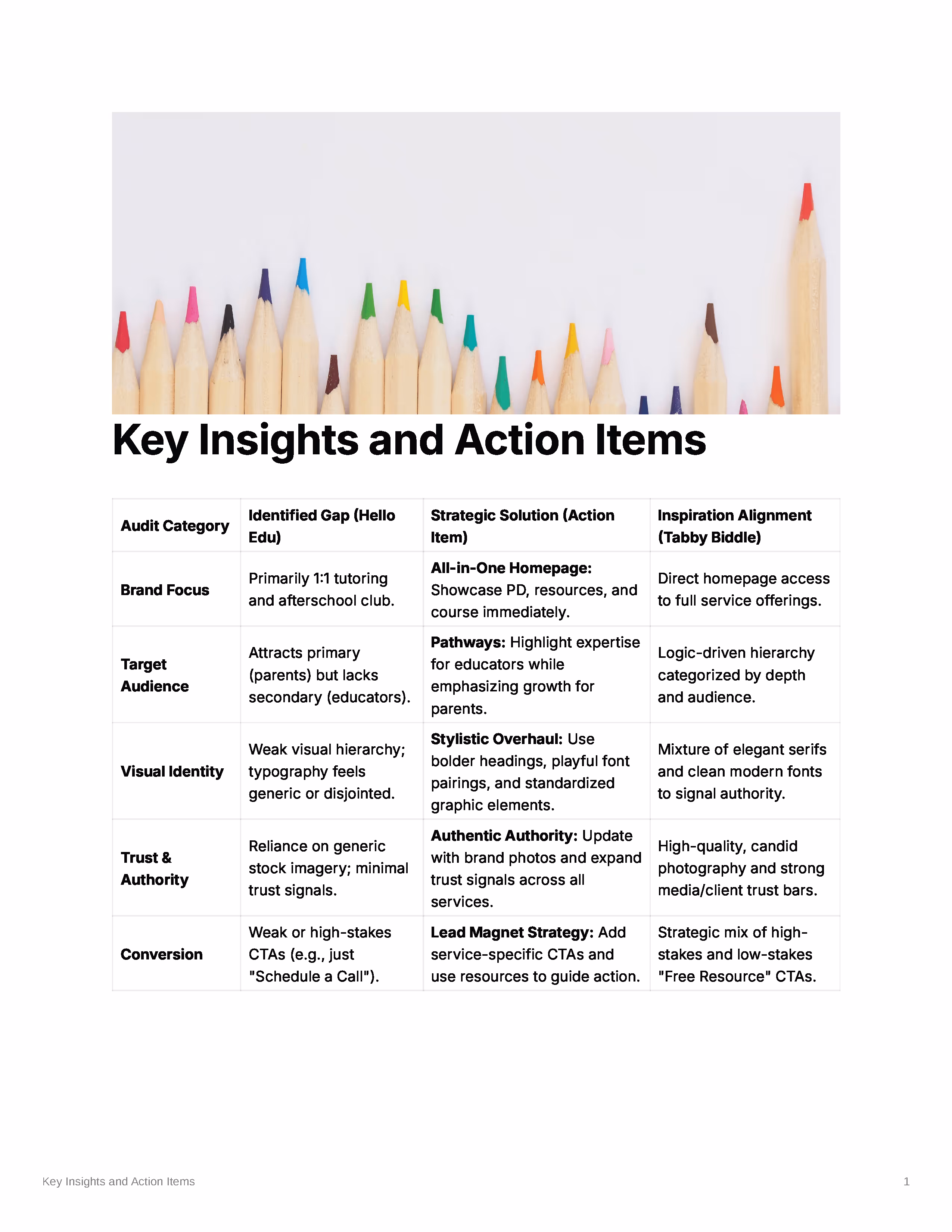
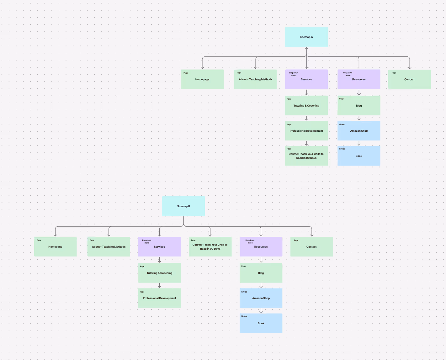
Based on discovery findings, I built a strategic framework mapping Hello Edu's identified gaps directly to proposed solutions. For information architecture, I explored two sitemap options. Sitemap A housed the 90-Day Course within the Services dropdown to keep navigation clean. Sitemap B elevated it to top-level navigation, giving the course equal prominence alongside core services. While Option A was my initial recommendation for a cleaner user flow, discovery made it clear that Option B better served Amanda's goals; the course needed to be impossible to miss.
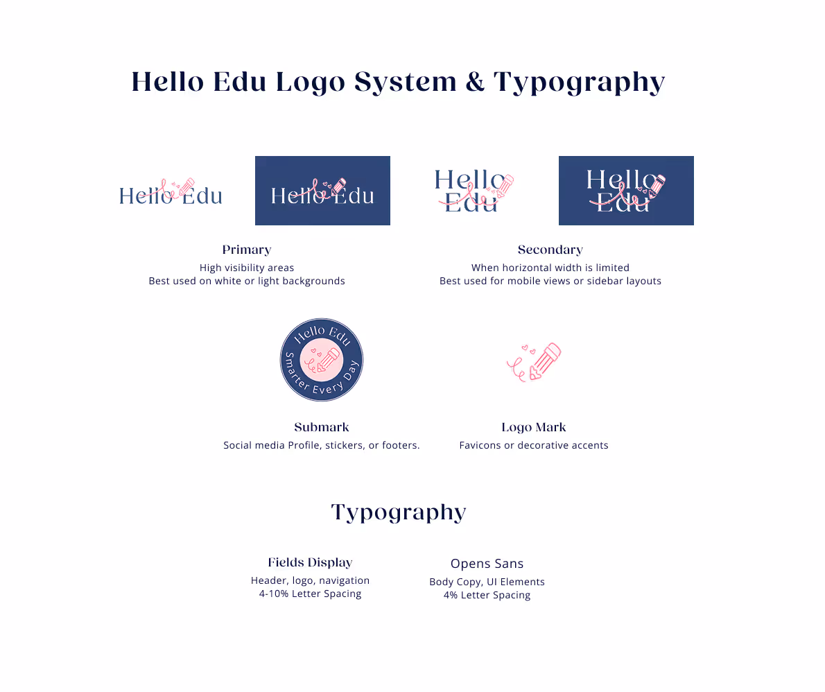
Logo & Brand System Development
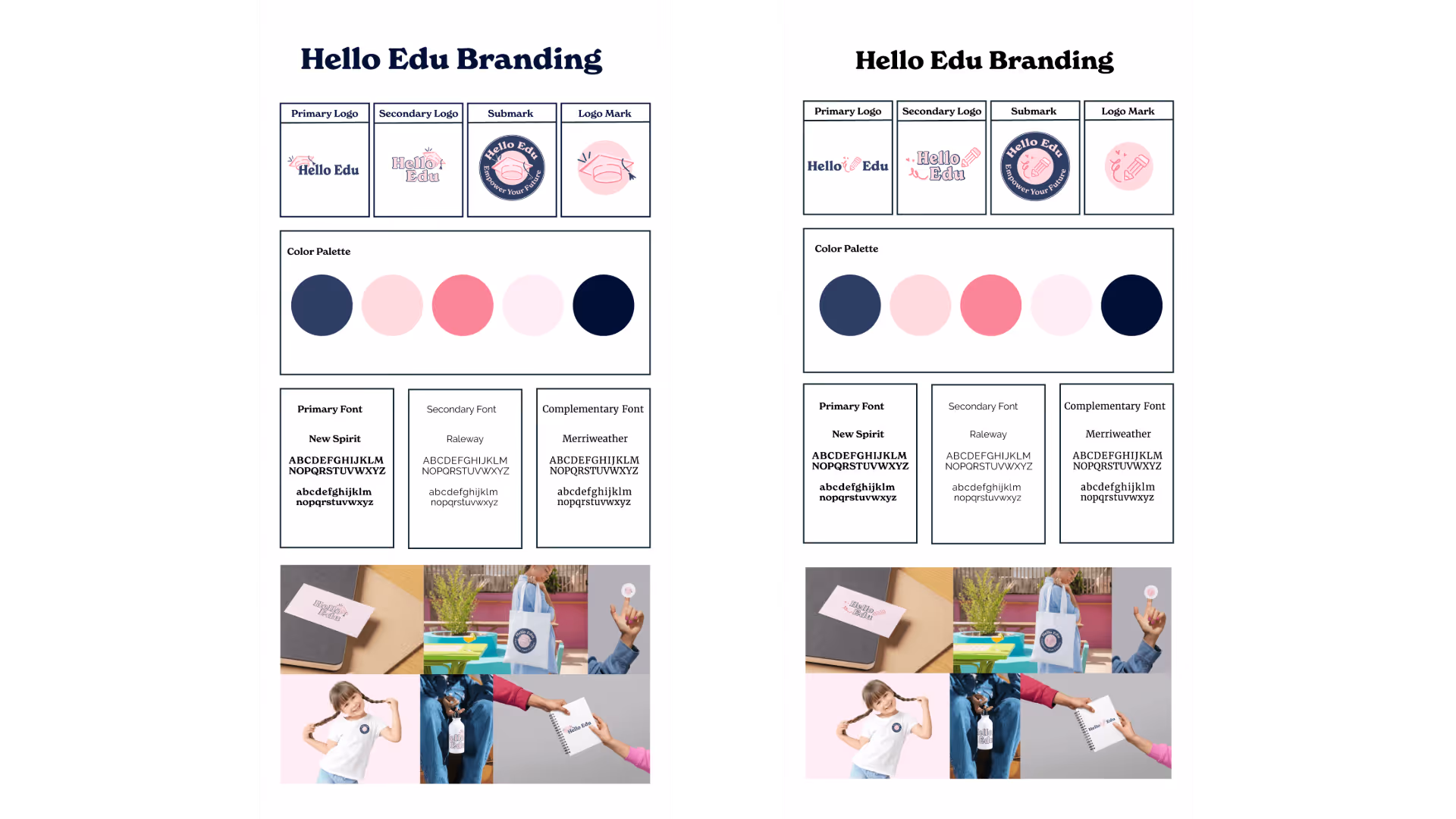
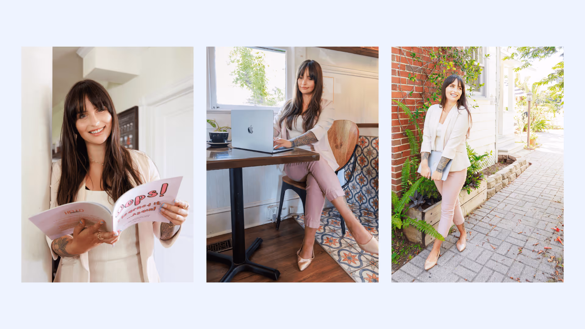
Using Amanda's logo questionnaire and brand preferences, I explored icon-based concepts built for versatility across social, print, and merchandise. Two directions emerged as the strongest: a graduation cap with a playful swoosh emphasizing achievement and movement, and a stylized pencil with heart accents conveying a nurturing, creative approach to learning. Each concept was developed into a complete brand system, including a primary wordmark, secondary logo, circular submark, and a standalone icon mark, giving Hello Edu the flexibility to show up consistently across every touchpoint. The color palette was refined from Amanda's existing navy and pink to meet WCAG 2.2 accessibility standards while elevating the overall feel. Typography was built on three level: New Spirit for headlines and impact statements, Raleway for navigation and UI, and Merriweather for body copy. The brand system was subsequently used as the creative brief for a full editorial photography session, directing visual style, wardrobe, and location choices to ensure photography and brand identity felt like a single cohesive system.
Website Wireframing
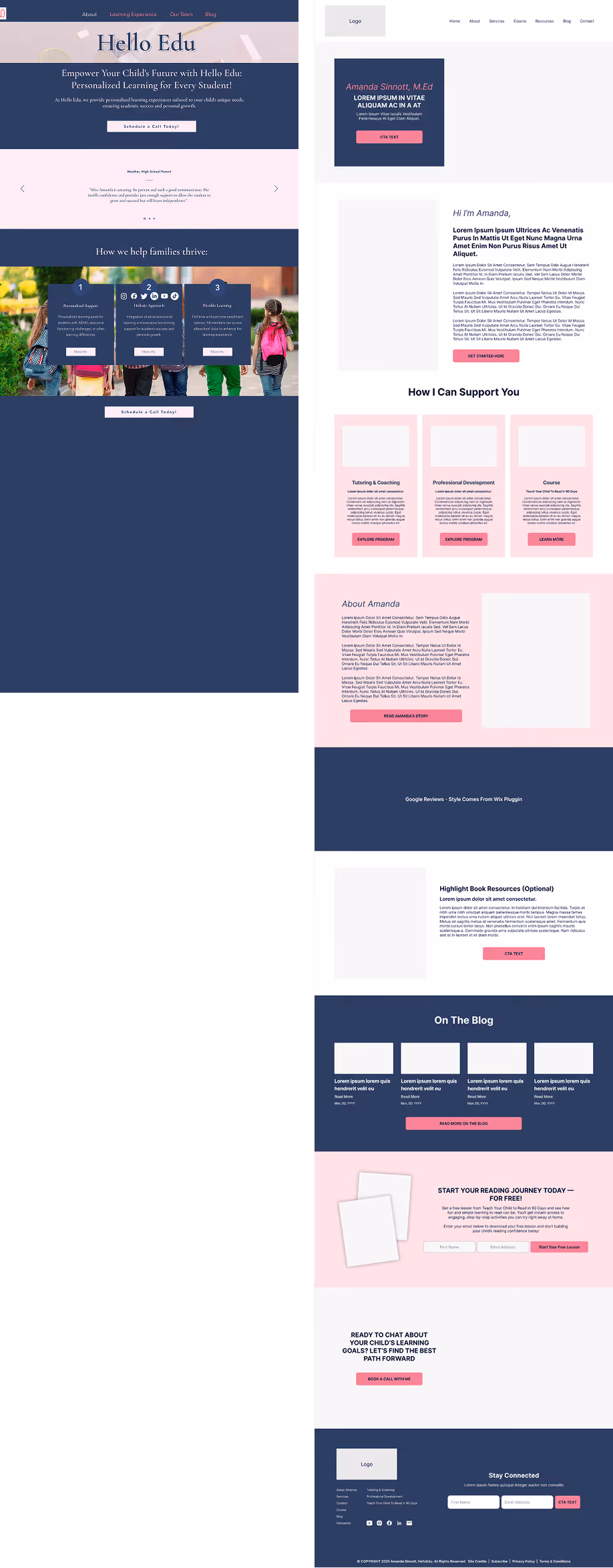
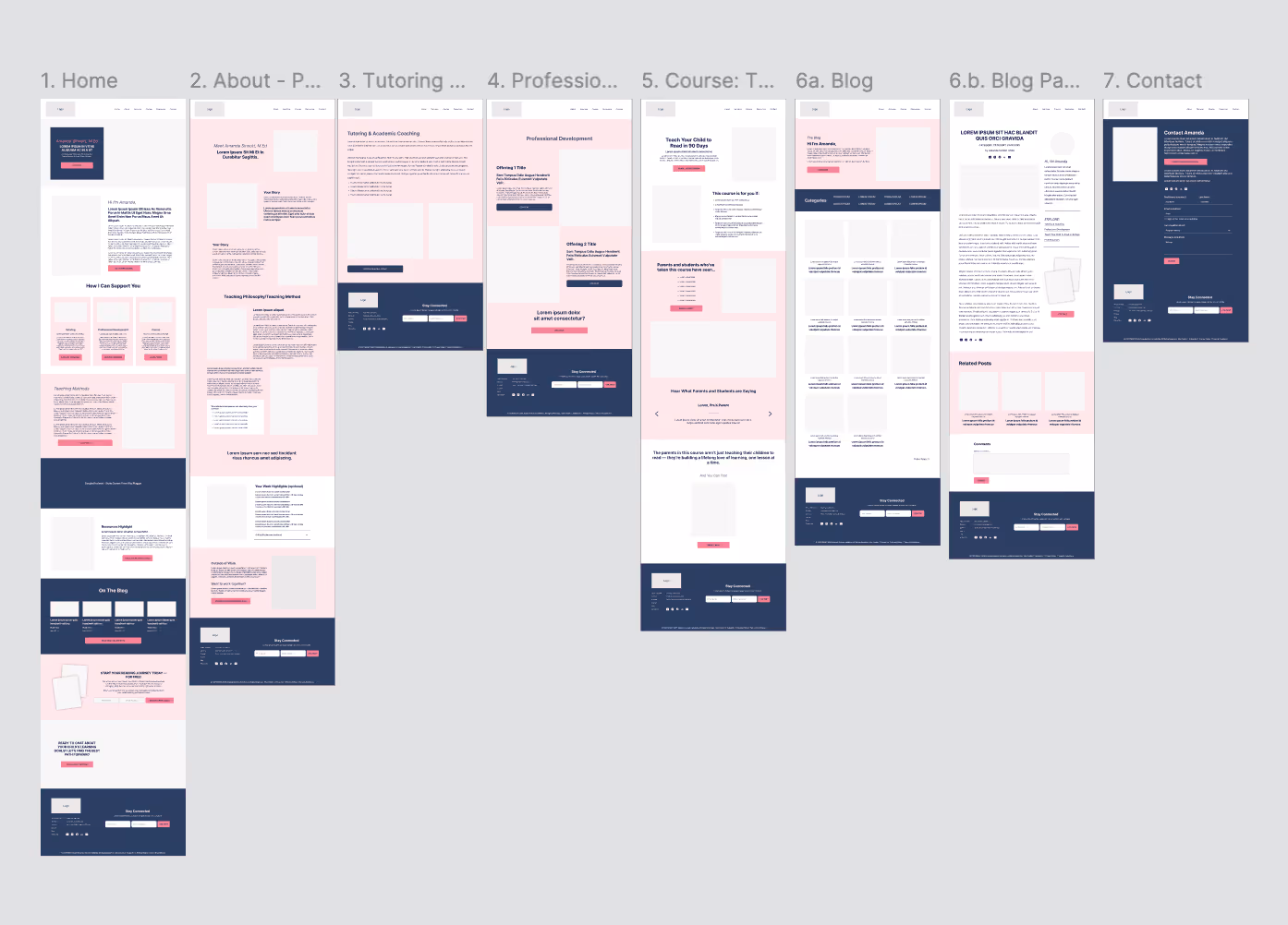
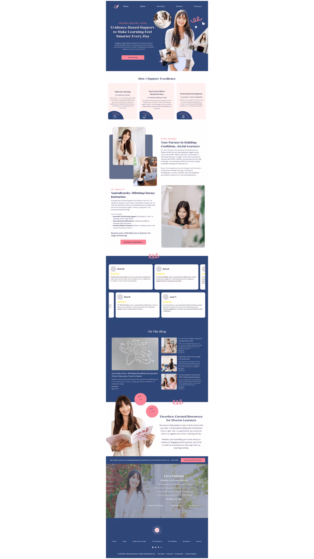
Wireframes focused on layout and structure before visual styling, establishing how each page would flow and how Amanda's expanding offerings would be organized. An interactive Figma prototype let Amanda experience the navigation and user flow firsthand. The homepage was designed as an all in one showcase: Amanda's M.Ed credentials in the hero as a trust signal, clear paths for each audience, Google reviews, and thought leadership content integrated naturally, and a free preview of the 90-Day Course to capture email leads while reducing commitment friction.
Refined Brand System
Revisiting the initial concepts, I pushed the brand further by incorporating feedback to refine the logo toward a sleeker, more modern serif, a tightened tagline ("Smarter Every Day"), and a more cohesive logo family. The navy was brightened and the light pink accents given more energy, all retested against WCAG 2.2 accessibility standards. The result is a brand system that still feels fun and approachable but is more timeless and better positioned for Hello Edu's long term goals.
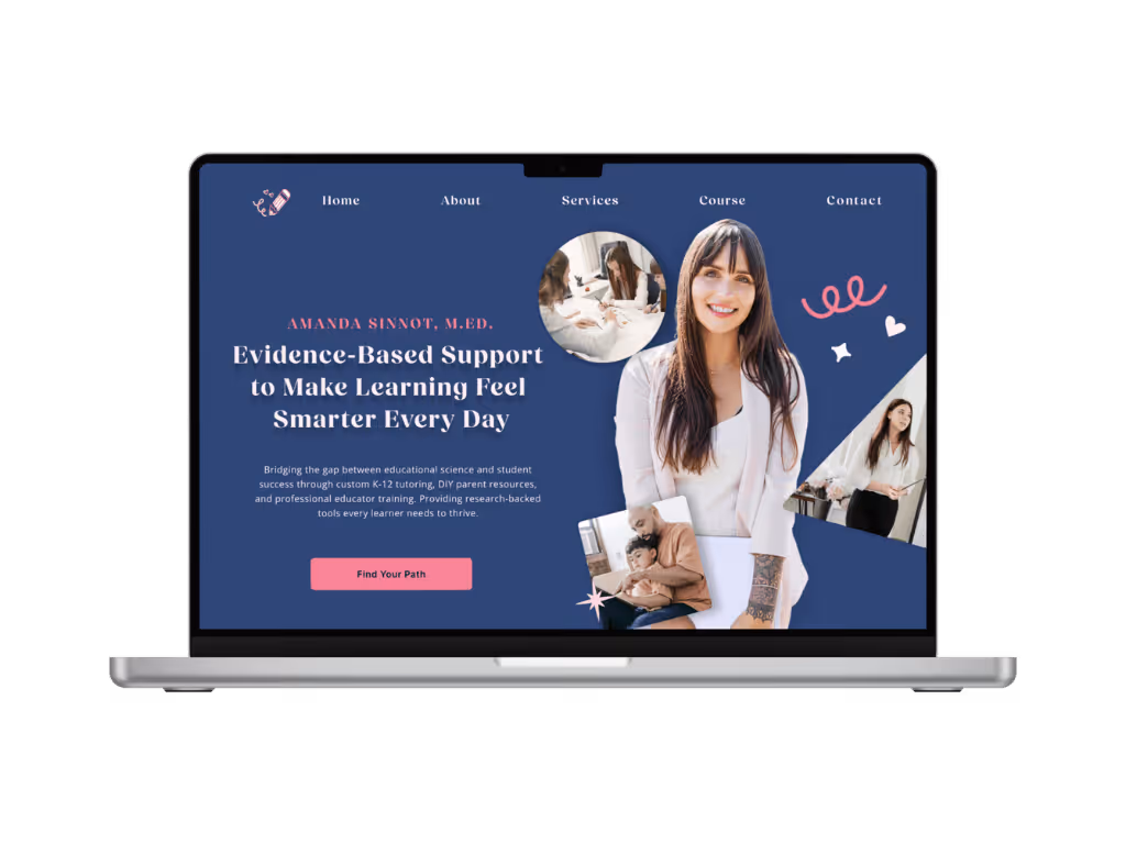
Revisted Homepage Design
Using the competitive research across 13 education brands as a lens, I enhanced the homepage to lead with Hello Edu's personality, opting for more curated brand imagery, playful elements integrated into the layout, and a restructured flow that highlights key offerings more immediately. The competitive audit showed how the strongest education brands balance approachability with authority without letting either quality override the other. That balance became the standard for every decision on the revised homepage.
The revised brand system gave Amanda a visual foundation strong enough to invest in. Following delivery, she commissioned a full editorial brand photography session to bring the identity to life across her website, social media, and press materials. The images were subsequently published in Canvas Rebel magazine, marking Hello Edu's first major press feature.
This project sharpened my understanding of where brand design actually begins. Strategy and structure matter, but a client needs to feel their brand in the work from the first wireframe, not just after the visual layer is applied. Revisiting the project pushed me to take bolder creative risks earlier in the process. Competitive research across 13 education brands confirmed what I already suspected: the strongest brands in this space don't hedge between playfulness and authority; they commit to both simultaneously. That's the standard I'll bring to every brand project from here.
Have a project in mind? Let's discuss how we can scale your brand through design.