A dual-audience brand and UX system designed for travelers and property owners within a unified booking experience. The project combines funnel strategy, UX design, and visual storytelling into a conversion-focused marketing system built for clarity and action.
Solo Brand, UX/UI, Marketing Designer
10 Day Sprint
Figma, Figjam, Canva
Lumara Escapes needed to market to two fundamentally different mindsets within a single brand identity. Travelers are led by emotion and sensory experience; they want to feel something. Property owners are led by logic and financial proof; they want to see numbers. Each audience required a tailored message and a distinct customer journey without the brand feeling split or inconsistent.
Research & Audience Definition
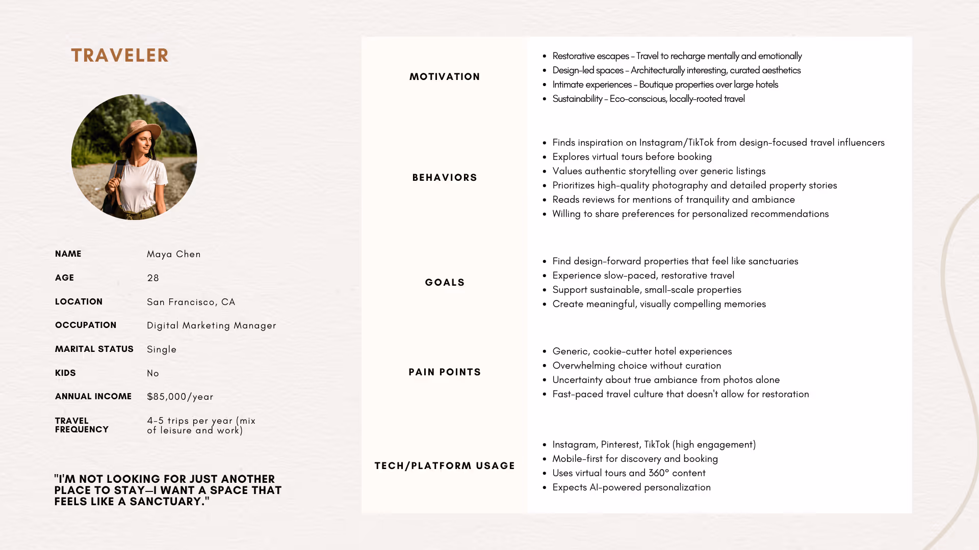
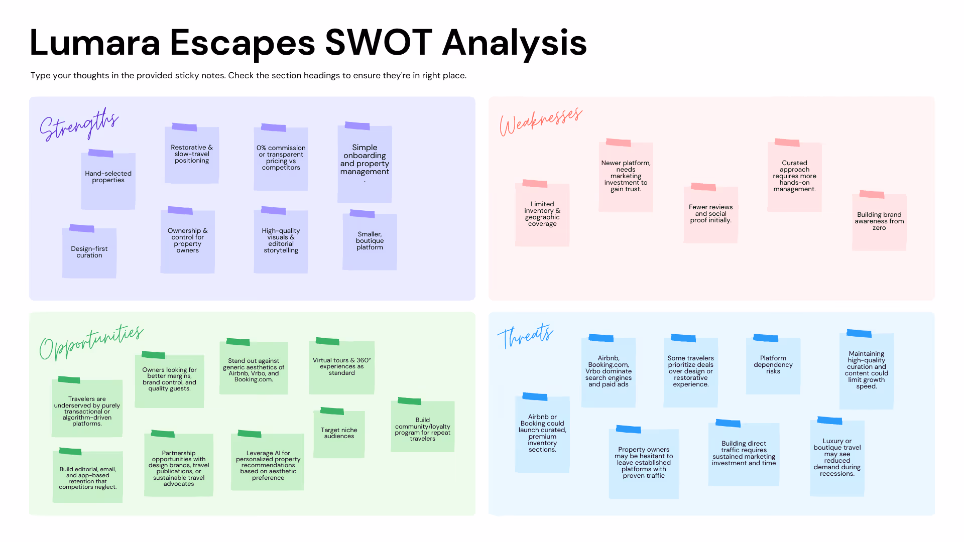
Before any decisions, I mapped the two audiences at a mindset level. Travelers (represented by Maya, 28) make decisions emotionally; aspirational imagery, sensory language, and a sense of discovery drive them forward. Property owners (represented by Michael, 42) make decisions logically; commission comparisons, control, and revenue proof points move them to act. A SWOT analysis confirmed Lumara's best competitive positioning: lean into boutique scale as a feature, not a limitation. Being intentionally smaller and more curated is the brand's strongest advantage over Airbnb and VRBO.
Brand Strategy & Wireframes
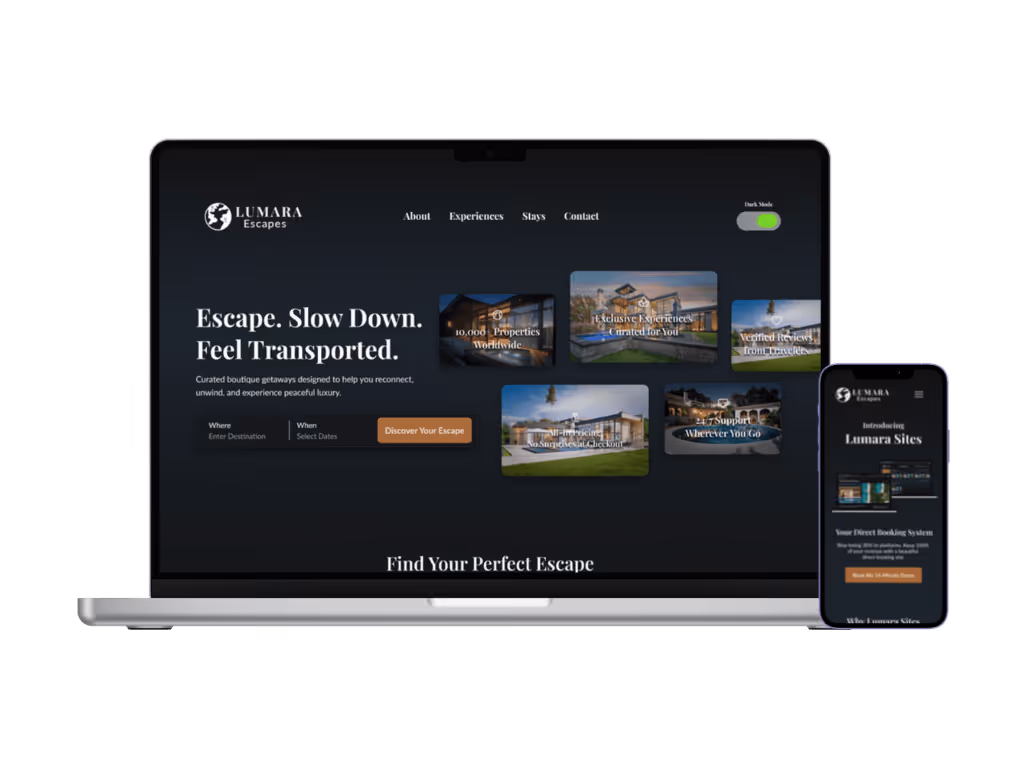
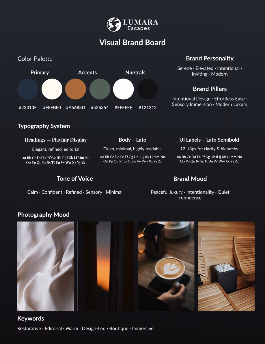
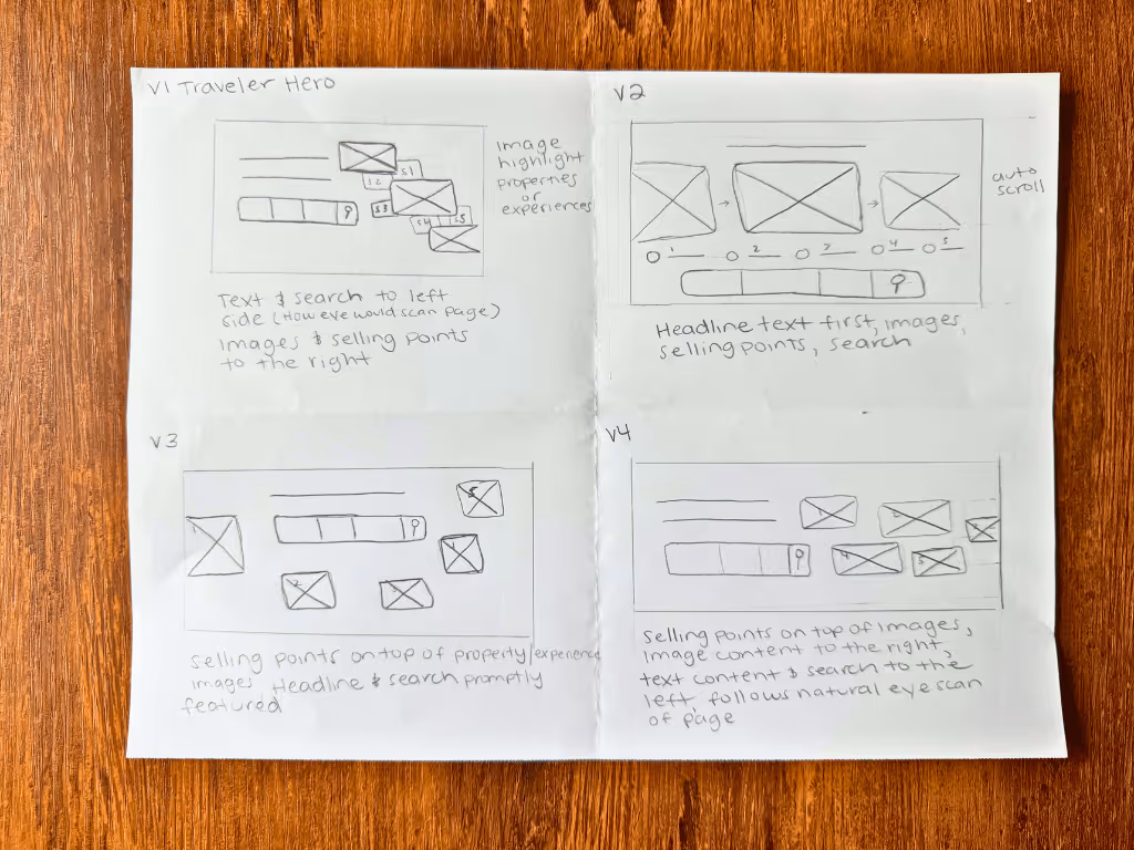
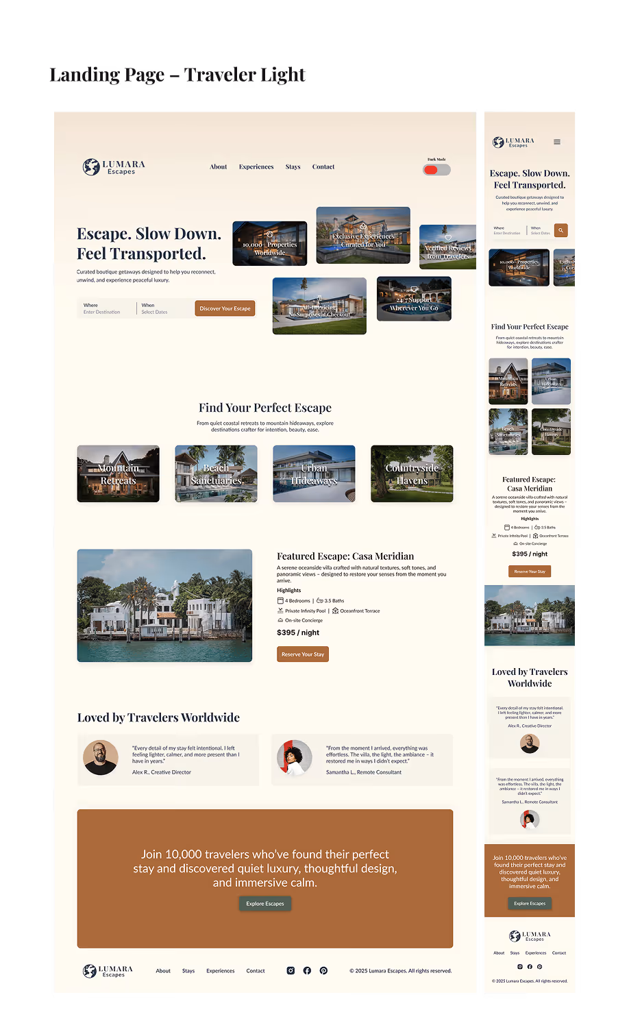
Before designing any layouts, I established the brand foundation: color palette, typography, tone of voice, and photography mood to ensure both funnels felt like one brand, even when speaking to different audiences. For the traveler landing page, I explored four hero layout variations. V4, a staggered magazine-style layout, won: for this brand, speed wasn't the goal, connection was. The slow eye movement and intentional white space communicate quality and curation before any copy is read. Wireframes introduced real copy early, which revealed where the emotional story was landing and where the logical proof points needed strengthening.
Dual Landing Pages
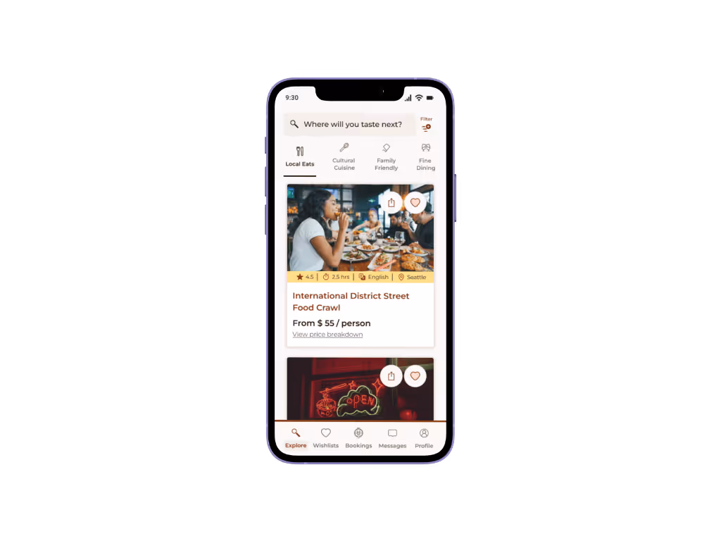
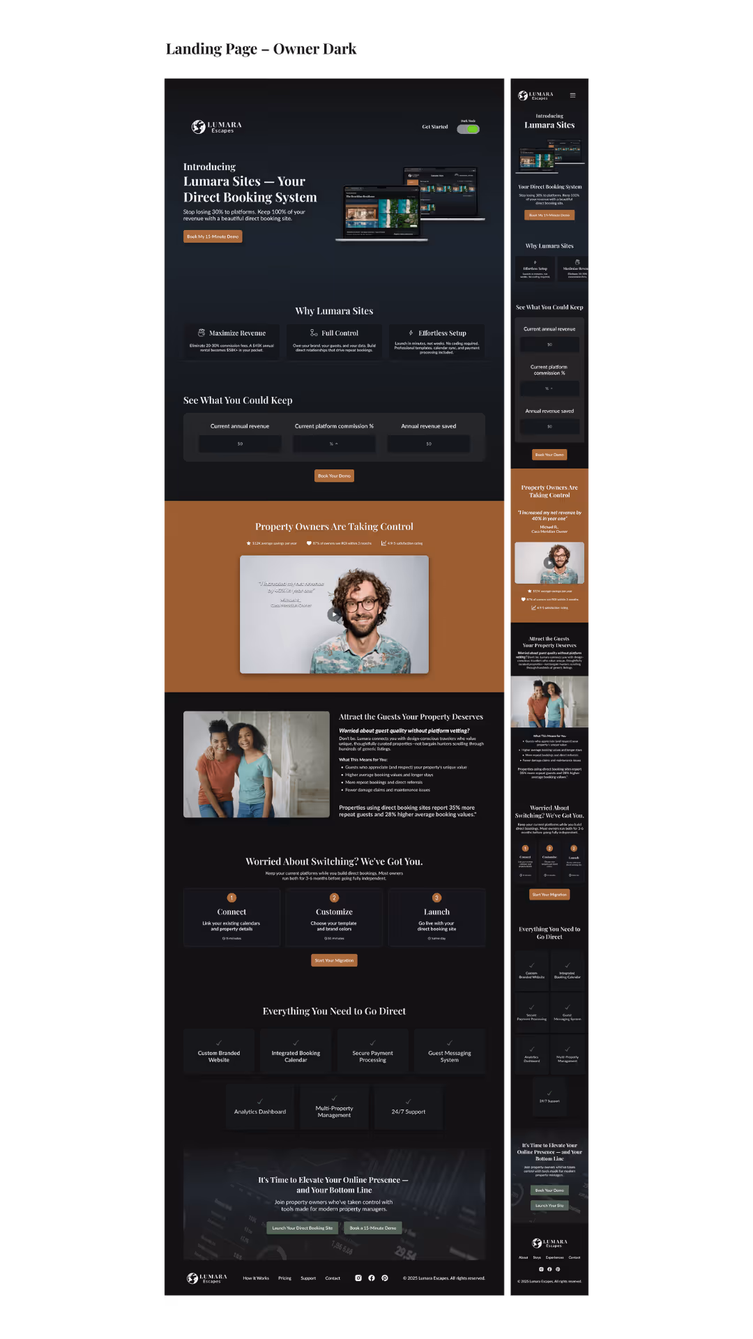
The traveler landing page slows the user’s eye deliberately: staggered imagery, generous white space, and aspirational copy build trust before any booking prompt appears. The property owner landing page leads with commission savings and control, addressing the core financial anxiety before introducing Lumara Sites as the direct booking alternative. Both pages were delivered in light and dark modes and optimized for mobile.
Email Marketing
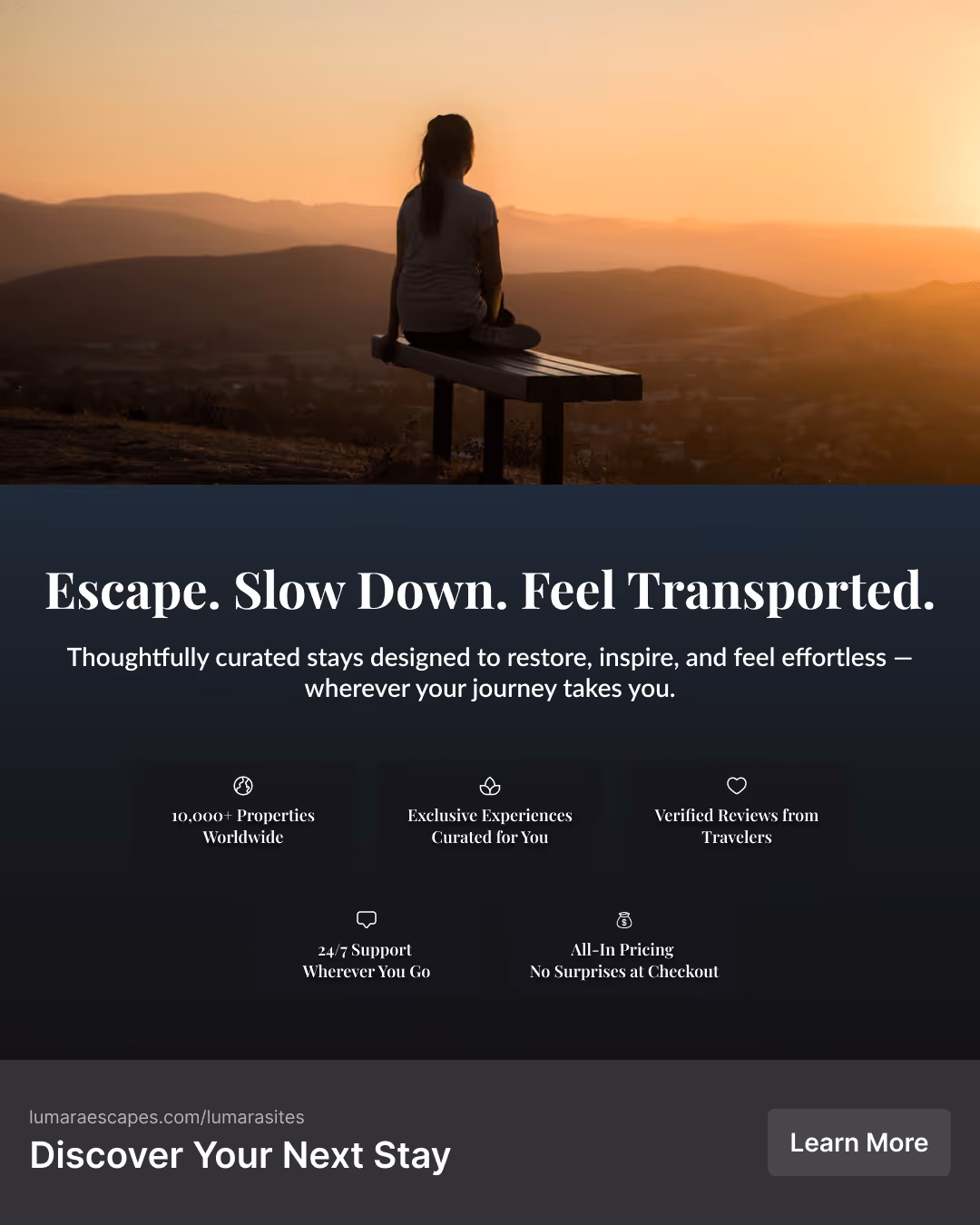
Two parallel email flows, one per audience. The traveler newsletter builds awareness through editorial storytelling and aspirational imagery. The owner's follow-up email moves from awareness to conversion, leading with revenue proof points and a clear CTA to list their property. Each email was designed to feel like a natural extension of its landing page; same visual language, tighter copy, single focused action.

Social Media Assets
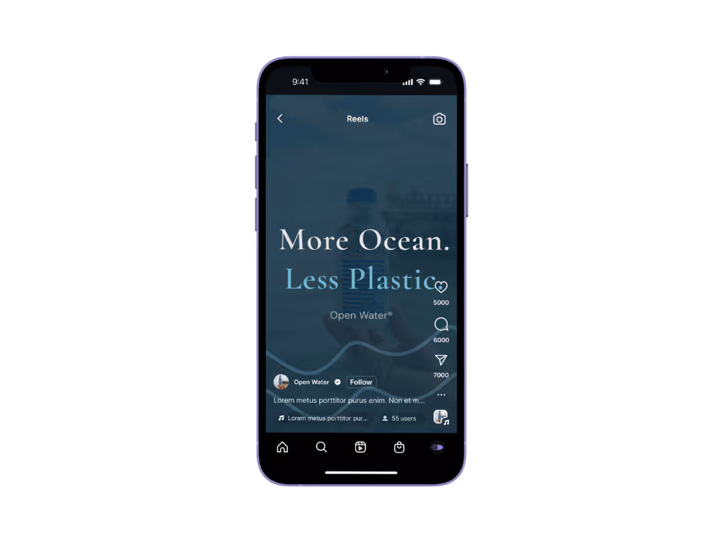
Instagram carousels and Facebook ads were designed for each audience using the same split logic: inspiration hooks for travelers, revenue hooks for owners. Each asset leads with a strong visual to stop the scroll then delivers the brand message in a boutique editorial tone that stands apart from the generic stock heavy aesthetic dominating travel advertising.
Delivered two fully realized marketing ecosystems in a 10-day sprint, achieving a dual audience brand system that speaks two distinct languages across a single cohesive identity. All assets are production-ready across light and dark modes and fully responsive across devices. Each funnel was designed around documented audience decision-making frameworks rather than assumptions, with layout, copy hierarchy, and proof-point sequencing tailored to each audience's specific mindset.
This project reinforced that audience-driven design isn't just about tone, it's about understanding the fundamental decision-making process of each person you're designing for. Travelers and property owners don't just want different things from Lumara; they think differently about how they make decisions. Designing parallel journeys that feel cohesive while speaking directly to each mindset required holding both audiences in mind simultaneously at every design decision, from layout pacing to copy hierarchy to which proof points surface first.
Next Steps:
Have a project in mind? Let's discuss how we can scale your brand through design.