Brand & Website Design for a Travel Blog and Photography Print Shop
Average Lost Couple is a travel blog and photography print shop that I run with my husband, Keith. The blog originally lived on Wix while the print shop operated separately on Shopify, splitting our content, brand, and even marketing emails across multiple platforms with no shared visual identity. When the Shopify store closed, it became an opportunity to rebuild the brand from the ground up by consolidating the blog, print shop, and email marketing onto a single platform. The goal was to create one cohesive experience for subscribers while simplifying how we manage the business behind the scenes.
View Live Site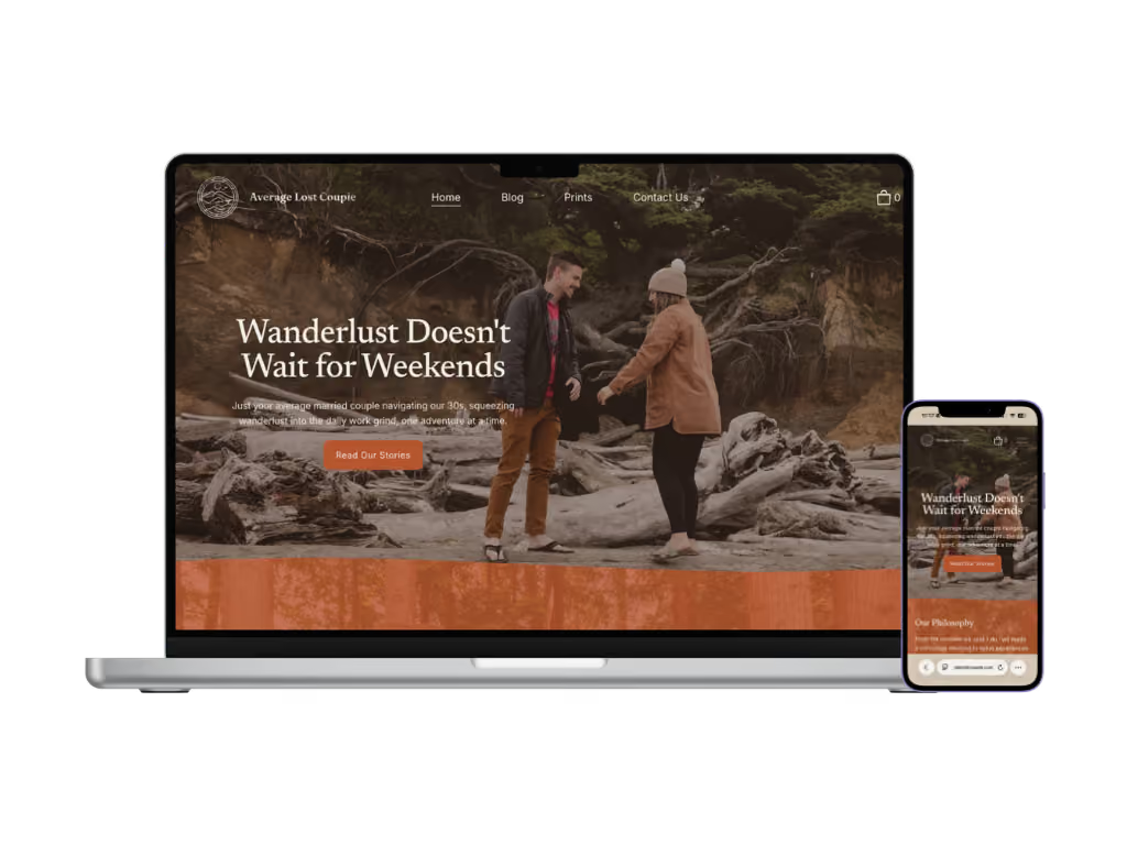
Project Snapshot
Solo Brand & Digital Designer
~2 months
Brand Strategy, Visual Identity, Content Architecture, Web Design & Development, Copywriting
Squarespace, Figma, Adobe Creative Suite, Procreate, Claude AI (copy evaluation against brand voice, chart visualization)
Average Lost Couple went from two separate platforms with no shared identity to one unified brand and website, with a print shop rebuilt from the ground up on a stronger fulfillment vendor.
Key outcomes:
Average Lost Couple had years of trip content and a growing audience, but no site built to hold either. The blog lived on Wix while the print shop ran separately on Shopify, splitting the brand across two platforms with no shared visual identity. When the Shopify store closed, the print shop needed to be rebuilt from scratch rather than migrated, on a new fulfillment vendor chosen for stronger print quality.
The challenge was building one brand and platform that could hold years of past and future blog content, stand on its own visually, support a print shop built from the ground up, and carry marketing emails in the same voice and identity, without the site (or the inbox) feeling like two different businesses stitched together.
X Build a visual identity from scratch that feels distinct from a personal social feed.
X Reunite the blog and print shop under one brand and platform after they'd been split across Wix and a since-closed Shopify store.
X Organize years of existing and planned trip content into a system that's browsable, not buried.
X Write a homepage and blog voice that sounds like an actual couple, not a generic travel brand.
X Rebuild the print shop from scratch on the new platform, migrating away from Shopify and switching print fulfillment from Pictorem to theprintspace to improve print quality, rather than relaunching the same setup elsewhere.
X Bring marketing emails into the same platform and identity as the blog and print shop, instead of managing a third disconnected tool.
✔️ Establish a visual identity system flexible enough for a badge mark, supporting illustrations, and photography.
✔️ Create a content architecture that scales with years of trip content.
✔️ Write a homepage and blog copy that reflects how Keith and I actually talk about travel.
✔️ Rebuild the print shop on theprintspace with stronger print quality than the previous vendor.
✔️ Consolidate email marketing onto the same platform as the blog and print shop for one subscriber experience.
Platform Options & Decision
Before any visual design began, the priority was what platform would be the best to move forward with. I weighed three paths forward: staying on Wix, since the blog was already established there; migrating the blog over to Shopify to join the already established print shop; or starting fresh on a new platform entirely. Staying on Wix would have left the print shop permanently disconnected from the blog. Migrating to Shopify solved the platform-count problem, but Shopify's blogging tools were too limited to support a content-driven travel blog, so it would have fixed one issue by creating another. I also considered Webflow and WordPress, but ruled both out on cost: Webflow requires an additional paid tier just to add ecommerce to a site, and running a blog and a shop through WordPress would have meant paying for hosting plus separate plugins or apps for each. Squarespace was the only option that handled blog content, an online store, and email marketing natively, in one plan, without stacking on extra costs for either half of the business.
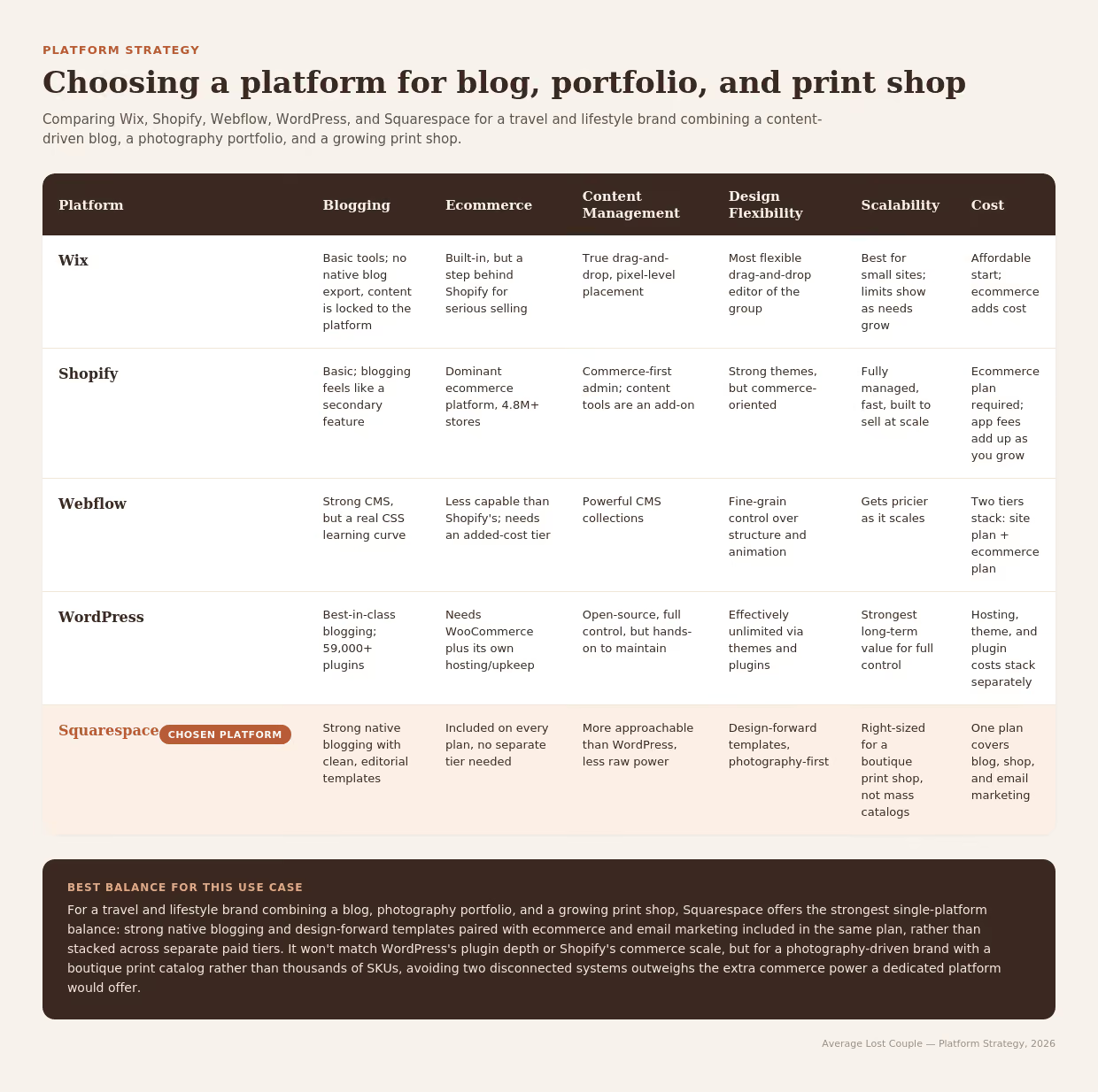
I prompted Claude AI to visualize this platform comparison, weighing blogging, ecommerce, content management, design flexibility, scalability, and cost across five platforms.
Information Architecture & Sitemap
With Squarespace decided, I mapped a full sitemap before any visual design began, covering not just the homepage but every page's internal structure. The homepage flows in a fixed sequence, Hero, Our Travel Philosophy, About Us, Featured Blog Posts, Browse Categories, Print Shop, Subscribe for Updates, Footer, so it could act as a single landing point directing visitors into every part of the business rather than functioning as just a hero banner. Each section builds on the one before it, moving a visitor from an emotional hook into the people behind the brand, then into the two things the business actually offers: blog content first, giving away the free stories and information that build trust and give returning readers a reason to stay, followed by the print shop as the natural next step for anyone already invested enough in the story to want to take a piece of it home.
Beyond the homepage, the sitemap laid out the Blog (Blog Collection → Blog Post Card → Blog Post Page) and Print Shop (Collection → Print Item → Cart) as their own structured flows, plus a Contact Us page. Two pages in that original plan, Work With Us and a Portfolio page linked from the Contact form, were mapped but haven't been built yet; they remain part of the roadmap rather than the live site.
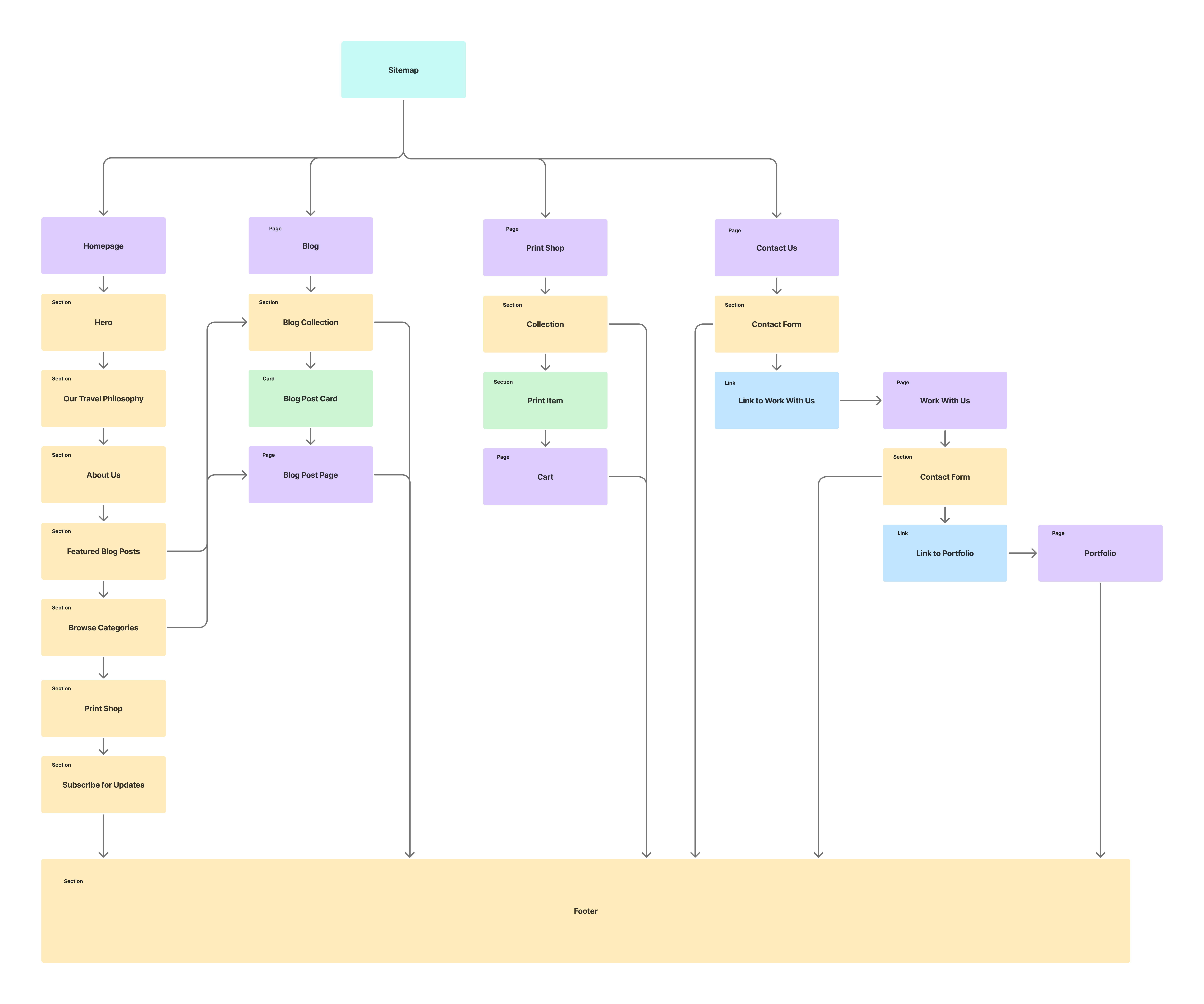
Full sitemap covering Homepage, Blog, Print Shop, and Contact Us page structures, including Work With Us and Portfolio as planned-but-not-yet-built pages.
Early Concept & Evolution
Before the final rebrand, I'd designed an earlier version of the site in Figma over a year prior, with a color palette that was more of a placeholder than a finished decision. That version was built around a travel stats section (countries roamed, continents journeyed, US states explored, national parks wandered), and the category system was designed to mirror those stats directly: USA, International, Wildlife, Adventure, Stays, Food, Cities, Hiking, National Parks, Travel Tips, Photography, and Pet Friendly, letting visitors browse by the same destinations and milestones the stats were counting. The plan at the time was also to eventually split content into three distinct arms: Destinations, Travel Tips, and, once the print shop was reintroduced, Photography Tips.
Most of the underlying hierarchy carried forward into the final site, but the category philosophy changed direction. The travel stats were cut because they felt generic rather than distinctly ours, and were replaced with the Philosophy section, which said something specific about how Keith and I actually think about travel instead of just counting destinations. That shift away from stats-driven categories led to the simpler, story-driven six-category system in the final site (Road Notes, Weekend Escapes, Trails & Parks, Lessons Learned, Photo Stories, City Wandering), organized around the kind of story being told rather than a checklist of places visited. And rather than relying on visitors to find their own way through navigation alone, the final homepage brings blog content back onto the page directly through the "Journey So Far" feed, paired with a more prominent category highlight, so visitors get a guided way in instead of a path they have to go looking for.

Early Figma concept for the ALC homepage, showing the travel-stats-driven category system and print-shop-forward layout that preceded the final story-driven category structure.
Copy Evolution
The original About block ran three ideas together in one paragraph: introducing us as the couple, stating the philosophy, and inviting people to follow along. Splitting it into Hero, Philosophy, and About let each section do one job and tightened the language along the way, "figuring out how to weave wanderlust into our everyday lives while working a traditional 9-5" became the hero's punchier "squeezing wanderlust into the daily work grind." The result reads less like an introduction and more like a thesis that unfolds across the page, hook first, why second, who we are third.
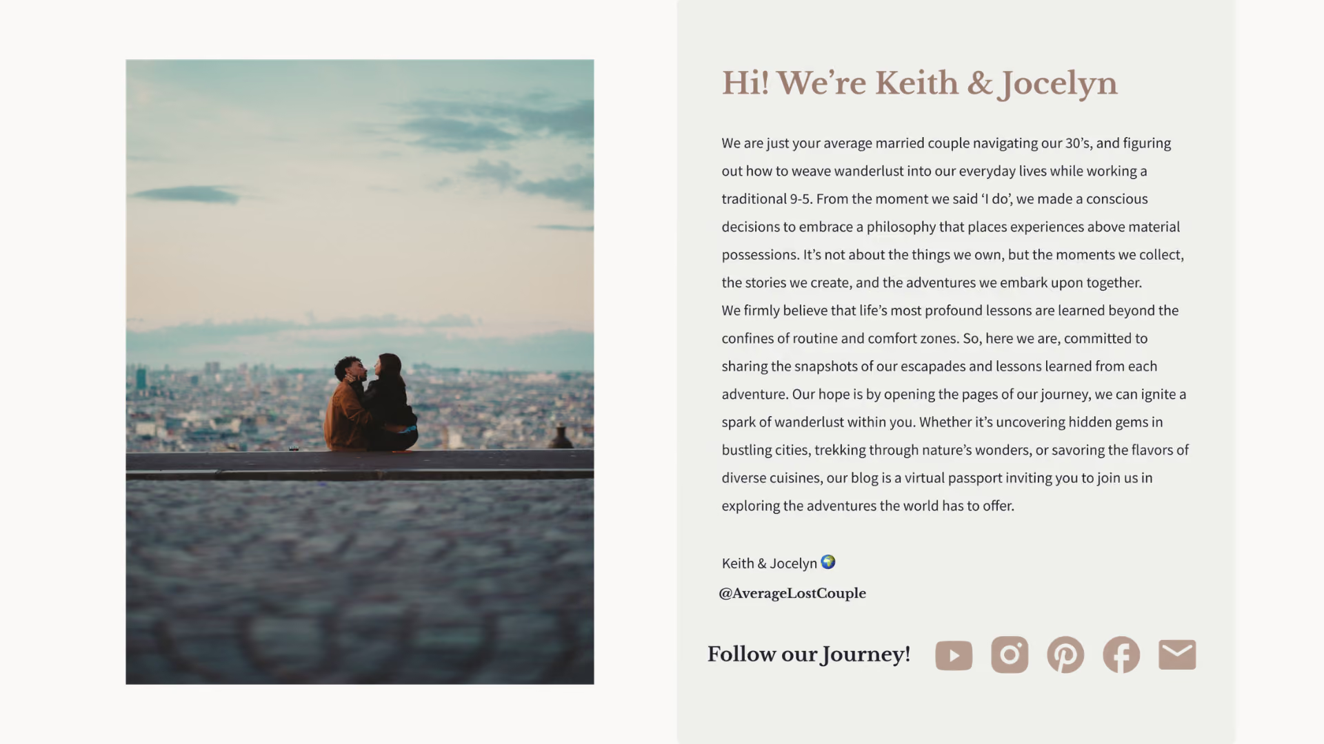

Old single About block (left) versus the final site split across Hero, Philosophy, and About (right), showing the same ideas separated into distinct sections with tighter language throughout.
Developing the Logo System
I started with word association and moodboard-style references to figure out what the mark needed to feel like. From there, I used our own trip photos as inspiration, pulling shapes and details that could become part of the mark instead of using generic travel icons.
I sketched through several directions before landing on the circular badge. I added a driftwood texture to give the mark a more natural, tactile feel and keep it connected to the outdoors and travel.
Rather than creating just one logo, I built a small system with different lockups for different uses. This included the full circular badge, a horizontal icon and wordmark, and the standalone mark. This gave the brand a few flexible options while keeping everything consistent.
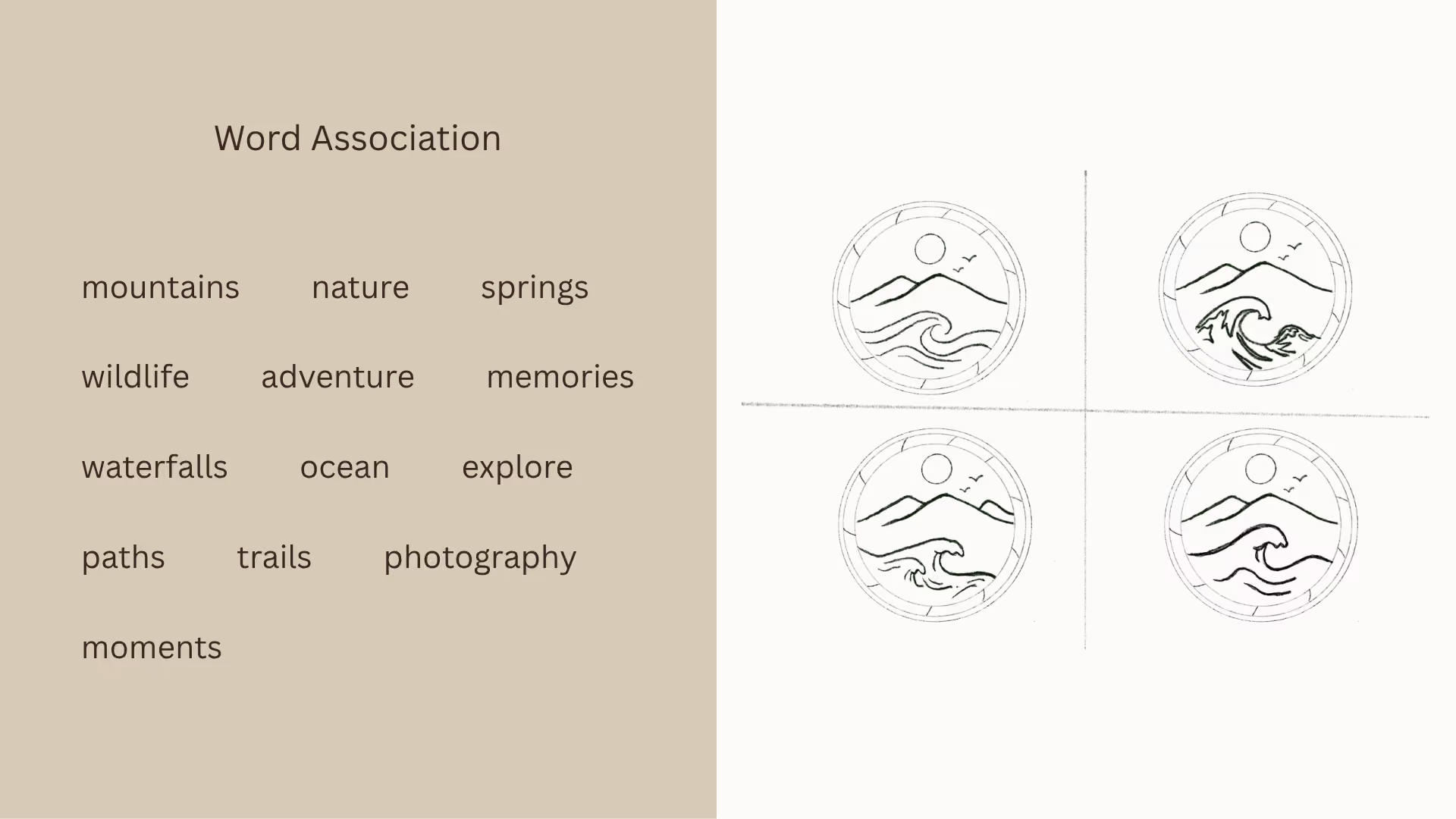
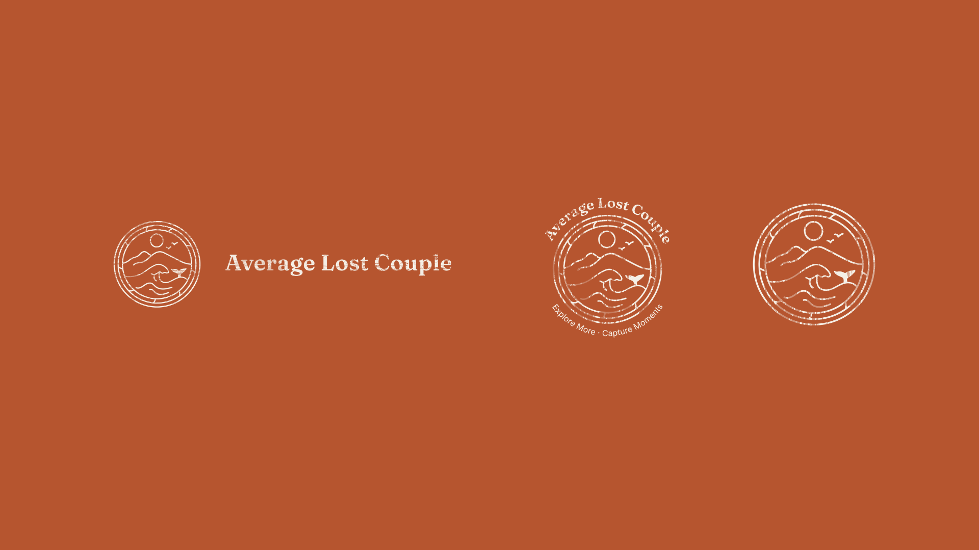
Logo development process: word association and reference gathering, sketches drawing on trip photography, and the final system across its three lockups.
Building the Color Palette
The palette was pulled directly from our real trip photography: Coastal Cream, Driftwood Ink, Pine Harbor, Rust Trail, and Weathered Sand. Using colors from the photography helped the palette feel natural alongside the images instead of competing with them.
After launch, I changed Driftwood Ink to Deep Driftwood, a warmer brown that worked better with the rest of the palette. The original felt a little too flat and cool next to the warmer Rust Trail and Pine Harbor, so the browner tone gave the palette more cohesion while keeping the warm, natural feel.
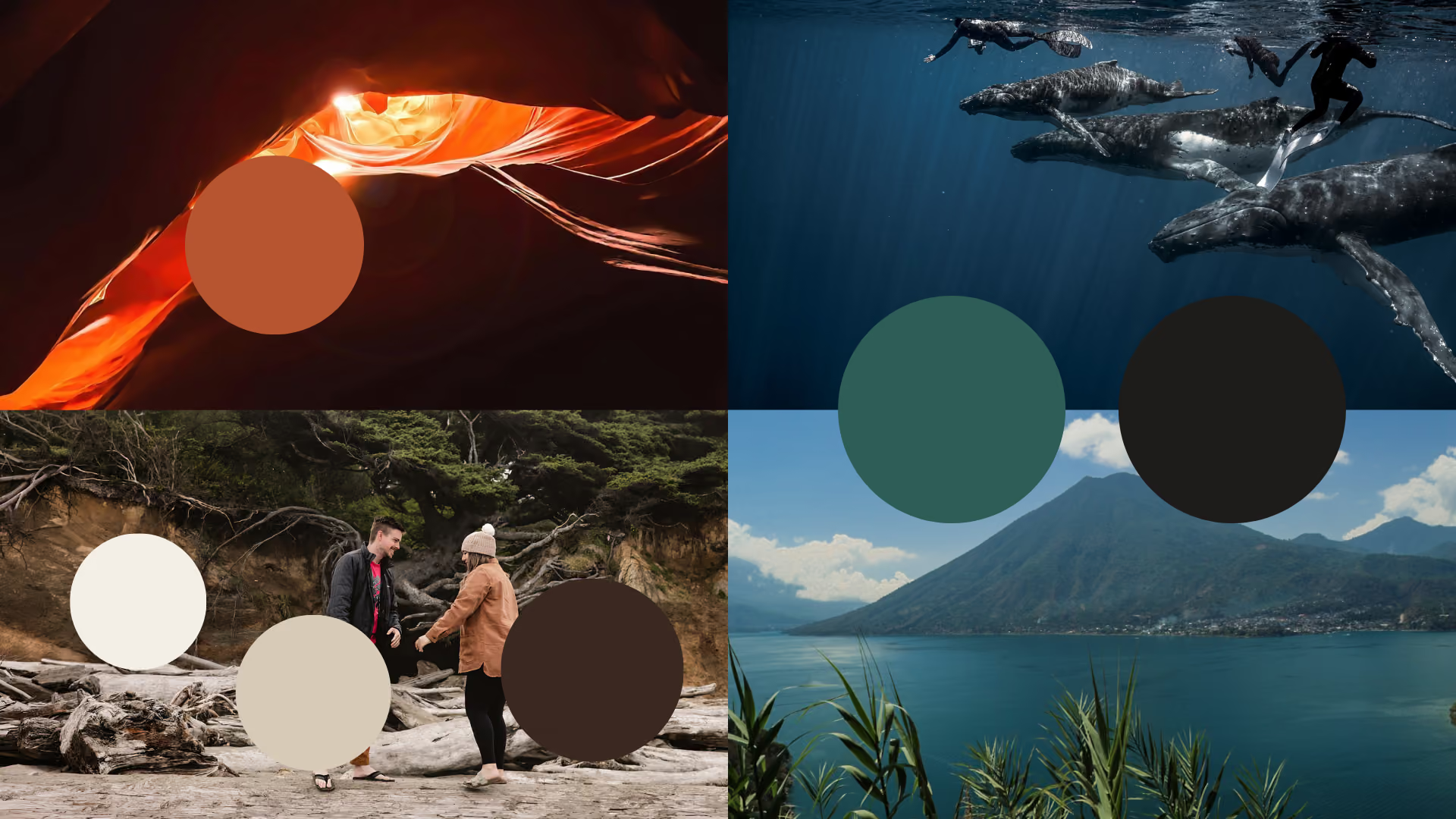
Color palette sourced directly from real trip photography: Rust Trail from Antelope Canyon, Pine Harbor blended from the Guatemala lake and a whale encounter, Driftwood Ink originally pulled from the same underwater darks, later refined to Deep Driftwood from the driftwood beach photo, and Coastal Cream and Weathered Sand from that same beach shot.
Finding the Right Fonts
Typography went through its own refinement. I initially chose Fraunces for its personality, but comparing the full alphabet side by side against Newsreader made its wonkier letterforms clear, particularly the J, which felt too distracting once applied across the actual brand. I moved to Newsreader for headers and section headings, Inter for body copy, and Instrument Serif for navigation and smaller utility moments like category labels.
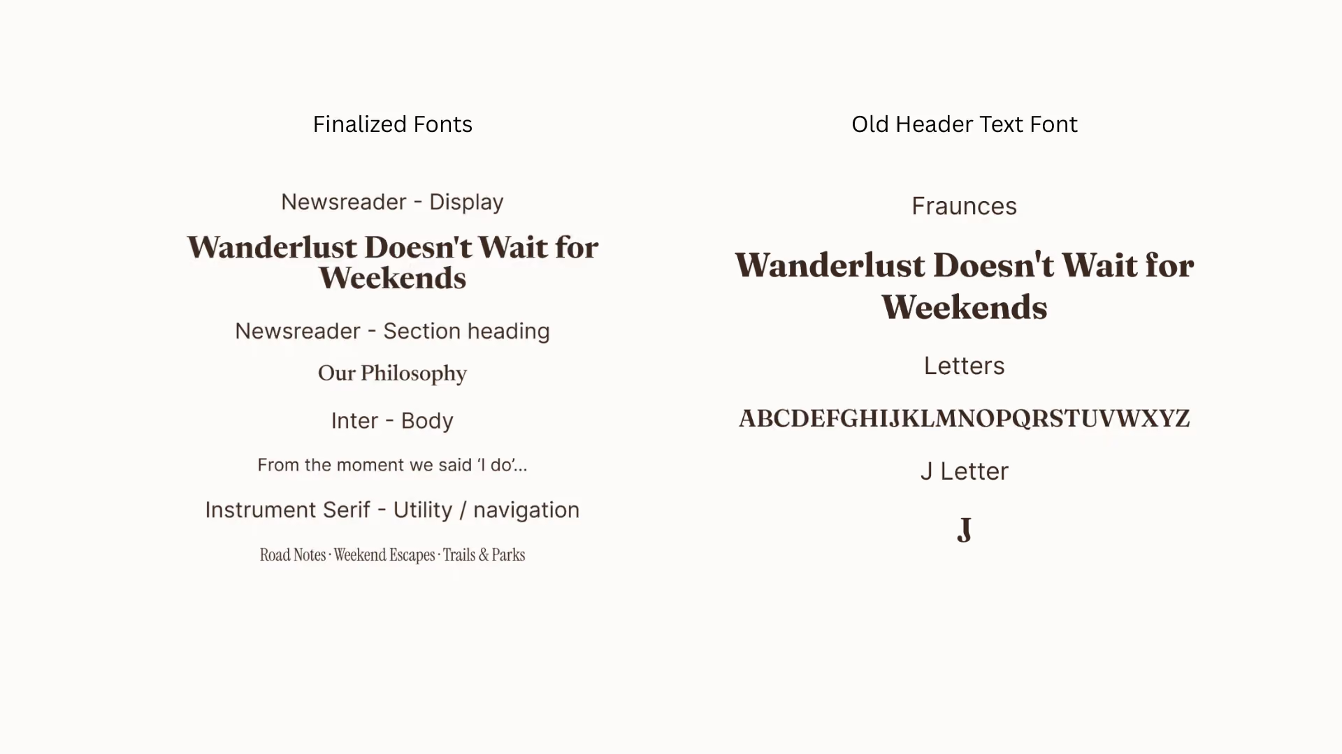
Old header font (Fraunces) versus finalized fonts (Newsreader for display and section headings, Inter for body, Instrument Serif for navigation and utility text), shown against the same headline. The isolated alphabet and J letterform highlight the wonkier characters that led to the switch.
Creating Supporting Illustrations
Once the logo system was in place, I sketched out a few directions for smaller illustrations before landing on the final set. For a travel-themed icon, I considered a plane window with clouds and a wing, and a car rearview mirror framing a wildlife scene. I moved forward with the plane window since it tied more directly to the act of travel itself, and set the rearview mirror concept aside to revisit later rather than cutting it outright. For the film reel, I sketched out which kinds of shots should fill each frame (a mix of travel, wildlife, hiking, and portraits) before finalizing the illustration.
A boots-with-wildflowers illustration was also fully developed in the same style, but ultimately cut: the linework in the flowers and boot came out more controlled and precise, while the film reel and plane window kept a looser, more hand-drawn feel. The boots illustration didn't match that same loose energy.
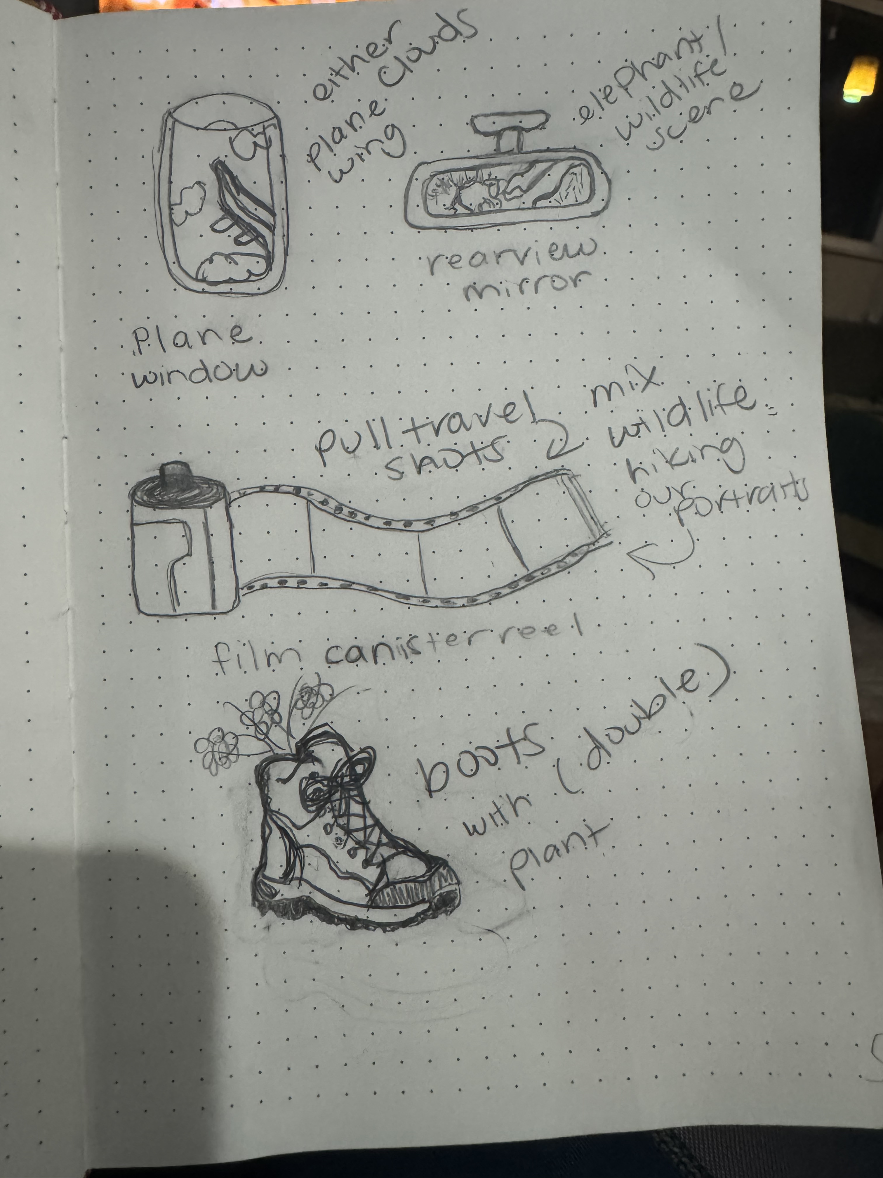
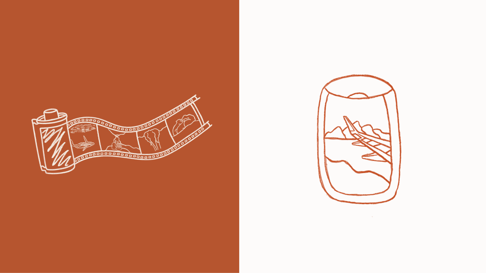

Early sketches for the plane window, rearview mirror, film reel, and boots illustrations (top), the finished boots-with-wildflowers illustration cut for its more controlled linework (middle), and the finished plane window and film reel graphics as they appear on the site (bottom).
Writing the Copy
Every homepage section, from the hero headline down to the philosophy statement, was written to sound like the two of us talking, not a brand voice borrowed from somewhere else. "Wanderlust Doesn't Wait for Weekends" became the thesis the rest of the copy builds from, carried through the About section, the philosophy statement, and the running banner phrases across the site.
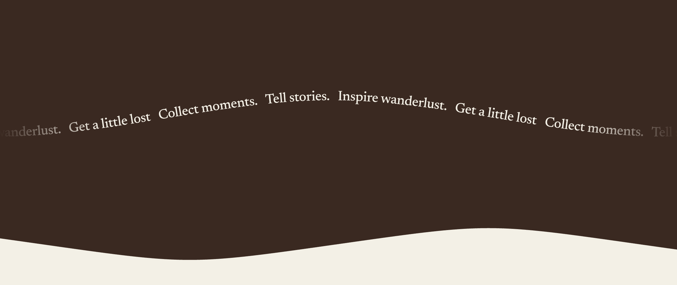
The same thesis carried across the homepage: the hero headline and philosophy statement (top) echoed in the running banner (bottom), each restating "wanderlust," "moments," and "stories" in a different register.
Building the Category System
Each of the six blog categories (Road Notes, Weekend Escapes, Trails & Parks, Lessons Learned, Photo Stories, City Wandering) carries through consistently from post to card to category page. A post tagged with a category surfaces that label on its blog card, and clicking the label routes directly to a filtered category page showing every post in that group. Food came up as an early candidate for its own category, but Keith and I cut it once we looked at the actual content pattern: food shows up throughout our posts, but it's sporadic rather than a dedicated focus of any given trip.
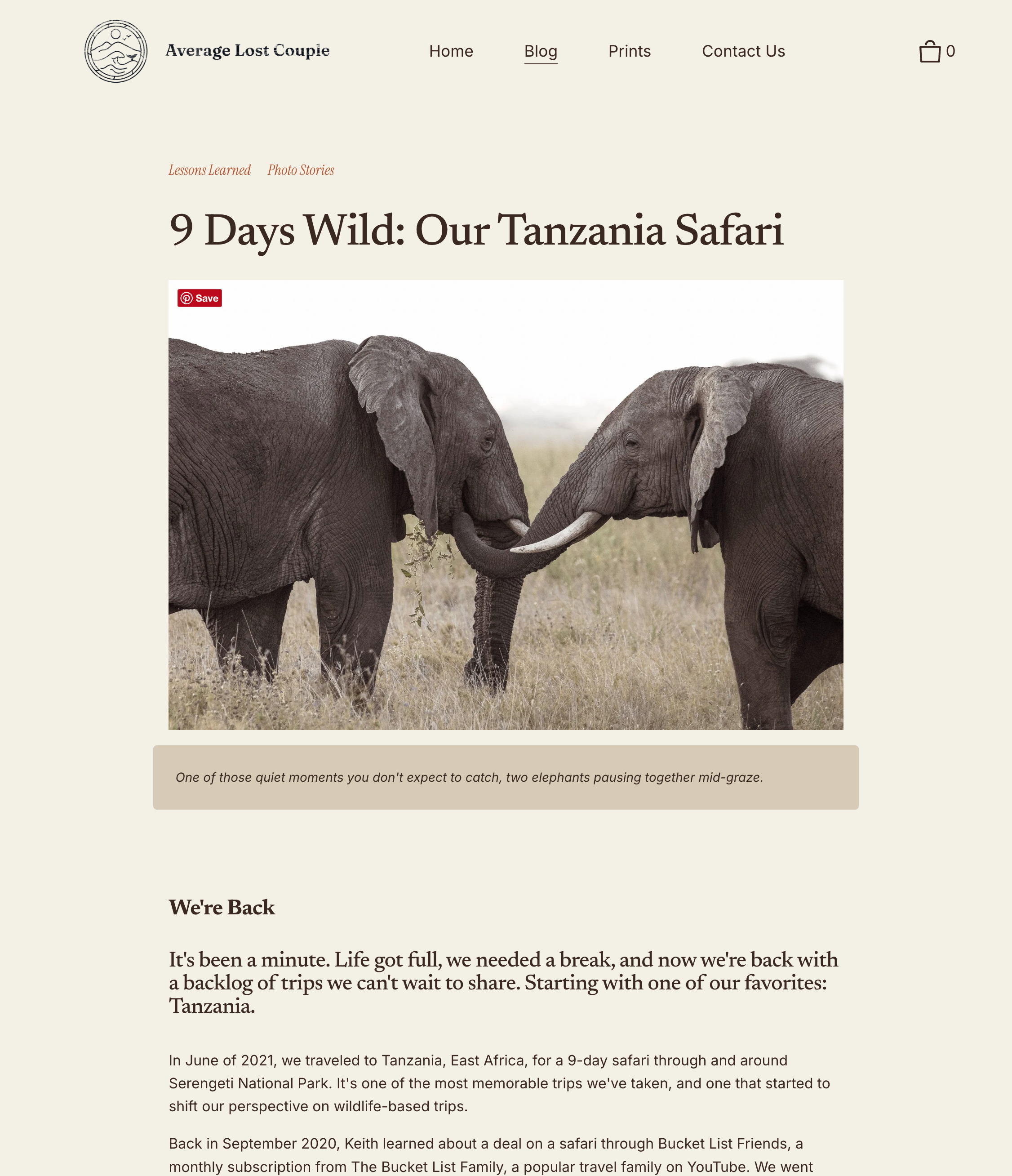
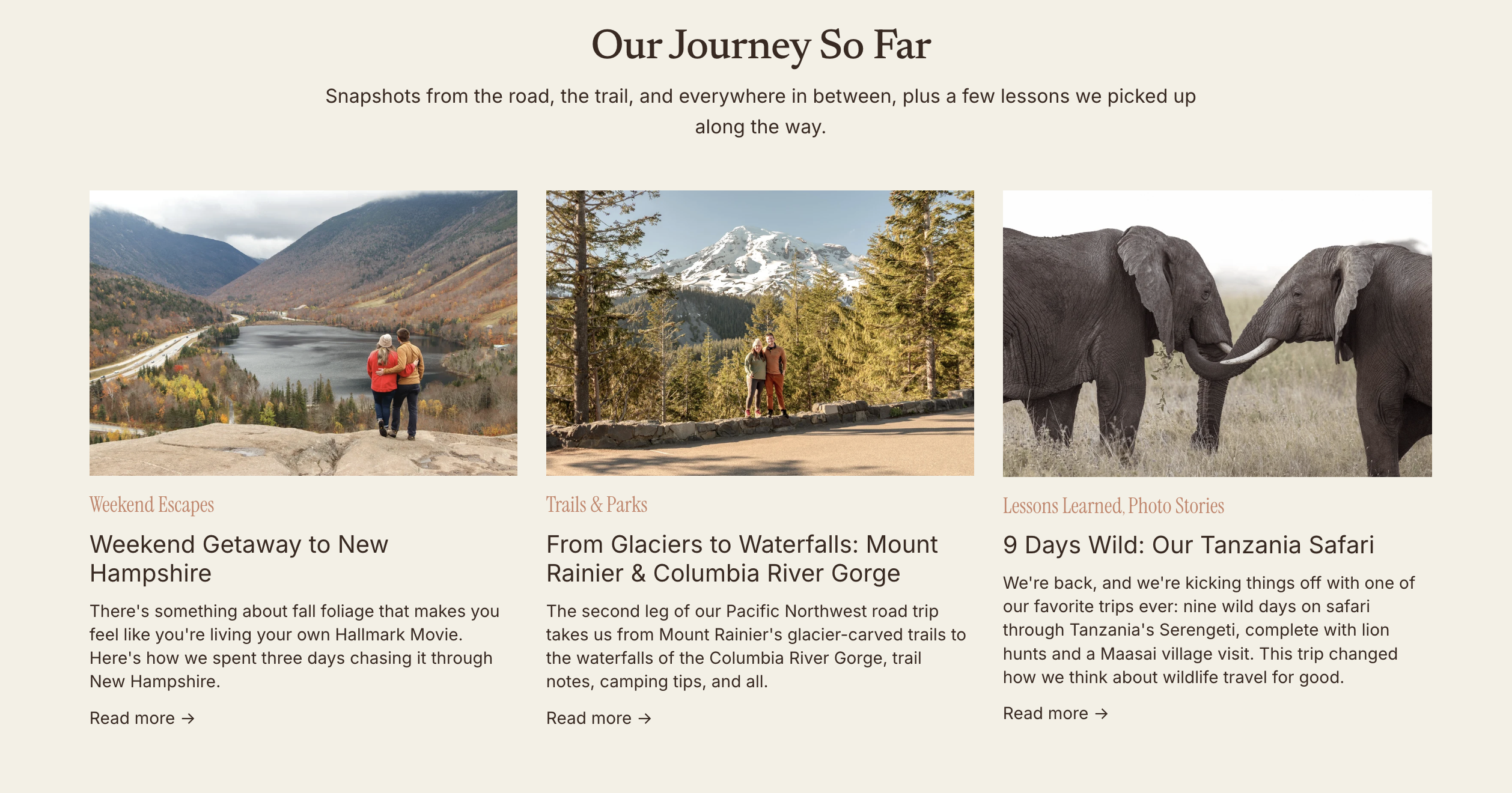

The "Lessons Learned, Photo Stories" label carried from the blog post header to its homepage card to the filtered Photo Stories category page, with the same post surfacing at every step.
Building the Website
The full site was built in Squarespace, which meant custom CSS work to get native blocks to hold a layout this specific, and to keep it consistent across sections ranging from the hero banner to a newsletter signup for the upcoming print shop. The homepage brings the brand together end to end: a hero that states the brand's point of view immediately, a philosophy section explaining the "why" behind the trips, an About section introducing Keith and me directly, and a "Journey So Far" feed surfacing recent posts by category.

The full homepage build, from hero through the print shop signup and running banner, showing the complete section sequence brought together in one custom Squarespace layout.
Publishing the Content Pipeline
With the architecture in place, I drafted a full slate of blog content against it. Since Squarespace's blogging tools don't include a true CMS component, I built a reusable blog post template Keith and I could duplicate for each new post, keeping section structure (Trip Overview, Planning Notes, body sections, closing) and formatting consistent without having to rebuild the layout from scratch every time. At the time of writing, the queue includes the six-post Pacific Northwest series, a Tanzania safari feature, and additional drafts covering New Hampshire, Maine, the Adirondacks, Seattle, and the Oregon Coast, with more destinations planned behind them.
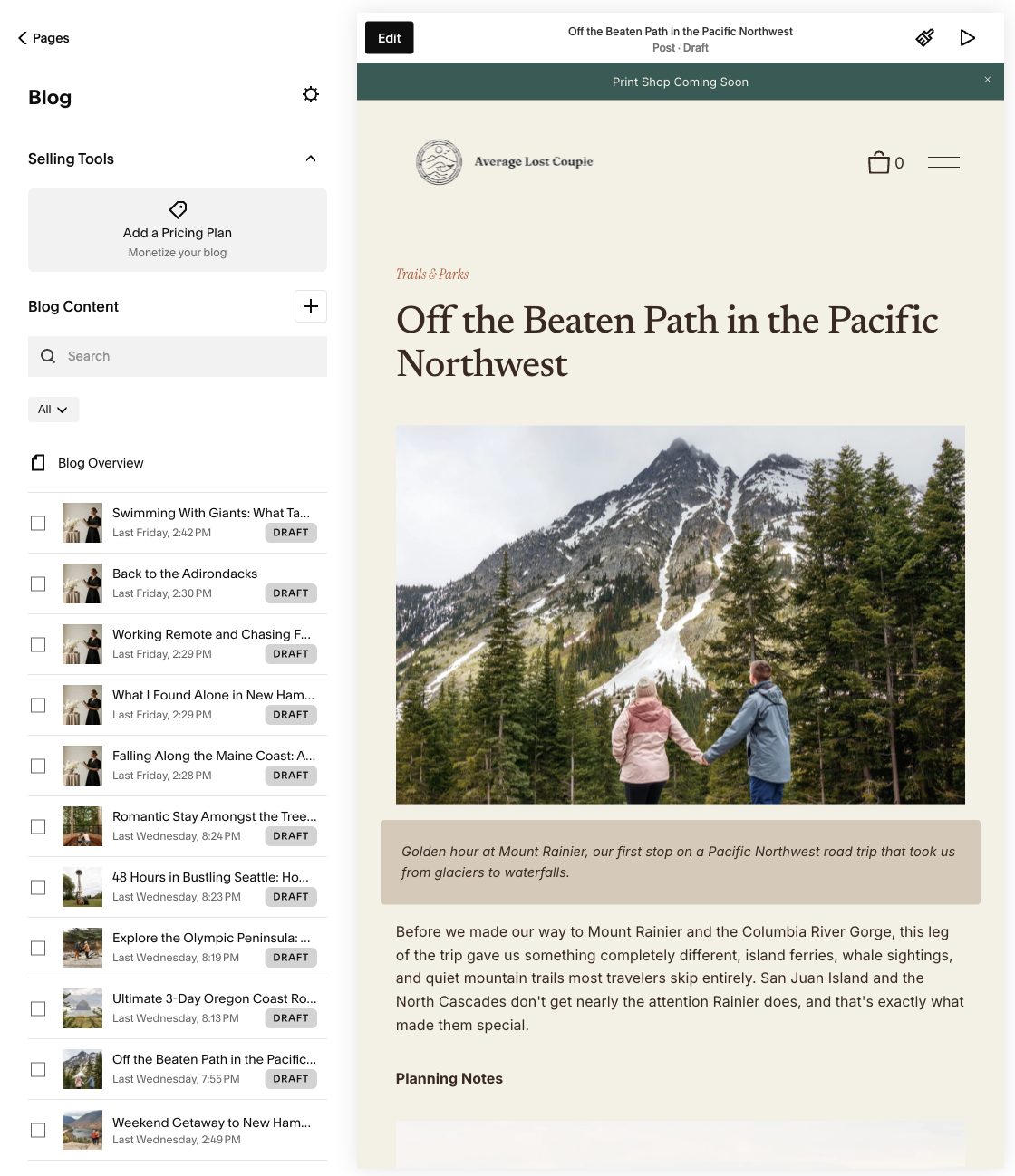
The reusable blog post template in use, shown here in a draft for the Pacific Northwest series, with the Trip Overview and Planning Notes sections already structured. The draft queue on the left shows the broader content pipeline in progress.
A Complete Brand and Content System Built to Scale
Average Lost Couple went from two disconnected platforms, no shared visual identity, and a closed print shop, to one unified brand and website built to hold years of trips and grow into a full print shop.
The final experience included:
Visual Identity System
A logo system built from real trip photography, complete with a primary badge mark, applied lockups, and a supporting illustration style, refined post-launch on both color (Driftwood Ink to Deep Driftwood) and type (Fraunces to Newsreader, Inter, and Instrument Serif).
The finished logo system across its three lockups: horizontal icon-and-wordmark, full circular badge with tagline, and standalone icon.
Six-Category Content Architecture
A blog structure (Road Notes, Weekend Escapes, Trails & Parks, Lessons Learned, Photo Stories, City Wandering) carried consistently from post to card to category page, deliberately excluding a food category once the actual content pattern showed it didn't warrant one.

The six finished blog categories, carried through consistently from post to card to category page.
Homepage & Blog Copy
A full voice and copy system, from the hero headline through blog captions, written to sound like an actual couple rather than a generic travel brand.

The finished homepage copy: hero, philosophy, and introduction working together as one voice, carried through from the first headline to the closing "See you out there."
Live Squarespace Build
A completed site on the brand's real domain, averagelostcouple.com, unifying a blog and print shop that had previously lived on two separate platforms (Wix and Shopify) with no shared identity.
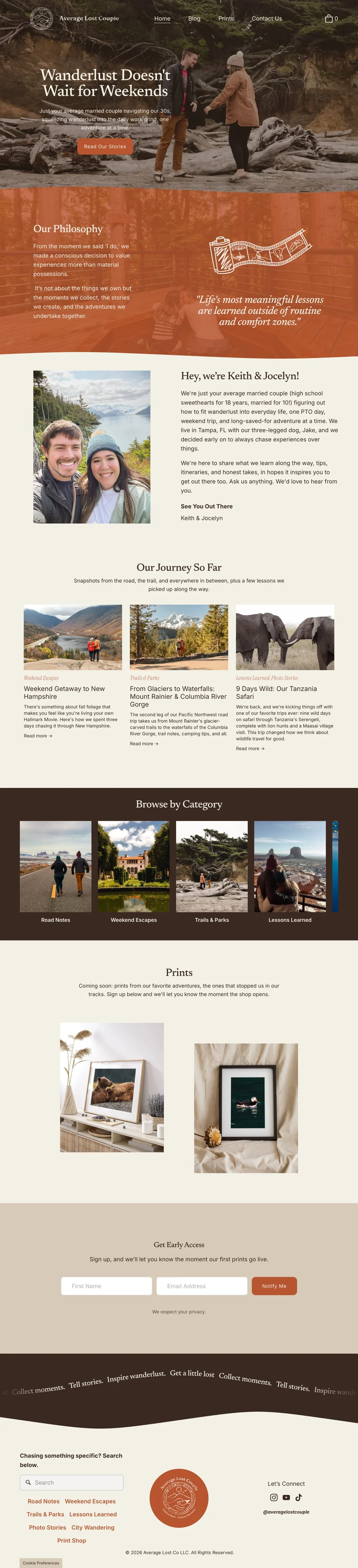
The finished Average Lost Couple homepage, live on Squarespace, bringing the blog, print shop, and email marketing together under one platform.
Rebuilt Print Shop
A new print shop, built from scratch on theprintspace after the original Shopify store closed, chosen specifically to improve print quality over the previous vendor, Pictorem.
Consolidated Marketing
Email marketing brought onto the same platform as the blog and print shop, giving subscribers one consistent experience and Keith and me one system to manage instead of three.
This project feels like a full-circle moment. Average Lost Couple's original website is the reason I got into design in the first place, working on it years ago is what first sparked my interest in UX and visual design and led me to a new career path. Rebuilding it now, with almost three years of professional design experience behind me, felt like the culmination of everything I've worked toward since leaving teaching. I got to bring my full story into one project, the systems-thinking habits from teaching, the strategic and visual skills I've built since, and the brand that started it all.
It's also the clearest proof point I have that those systems-thinking habits translate directly into design work: consolidating two platforms, rebuilding a print shop from scratch, and organizing years of scattered travel content into something someone can actually browse is, at its core, a curriculum problem.
Project Takeaways
Brand Strategy
Evaluated Wix, Shopify, Webflow, and WordPress against real cost and content-format tradeoffs before choosing Squarespace as the only platform that could hold a blog, a store, and email marketing without added cost.
Visual Identity
Developed a logo system built from trip photography and word-association exploration, then refined it post-launch on both color and type once real-world use surfaced what wasn't working.
Content Strategy
Designed a category architecture carried consistently from post to card to page, and cut a planned category once the actual content pattern showed it didn't hold up.
Information Architecture
Sequenced the homepage deliberately, leading with free content before the print shop ask, rather than defaulting to a generic hero-then-shop layout.
Web Design & Build
Delivered a full Squarespace build, including a reusable blog post template and custom CSS work to support a highly specific layout across devices.
Copywriting
Established a distinct brand voice carried consistently from the homepage through blog content, splitting one dense paragraph into a hero, philosophy, and introduction that each do one job.
Let's discuss how we can scale your brand through design.